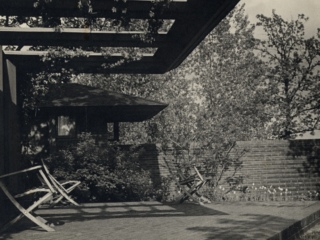
Willey House Stories Part 17 – Roll Down to Levittown
Steve Sikora | Dec 27, 2019
Every house has stories to tell, particularly if the house was designed by Frank Lloyd Wright. Some stories are familiar. Some are even true. Some, true or not, have been lost to time, while others are yet to be told. Steve Sikora, owner of the Malcom Willey House, continues his exploration of the home and its influence on architecture and society.
In a fit of financial angst, young Nancy Willey rejected Frank Lloyd Wright’s original design for her and Malcolm’s home in November 1933, and consequently set into motion a series of events destined to have long-lasting implications on the future of the American home. Although the initial scheme for the Willeys foreshadowed, in spirit, the dramatic character of the soon to follow Fallingwater, Nancy knew that she needed something more practical in a house, something affordable, easy to clean and a place she could entertain in. The resulting redesign by Wright proved an ideal home for the Willeys and spawned a host of innovations in modern living that would be emulated widely. Of particular interest to me, are the ways Wright connected indoor and outdoor spaces.
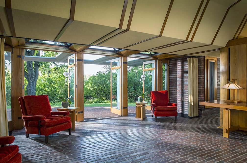
Free-flowing interior spaces in the Willey House connect seamlessly to the outdoors via a wall of operable French doors. Copyright Matt Schmidt
I grew up in Kenosha, Wisconsin. My mother purchased her house in 1951. It was a ready built, spec home, economical and thoroughly up to date. She was the breadwinner in her family with a good job at the Simmons Mattress factory. Both her parents resided with her. Her younger sister also lived in the house until she married.
After my mother and father wed in 1954, it became home to me and two siblings. In the family tradition, it also became temporary residence to an uncle and later, to grandfather both on my father’s side. We lived in Sunnyside. The streets of the Sunnyside neighborhood were graded over a swath of rezoned farmland. The largely rectilinear grid was bounded by 75th Street to the north, 27th Avenue to the west, 80th Street to the south and Sheridan Road to the east, which connected nearby Milwaukee and Chicago.
The eastern edge of Sunnyside, that closest to Lake Michigan, was the earliest to be developed after World War II. My mother’s house along with numerous others was of early 1950s vintage and conception. She told me her father warned about the quality of her house. Its construction was a significant departure from the turn of the century homes he had lived in. This new generation of dwellings was practical and relatively light on amenities. Familiar sand-float plaster walls were now applied to expanded metal mesh instead of the more labor-intensive wood lath. Rooms were compact and few-in-number. Dining took place in the kitchen, fitted out with linoleum floors and countertops. The varnished, hardwood trim around doors, windows and baseboards was streamlined in profile and unobtrusive. All interior doors were of hollow core construction. And due to the advent of wall-to-wall carpeting, many homes were no longer furnished with standard hardwood flooring, although ours was. The neighborhood was not planned as a builder’s development, featuring a dominant style per se. Instead, city lots were sold at random and a miscellany of small houses erected by any number of contractors. Consequently, the neighborhood featured a willy-nilly, potpourri of sundry shapes and sizes ranging from vestigial Victorian farmhouses to swoopy mid-century ranches, and everything one could imagine in between.
Houses like ours were prolific. In fact, my wife Lynette and I grew up in nearly identical homes. Hers, although built in the same year, was some 375 miles away in Crystal, a suburb of Minneapolis. Realtors both then and now would label our homes Cape Cods, one and one half story boxes with broad maple staircases leading to an unfinished attic space, ideal for later expansion into a second story. As intended, our fathers both jacked up the roofs of our respective houses, to form rear dormers, to help accommodate their expanding families. The two Cape Cods we grew up in were situated in post war neighborhoods. During the housing boom, at the end of WWII builders put up a cacophony of styles in these neighborhoods, making it evident that homes built in the early 1950s like ours, were dramatically outmoded by the neighboring moderns built just a few years later.
My aunt and her husband moved into the neighborhood. Breaking ground in 1960, her house was two blocks down from ours. I distinctly remember walking with my mother to see the foundation being dug with a steam shovel. Their new house was completed in time for my cousin and I to attend kindergarten together at the nearby Sunnyside Elementary School. Somehow, even as a four year old, I knew my cousin’s house was different. It was a single-story modern design. Interior spaces were more open to each other, than were the rooms in our house. Their living room featured a swath of glass that wrapped around one corner of the space. Each of the three bedrooms had clearstory windows, too high for kids to see out of, but wonderful for the transmission of light and circulation of fresh air, all accomplished with complete privacy from the prying eyes of neighbors. If the genesis of these revolutionary, residential features were ever discussed in our family, I don’t recall it. But today their inspiration seems obvious to me.
One of the very few vanities that could be ascribed to my mother was her desire for a picture window. Our 1950s house was constructed as a no-frills solution for baby boom families. The front room of the house came standard with a set of double-hung windows framing a larger divided light unit of fixed panes. As the Sunnyside neighborhood continued to fill in, it became obvious that a revolution in housing was underway.
Like her sister’s home, the newer dwellings, though still economical, had decidedly modern attributes. To be sure, even newer Cape Cods boasted a particular feature that hinted at this modernity. This enviable, breakthrough was known as the “picture window.” My dad was a carpenter by trade. The addition of a picture window was the first of many upgrades he performed on our home. In a study of the American suburbs aptly titled Picture Window: How the Suburbs Happened, the authors posit that the picture window was not meant for taking in the vista, but rather as a glance into the lives of the people who inhabited the home, as a kind of display space for the revolving pageant of seasonal décor.
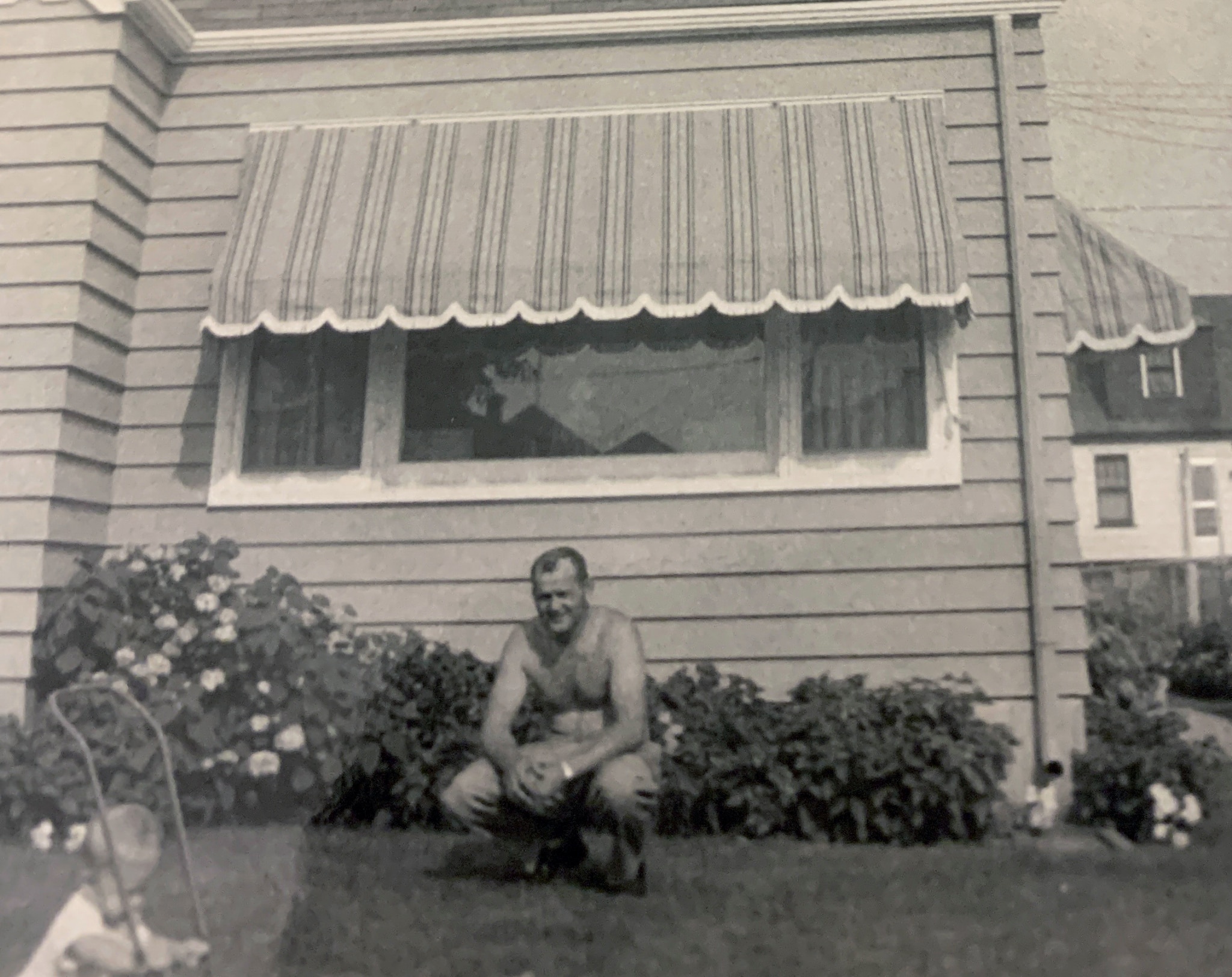
Our family home with dad and sister in the front yard. In the center of the frame is my mom’s beloved picture window. Sikora Family Archive
No doubt the picture window was a form of cultural communion with the rest of the local community. This was the one window in the house that welcomed public scrutiny and “fingers crossed,” merited admiration from judgmental peers. Wise use of this display space demonstrated that you “fit in” while it created ample opportunity distinguish yourself in passive competition with the neighbors, based upon the quality of the vignettes staged within the proscenium of the picture window. It is said that the picture window first appeared as a feature in the prototypical suburbia called Levittown.
For the sake of this article, the definition of a picture window is: A fixed pane of plate glass, large in scale relative to the wall area, usually uninterrupted by leading (with exceptions) and generally framing a view.
I won’t argue that the Christmas tree was the centerpiece of every picture window in Kenosha. Still, I believe display was secondary to the principle purpose. The value of these large expanses of glass was the way they aggrandized tight spaces within the cloistered box of the American home. These gaping chasms of natural sunlight, vista and airiness offered a bona fide psychological benefit of those who lived within. It was a psychic benefit, more than a ready tool of one-upmanship to wield against the Joneses. In my personal experience, any perceived confinement of space we may have felt in the living room, was eradicated after my mother’s wish was granted. Our house, like those of our neighbors was oriented toward the street. Hence, the most prominent architectural feature of the house, the picture window, likewise faced the front. That, is where even the most contemporary of homes in our neighborhood diverged from the way in which Wright used large expanses of glass. His purpose was identical, creating a new openness and sense of freedom in the home. However, in his houses starting with Willey, space was reversed.
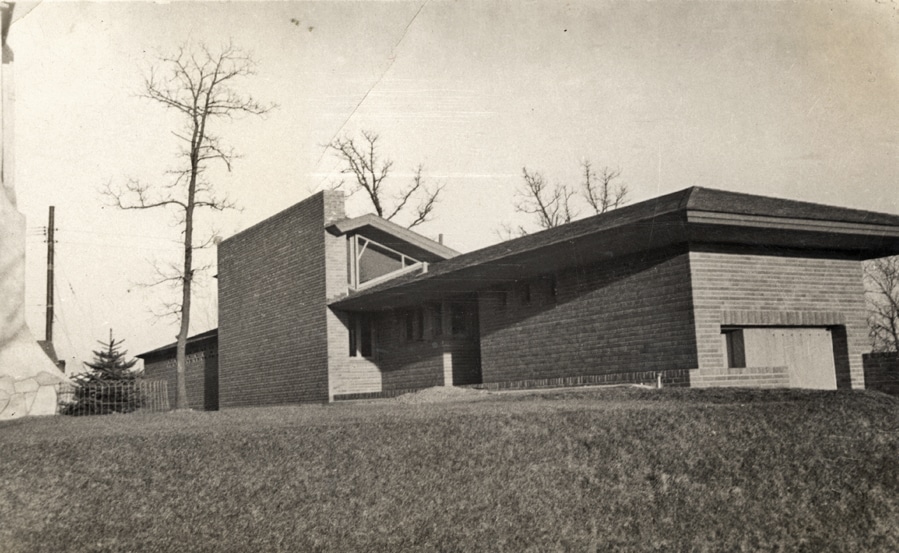
The Willey House turns its back to the neighborhood and caused a neighbor to dub it a “spite wall.” Nancy Willey’s photo album
A criticism of the Willey House, at least from the immediate neighbors, was the manner in which it broke ranks and turned away from the rest of the homes on Bedford. One neighbor considered the rising masonry so unfriendly she declared it a “spite wall.”
Of course Wright’s intent was never to blend in, but rather to establish a particular set of living conditions he aptly described in The Natural House, “The plan protects the Willeys from the neighbors, sequesters a small garden and realizes the view to the utmost under good substantial shelter.” To do so, the Willey House has an intentionally obscuring, solid masonry side of red brick, and conversely, a wide-open, transparent side composed entirely of operable French doors.
Since virtually all glass on the transparent side of the house is in the form of a functioning door, there is no need, nor place for, any large panes of fixed glass. The only exceptions are the kite-shaped windows in the high spaces below the roofline framing each end of the living room.
Wright did employ the occasional fixed-glass picture window in some of his Usonian homes; the Walter (1945), Grant (1946), Mossberg (1946), Neils (1949) and Hagen houses (1954) immediately come to mind. At Wright’s own home Taliesin II, prior to 1925 he placed fairly large, clear panes of glass looking out from the living room to the valley below. But it wasn’t until Taliesin III, that Wright, constantly renovating, introduced immense expanses of plate glass. We don’t necessarily perceive their enormous scale because of the artfulness with which they’ve been integrated into the building. In 1943, a large hexagonal window was set in the little kitchen adjacent to the living room. Between then and 1946, the main entrance to the residence included floor to ceiling, plate glass next to the entry door.
Today, two rooms in particular at Taliesin hint at the suburban picture window. Wright’s bedroom is walled in floor to ceiling plate glass looking out, not upon the vista, but to his personal terrace and plunge pool just outside, creating an intimate connection between bedroom and private garden spaces. According to Cultural Historian at Taliesin Preservation, Kieran Murphy, these windows were added in 1958 based on an account by Robert Green, an apprentice who was with the Fellowship for only one year, from 1958 to 1959.
Another contemporary example, appears in the converted porte-cochere, which was reconfigured in 1943 to accommodate a visit from Solomon Guggenheim and the Baroness Hilla Rebay. In this space, now called the Garden Room, there is a prototypical picture window overlooking the Garden Court and fountain. The window was enlarged to its current proportions between 1950-52. Like the other plate glass planes remaining at Taliesin today, this window possesses a quality of utter intangibility. It appears more as an opening than a glazed window, creating the illusion of no separation between inside and out.
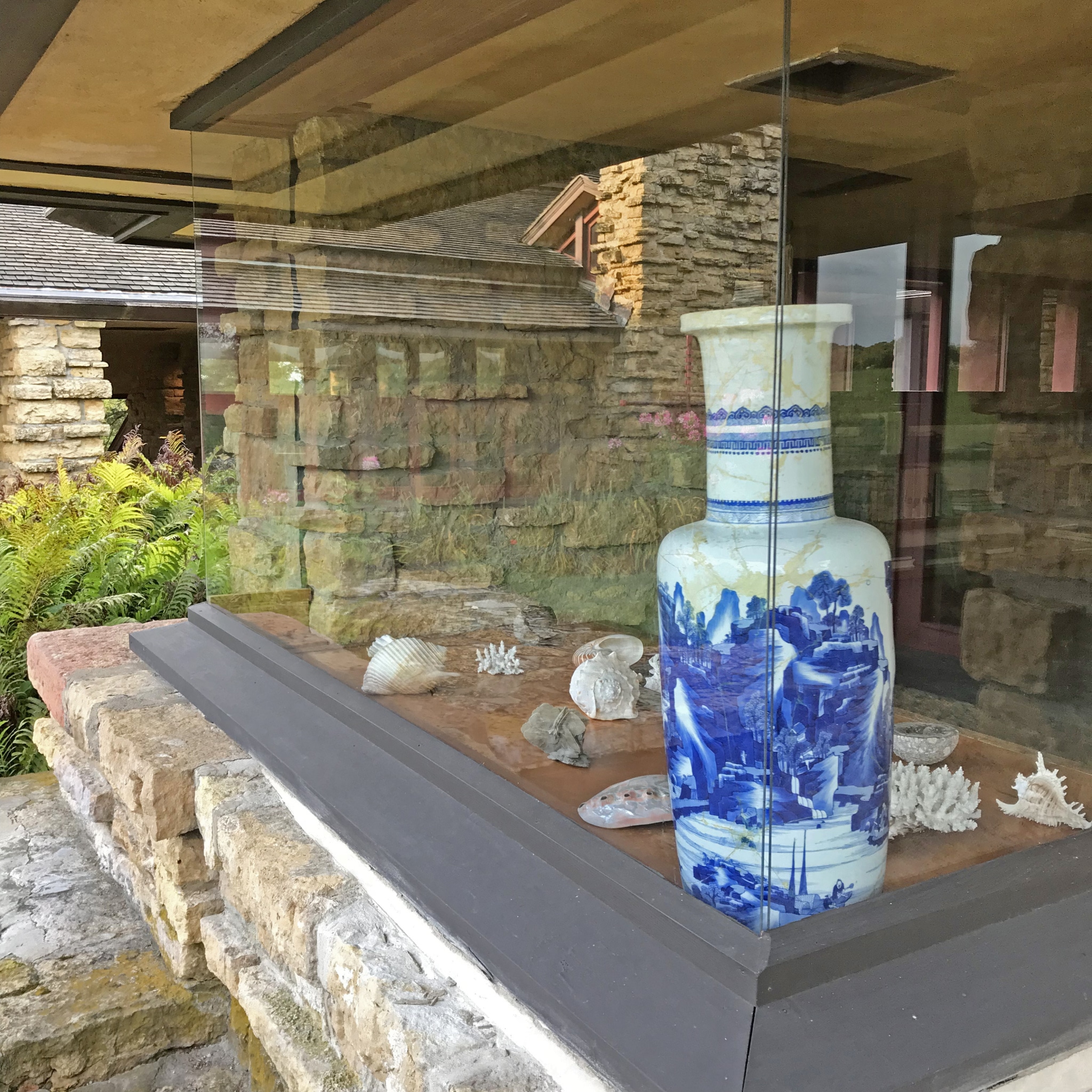
The Garden Room picture window. Copyright Steve Sikora
Wright’s few applications of the picture window are consistent with its appearance nationwide and might even predate its meteoric rise in popularity. At Taliesin we first think of the sweeping views framed by the ribbon of living room windows or the vista opening up beyond the tall glass, French doors in the loggia. But the largest expanses of glass all face uphill, toward the private courts of the residence, in places erasing the exterior walls of the house. This perceived absence of materiality is exactly the impression Wright was experimenting with. In The Natural House, 1954, Wright praises the qualities of glass as if it was a recent invention, when in actuality, he was seeing it in an entirely new light. “A NEW REALITY: GLASS…a super material qualified to qualify us; qualify us not only to escape from the prettified cavern of our present domestic life as also from the cave of our past…”
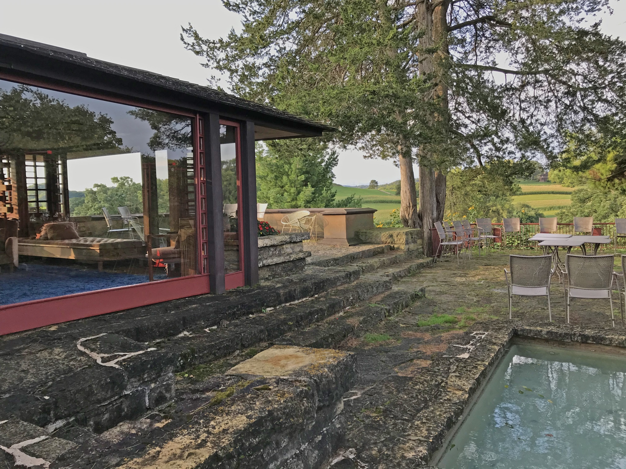
Plate glass walls facing the private terrace and plunge pool outside Mr. Wright’s bedroom. Copyright Steve Sikora
Wright’s Usonians, beginning with Willey, typically employ a plan that turns away from the street, closing off the public side of the house while fully exposing the private side to the outdoors. The perception that these houses were unfriendly to the neighbors belied the fact that in exchange, they created a feeling of casual comfort and a profound sense of security for the people who lived within. This inverted concept was rarely embraced outside of Wright’s circle. In standard, side-by-side American neighborhood homes, the opening of space was street-oriented, and exposed family life in ways that required the installation of equally large floor-to-ceiling drapes. Due to cultural customs the picture window, serving the same purpose as Wright’s use of glass, became largely a front of the house “presentation” phenomenon, yet there is one notable exception. And again, it was found in this place called Levittown.
Even in the Wisconsin of my youth, the name Levittown was familiar to me. One of the first vinyl LPs my parents gave me, by the singing satirist, Alan Sherman of Camp Granada fame, featured Levittown in song lyrics set to a calypso beat. “I’m upside down, my head is turning around. Because I gotta sell the house in Levittown.”
The mysterious, yet ever-present Levittown frequently served as a convenient punchline for television personalities like Don Rickles to spew on Johnny Carson, “I did not know that.” The gist of which always implied that “economical” equated to “mundane” or worse, “inferior.” As it turns out, these statements were as myopic and prejudicial as the false perception of imported goods labeled “Made in Japan” were judged to be in Bugs Bunny cartoons. Japan of course redeemed itself. Levittown did not fare quite as well.
My first and only proximity to Levittown was in the year 2000. I was riding in a gleaming, new 7-Series BMW northbound on Interstate I-295 between Philadelphia and Princeton, New Jersey. Behind the wheel was the architect Michael Graves. Seated beside him was Patrick Burke, a senior architect. I was in the backseat with a designer from my office. At the time, Design Guys and Michael Graves Associates were collaborating on a Target store prototype. We had just visited the one of the first Target stores on the East coast and the one closest to Princeton, where the Graves office was located. On this drive we sped past a road sign reading Levittown. I asked if this was indeed “the” Levittown and Michael confirmed that it was. I asked if he had ever visited. He had not. A curious and missed opportunity it seems now, considering the work we were then doing—laying the groundwork for the “democratization of design” at Target. The town we passed was actually the second Levittown, founded in 1952. The original Levittown was founded on Long Island in 1947. The first was populated with row upon row of houses very much like the Cape Cod I grew up in, some 17,207 of them. The second Levittown was far more diverse in style, with six distinct home models to choose from. It too was the size of a small city with 17,311 homes.
I am embarrassed to say that until recently, my only impressions of Levittown were those talk show characterizations still floating around inside my head. I knew nothing of the innovations in process, design, and packaging that Levitt & Sons brought to the housing industry. Least understood by me were the surprising influences behind the home models lining the streets of these planned communities.

Promotional flyer for The Levittowner, a Levittown model home, inspired by Frank Lloyd Wright. The house came in four plan variations. Image courtesy of Levittown
The Midwestern landscape of my childhood was densely populated with Wright’s aesthetic ideas and architectural inventions, yet Wright, on his own was never able to make the true essence of his organic architecture a reality for the many. It was not for lack of trying. His American System-Built Houses were as bold an experiment in affordable, high quality housing as the Erdman Prefabs were in manufactured homes. Both, valiant efforts to bring good design to the average citizen, both invariably proved too complicated and ultimately too expensive. Either Wright was never able to collaborate with the ideal partner to make his affordable housing ideas a reality, or more likely, he never was able to leave “good enough” alone, long enough to keep costs at bay. Organic architecture by its very definition is a custom endeavor, decidedly an intuitive response to both site and client. It is a contradiction to think that something of such specificity could exist in the realm of predetermined menu options.
Even Wright’s Usonian houses, envisioned as yet another efficient system of construction, for the most part did not adhere to the original kit of parts devised, originally for the Hoult House project and ultimately used at the first Herbert and Katherine Jacobs House. As long as Wright was involved, the particular needs of the client and intricacies of site were hard to ignore. Regardless of his persistence and endless fascination with it, mass homebuilding amounted to rubber-stamping to Wright’s original artistry. He never wanted to repeat himself, and usually didn’t. Enter Levitt & Sons.
Abraham Levitt, in partnership with his sons, founded a real estate development company during the Great Depression. William Levitt was made company president at age 22. His younger brother Alfred Levitt, while still a teenager, became vice president of design. At face value this doesn’t sound like a recipe for success, but Levitt & Sons quickly garnered a reputation for building high quality, custom homes, completing over 300 of them. As WWII drew to a close William Levitt, now at the helm, saw new opportunity in a rising need. The supply of economical housing for G.I.s returning from the war was low. To put down roots and start families they required solutions for affordable housing. The Levitt’s devised a way, to make the American Dream a reality for them, circumventing every obstacle that stood in the way. New housing stock at an affordable cost, initial down payment, and financing were offered in a carefully considered package. These houses were also outfitted with the latest appliances, and sold on an installment plan, all for a low monthly payment.
The Levitt genius proved to reside in their process, brilliant packaging and consumer marketing of tract housing. Using methods of mass production as if homes were factory-made products, they offered a limited number of styles and used assembly line practices to erect as many as 30 a day. The only difference was, in Levittown, the product remained stationary while the workforce moved from house to house, completing the same specialized tasks repeatedly, on one after the other, with great speed and efficiency. The Levitt’s system broke down house building to a concise 26 steps and utilized specialty subcontractors to complete each step. Due to their extraordinary volume, Levitt & Sons were able to purchase materials and appliances direct, further reducing overall costs. By controlling the site, the materials, the workflow and the financing they revolutionized post-war housing developments.
Anticipating the changing tastes of the American family, at the height of this building frenzy, Alfred Levitt stepped away from his duties for almost a year, in order to study a house designed by Wright, as it was being erected. He scrutinized every aspect of the Usonian design, from plan to aesthetics; materials mix to construction methods in a quest to understand how Levitt & Sons could benefit from Wright’s celebrated and revolutionary ideas. The subject of his research was the Ben Rebhuhn House built between 1936-37, in Great Neck Estates New York. It was designed for the Publisher of Horizon Press, Ben Rebhuhn and his wife Anne. Horizon published many of Mr. and Mrs. Wright’s books and the Rebhuhns became life long friends and advocates for the Wrights.
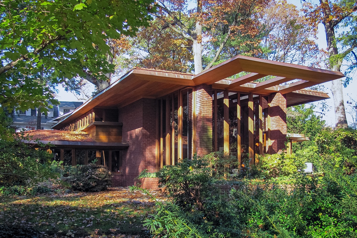
Alfred Levitt studied every aspect of the Ben Rebhuhn House over the 10-month period it was under construction. Copyright Stan Ecklund
The takeaway from the months Alfred Levitt dedicated to observing construction of the Rebhuhn House was not a solution for making organic architecture available to a general audience. It was clear that the complexity of design and detail would never make these houses reproducible on a mass scale. Instead, he focused on the benefits inherent to the modern features of a Usonian home, particularly those features that could be reproduced or implied in conventional construction. Alfred was a diligent student. He spent 10 months on the job site of a single house, and certainly familiarized himself with Wright’s earlier achievements as well. Alfred Levitt’s understanding of the principles underlying Wright’s work included how a bold use of fenestration could dramatize an otherwise intimate domestic setting.
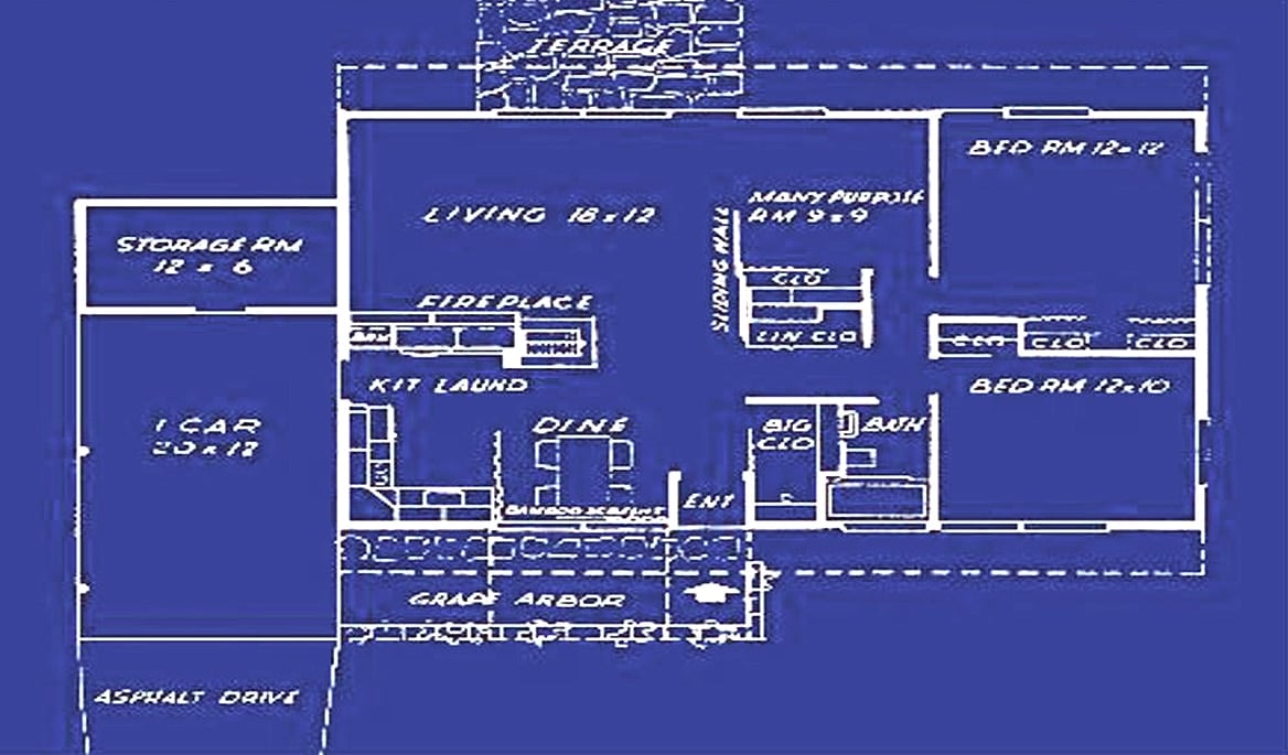
The floor plan of the Levittowner model depicted in the promotional photo. Image courtesy of Levittown
In their second mass-produced suburb, Levittown, Pennsylvania, a wider array of housing styles was made available to prospective homeowners. The one that best demonstrates how Levitt incorporated Wright’s ideas, was called the Levittowner. There were four Levittowner configurations.
Generally the Levittowner was a single-story ranch design. Depending on model, the roofline could be extended to create a carport, or exterior walls drawn in below a corner of the roof to create a sheltered ramada for outdoor living. A subtle, steel corner post supported the resultant, implied cantilever.
The borrowed, Wright-influenced inventions were many. Among them; indirect entry sequences, open floor plan, carports rather than garages, poured concrete floors with embedded radiant heat, fireplaces, a simple materials palette, exposed kitchen, clearstory windows, implied cantilevers, indoor/outdoor living and private outdoor spaces.
A single promotional photo showing the interior of a Levittowner model tells a remarkable story. This image of a fully furnished Levittowner conveys everything a young, aspiring family could possibly desire. They can imagine themselves, living the most up-to-date version of the American dream, in a spare and spacious, free-flowing environment, easy to clean and utterly conducive to a modern casual lifestyle. Lack of conventional, ceiling fixtures creates a smooth plane of the overhead space.
Radiant heat pipes concealed below a poured concrete floor, clad in patterned linoleum, creates continuity between spaces and eliminates the aesthetic blight of visible heat registers. All the communal spaces of the Levittowner combine into a single, zoned space. Here we have a fully exposed kitchen, and like Wright’s open kitchen at the Willey House and others, it can be closed off as necessary. In this case, the veiling mechanism is a sliding curtain wall exactly like those used to divide the kindergarten classrooms at Sunnyside Elementary School. Directly linked to the kitchen is a dining area, which in turn opens to a spacious living room. A masonry wall forming a fireplace, screens kitchen/dining functions from the living room without completely walling it off. The mass of the fireplace masonry creates the sensation of a thrusting cantilever, even though it is actually resting on a steel post.
The “inclusion” of a fireplace is remarkable in itself, given the cost sensitive nature of these homes. But most amazing is its design. This is not the typical hole-in-the-wall fireplace. The masonry mass steps down, creating a set of jaws, inside of which is panoramic firebox, visible from three sides and almost as open as a campfire. It’s questionable as to whether or not a wood-burning fireplace like this one could be used without suffocating the family. The chimney is offset from the fire basket. Perhaps it was fitted with a gas flame, or simply used a clever prop. There remains the question of what justified this investment from a cost benefit perspective? Masonry is labor intensive and therefore expensive. Extraneous cost is antithetical to a tract home where every expense is carefully weighed and justified. Given that the fireplace was quite possibly useless, why add this feature? Simply stated, it is the best evidence that Albert Levitt took the time to understand Wright even if he knew he could only simulate what Wright had achieved.
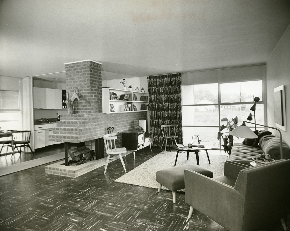
Promotional photo of a Levittowner model demonstrating the many features inspired by Frank Lloyd Wright. Byoir, Carl and Associates, circa 1953, Image courtesy of the Special Collections Research Center. Temple University Libraries. Philadelphia, PA.
A fireplace is a representation of warmth, shelter, and sustenance. What could be more appropriate than an architectural feature that links all the rooms associated with those particular functions? Since the dawn of man, fire has always been central to communal gathering places. In a residence, these combined living spaces add up to exactly that, the family circle. The fact that the Levittowner was a petit house magnifies the power of this effect. Albert Levitt took advantage of the small footprint of the tract house, to leverage Wright’s use of compact spaces that open to vistas, in order to invoke sensations of comfort and security. On a primal level we respond to these cues subconsciously. Staged environments like these retain their power even if they are only symbolic. Which brings us to the picture window depicted in the photo. It looks into a private corner, sheltered under a projecting roofline. In an alternate plan version not pictured, the window opens to a terraced back yard. Not that Levittowners didn’t follow the tract house convention of picture windows in front, they did. But the addition of a second picture window, in back, opened the interior to private outdoor living space as Wright had done. This arrangement also created a line of sight through the house bestowing interiors with an enhanced sense of freedom.
A retail trend forecasting term “fashion roll down,” is a measure of the time it takes for a particular style or trend to work its way from the runways of haute couture to the retail racks of the mass market. Once available to the general public, the creator may feel it a mere semblance of the original idea, but to the consumer, it’s the next big thing! The magic recipe, a dilution in taste, baked into economies of scale, result a distinct new flavor, palatable to a great number of individuals. Few will ever own a Ferrari, but many can own a Fiero. Furthermore they are happy with their mid-engine, plastic Fiero, thinking it to be “like a Ferrari.”
A pop music corollary is Bob Dylan, who never had a Hot 100 number-one hit single. His songs in the 1960s however, covered by other, more “commercial” recording artists including Peter, Paul and Mary (Blowin’ in the Wind), The Byrds (Mr. Tamborine Man), Manfred Mann (Quinn The Eskimo), and the Turtles (It Ain’t Me Babe) were smash hit singles with incessant radio airplay, that vastly expanded the audience for Dylan’s music and message.
This same principle applies to architecture. Wright’s organic architecture time and again proved outlandishly expensive and perhaps too uncompromising for the conventions of the average suburban family, who last of all, want to stand out from their peers. In Levittown standard model designations, like “The Levittowner,” gave permission to consumers to embrace modern ideas without fear that they might seem queer to the neighbors.
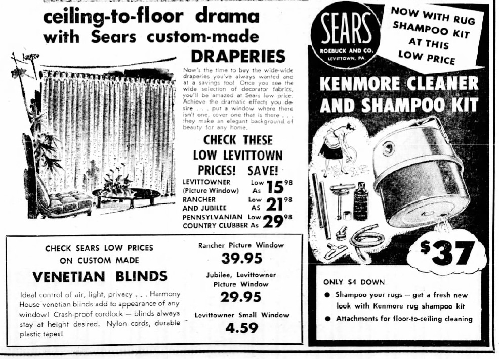
Sears Roebuck and Co. sold home accessories specific to Levitt home models. Courtesy of The Bristol Daily Courier, October 21, 1959
Buying into Levittown offered other subtle advantages as well. Major retailers such as Sears saw the opportunity to sell accessories specifically conceived to fit Levitt homes like a glove. Draperies, for instance could be purchased not by height and width, but by the home model name a customer owned, not so different from a Barbie DreamHouse on 1:1 scale. I have often wondered about the product lines that Wright licensed in 1955 in conjunction with House Beautiful Magazine.
He obviously believed that enough of his ideas were in the world that he could offer Taliesin designed furniture, wall coverings, fabrics, draperies, and paint colors to help those inclined to beautify their modern homes, even if they could not have one designed by the master himself.
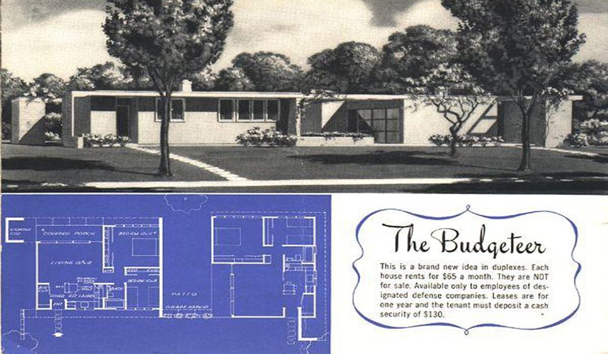
Promotional flyer for The Budgeteer, a Levittown duplex designed for multi-family rentals. Image courtesy of Levittown
“At least I lived long enough to see my country begin to understand what I am about.” Could they too have been more successful if designed as part of a master housing program? I think they still could.
Levitt & Company made a valuable and unacknowledged contribution to Wright’s legacy, thanks to the care Alfred took in integrating key elements of Wrightian environments into aspirational yet economical homes. He even explored Wright’s ideas in the form of multi-family rental duplexes, in a model called The Budgeteer, though it is unclear any were ever built.
There is a pervasive sense of inevitability that housing today (as then) must be what it has become, in the name of economics, that financial constraints drive all design decisions. Levitt & Sons proved otherwise, just as Target did when it was courageous enough to partner with Michael Graves on the launch of thousands of products that filled every hardlines department of their stores. They proved that thoughtfully designed items could replace bland, anonymous designs with a very minimal increase in cost. Customers responded and expectations rose.
Simple, functionality, of course was never enough for Wright. But for most people, to own a home like the Levittowner, was more than they could hope for. How did Wright feel about his inventions rolling down to the tract housing market? It certainly wasn’t Broadacre City. It wasn’t even Usonia, where every home was sensitively sited on its own acre of land. But unlike the legions of purely aesthetic imitations found everywhere, I suspect that he would have been a little more appreciative that Levitt employed real principles at Levittown. As Wright said, “No man owns an idea…By using it he gives it to the world.” Wright was utterly opposed to the residential box, even if it was one drawn by a modernist. Organic architecture was not based on the box, but everything else was. According to him, “the box is a symbol of containment…Man should not be crated, he should not be boxed. He should have a free environment to go with his free faith in himself, as himself. From that he can proceed to develop and maintain his faith in his fellow man.” Using conventional framing techniques, the Levittowner still managed to make significant advances in the dissolution of the Wright’s box, freeing the spirits of those inside, whether the young inhabitants were aware of the fact or not. The beneficial psychological effects of being in proximity to the natural world, combined with the primal attraction of gathering in a place of shelter, are now commonly understood as fundamental to human health.
We can only imagine what the result of a partnership between Wright and Levitt & Sons could have meant to the modern house. Sadly, that never transpired. But serendipitously, I happened upon a letter in the Taliesin archives, sent from Abraham Levitt to “Taliesin Foundation,” on February 19, 1939. It reads:
“Will you please send me a rough sketch (no particular scale) and an explanation in general of the heating system, utilizing the brick floor as the dispenser of heat, which Mr. Wright uses in his later dwellings. (A reference to a book showing the detail will do as well). I do not understand the principle involved and the method from the text of Mr. Wright’s written works, which I have read up to the present.
As I desire to use this method in a school problem (Pratt Institute-Evening Session) in which I must show details, this sketch will be of great help to me.
Thank you.
Very truly yours,
Abraham D. Levitt
This correspondence implies that Abraham Levitt himself may also have been a follower of Wright. But even if it was just a case of the patriarch inquiring about the workings of radiant heat, at the behest of his son Alfred, in-floor heating most definitely did became a mainstay in Levittown homes. An innovation devised by Wright to integrate heat into the structure of the building as though it was the circulatory system of an organism, turned out to be an economical solution in many thousands of tract homes.
Ways in which the Levittowner reprocessed Wright’s innovations, helps illuminate the evergreen potential for Wright’s continued relevance into the new millennium. No substitute, including a Levittowner, is ever going to compare in artistry to an original Wright. But Albert Levitt’s efforts did successfully realize aspects of Wright’s ideas that can point the way for the infusion of organic features into future generations of affordable housing. There is still much to be learned from Wright. Much we know now can be applied today. By apportioning space to meet current needs and fit evolving patterns of living, ideas like those borrowed from Wright could transform again how we well we live, and in turn how well we build. Perhaps its time to reconsider the bloated proportions of the modern house, and the anonymity of the current scourge; block after block of the banal, McApartments being erected on every major thoroughfare, in every American city.
Advocating for her late husband, Olgivanna Lloyd Wright wrote in The Roots of Life. “Being beyond styles and fashions, organic architecture is of all time; its principle is to create in accordance with the purpose which the building serve, for the terrain of which it stands, for the conditions in which it is to exist—economic, social, individual. The materials used in organic architecture are in accordance with this same principle, making the house harmonious with its environment and natural to its site. Whatever is built on the principle of organic architecture cannot be but harmonious, appropriate, sound, characterful and beautiful.” Harmonizing interior space with the external environment is not an unattainable vision. It happens all the time.
Kite windows in the Willey House living room offer vistas of the sky on both ends of the living room. Copyright Matt Schmidt
The kite-shaped picture windows in Nancy Willey’s living room, capture the eastern and western skies. They trace the changing angles of the sun and display with theatrical flair, the restless circumstances of weather. Wright’s picture windows dissolve the walls of his home Taliesin, and blend seamlessly with the enchanting beauty of the Garden Court. The young family, whose name we will never know, living in the Levittowner depicted in that 1953 photo, gazed with familial contentment, through a wall of glass to a private corner of the yard outfitted with folding chairs and a smoking barbeque grill. Framed within my mother’s picture window was and still is a little brown house on the opposite side of 19th Avenue, with the huge oak growing before it. Sentinel to the neatly trimmed front yards, sidewalks and street that served as playground, for her children and all the neighbor’s kids, this was her heavenly vista.
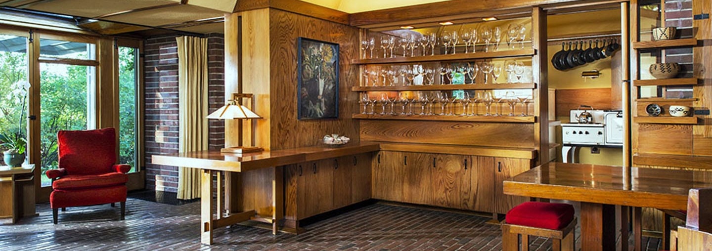
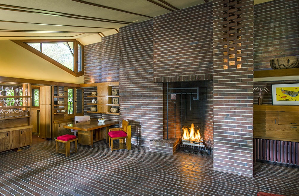
Header image: Willey House dining room, copyright Matt Schmidt
READ THE REST OF THE SERIES
Part 1: The Open Plan Kitchen
Part 2: Influencing Vernacular Architecture
Part 3: The Inner City Usonian
Part 4: A Bridge Too Far
Part 5: The Best of Clients
Part 6: Little Triggers
Part 7: Step Right Up
Part 8: A Rug Plan
Part 9: Hucksters, Charlatans, and Petty Criminals
Part 10: Lo on the Horizon
Part 11: Origins of Wright’s Cherokee Red
Part 12: One Thousand Words
Part 13: The Plow that Broke the Plains
Part 14: Separated at Birth
Part 15: Trading Drama for Poetry
Part 16: A Red By Any Other Name

