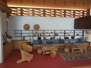
Willey House Stories Part 1 – The Open Plan Kitchen
Steve Sikora | Nov 10, 2017
Every house has stories to tell, particularly if the house was designed by Frank Lloyd Wright. Some stories are familiar. Some are even true. Some, true or not, have been lost to time, while others are yet to be told.
This is the story of the Willey House kitchen.
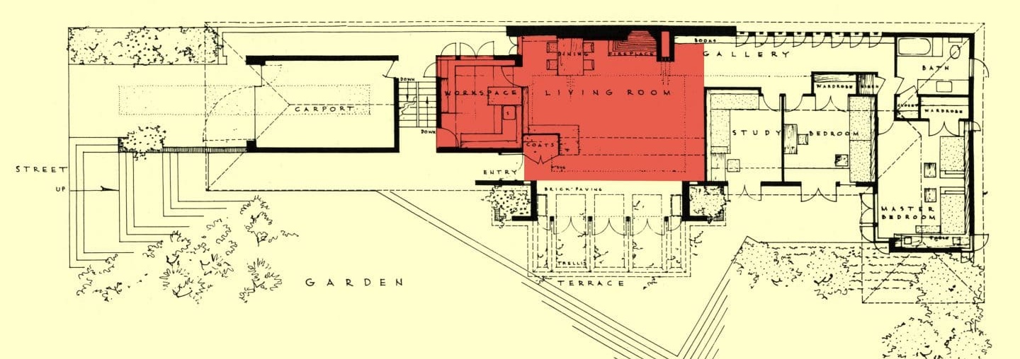
A tipping point was reached at the moment an exasperated Nancy Willey wrote “I want an eight to ten thousand dollar house for eight to ten thousand dollars. Can I have that?” The first plan Wright put forth to the Willeys was simply beyond their means. Nancy spent more that a year determined to find a way to get it built. After Wright tried to convince her to construct the ground floor only and the second story later on, she told him she couldn’t get a mortgage on half a house and with her withering ultimatum, Wright at last conceded in a letter dated November 29, 1933. “We’ll try again. It seems the simplest way. My best to the other half. And we’ll let you know when to ‘drop in’ – on a weekend the playhouse is in action.” And so, by December 13th of 1933, he drew the basis of what would be an entirely new kind of dwelling: a single level plan with inline rooms that formed an ell at the master bedroom. A garden wall extended an arm from the bedroom wing creating a private garden. Despite the northern climate, this was a house thoroughly intended for indoor-outdoor living, each and every room opening to a brick paved terrace via floor-to-ceiling French doors. A continuous roofline spanned the gap between house and garage modules with deep soffits creating sheltered spaces, together with a continuity of materials flowing from inside to out that together conspire to accommodate the modern, free and casual new lifestyles that Americans were imagining for themselves during this decade of social reinvention. The key that unlocked Wright’s understanding the needs of the next generation was Nancy Willey. She did so as the best clients often do, by pushing back, insistent on what she needed and had the means to afford.
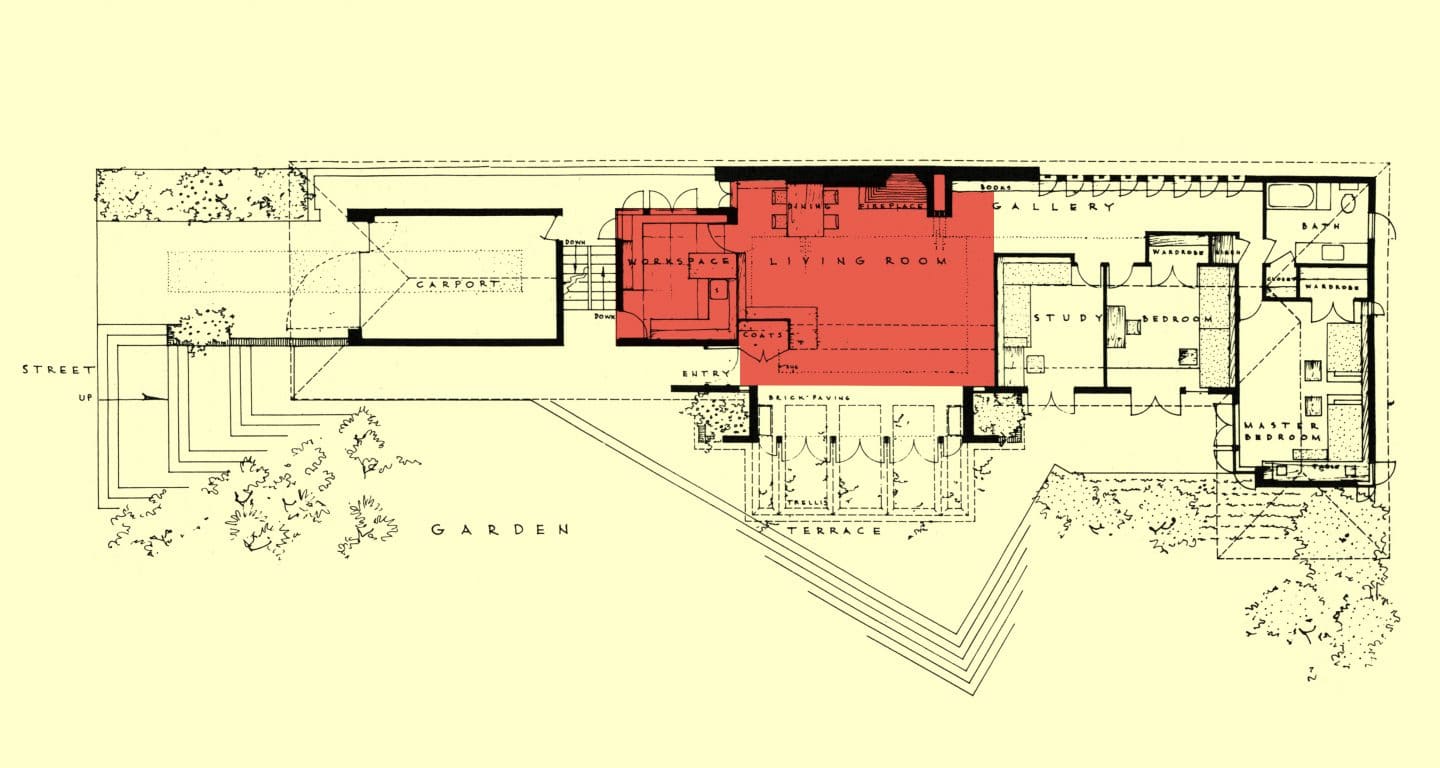
By late 1933, Wright knew Malcolm and Nancy Willey much better than he did when he designed the first house for them. In his second go-round, he would have understood their proclivities, lifestyle and financial constraints having spent social time together.
The popular notion implied to us when we first acquired the Willey House was that Willey Scheme 2 was some sort of compromise. But there is little comparison between the two ideas let alone the second being a reduction of the first. The second plan was certainly a more compact design and less costly to build, but if anything, it was more forward-thinking than the original in that it addressed the specific needs of the Willeys, but more importantly, it generally expressed the needs of a whole new generation. Features introduced in this design influenced decades of homebuilding to come and many still resonate with us today.
When describing it Wright said: “The house emphasizes the modern sense of space by vista inside and outside, without getting all ‘modernistic.’” (The Natural House) His quote relates to the Willey House kitchen, which exemplifies the interior vista Wright calls out. One photo in the January 1938 Architectural Forum shows a view from the Willey House kitchen into the living/dining room. No other Wright kitchens are shown in the 1938 Forum. But when the same photos are repurposed in Wright’s 1954 The Natural House, several Usonian kitchens are pictured; the Usonian Exhibition House, Pew, Carlson, Miller and Adelman after the open kitchen concept is popularized.
In Wright’s previous work, kitchens were not lavished with the same attention that the traditional parlors and public spaces of a home routinely received. Most of his early work had been done at the behest of a wealthy clientele who expected their homes to follow formal societal conventions of the day. Those expectations included the retention of domestic servants. Wealthy clients did not spend a great deal of time in the kitchen and service areas of the house. Those were the domain of servants. Accordingly, kitchens were less aesthetically focused and were less integrated into the whole of the house.
Enter Malcolm and Nancy Willey. Wright knew that the Willeys were a middle income, university couple who would be doing a great deal of entertaining. Without the benefit of domestic help, Nancy would be preparing for guests on her own. The open kitchen was the solution for her to remain in contact with her guests while she herself prepared for and served them. To signal this change in social structure, to acknowledge that the room had evolved and to boost its esteem value, Wright renamed the kitchen the “workspace.”
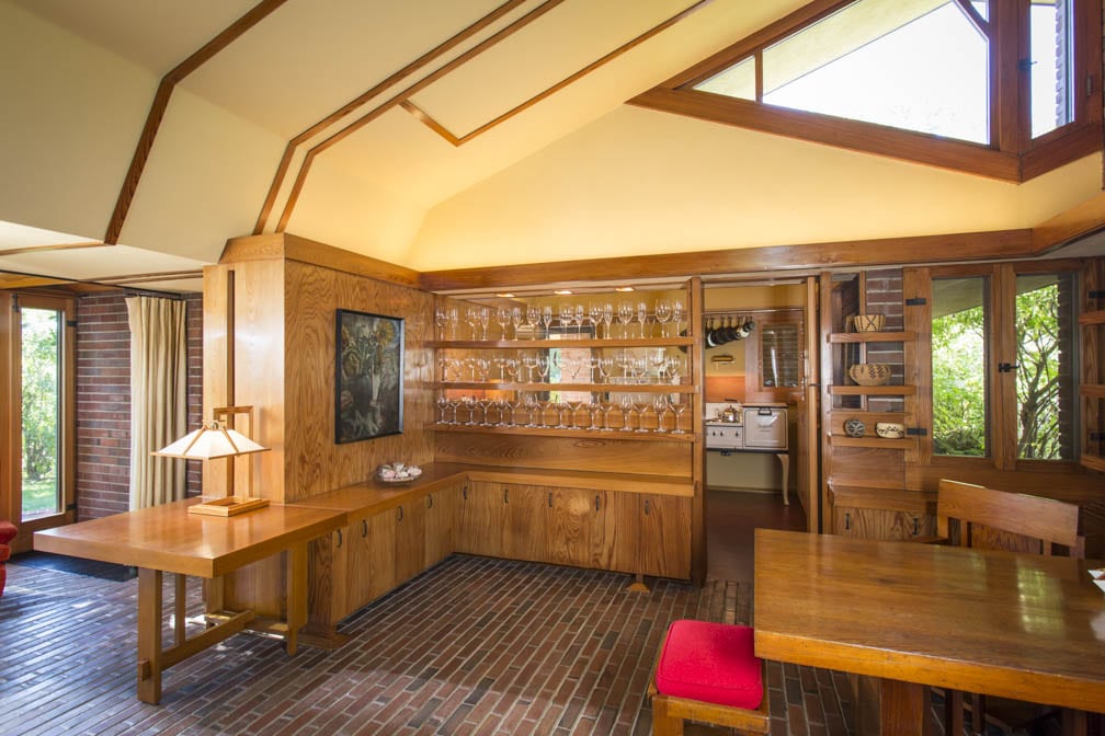
Photo by Matt Schmitt
In her book The Food Axis: Cooking, Eating, and the Architecture of American Houses, Elizabeth Collins Cromley examines how the human requirement for food defines the shape of the American household over time, from colonial times to the present day. The term “axis” for her means the alliance of elements with related interests, in this case those related to food production. Her book chronicles how kitchen spaces shrink with the addition of labor-saving, modern appliances as they are introduced into the home. By the early 1930s, home economists favored the smallest kitchen possible in order to minimize the movement required in food preparation.

Hedrich-Blessing courtesy Chicago Historical Society
She calls the Willey House, “An example of a food-axis arrangement that partially realizes the modern promise of servant-less housekeeping. The Willey House plan includes a dining/living area that communicates with the kitchen through a glass screened partition wall, fully exposing it for the first time to the formal space of the house.” As far as I know she never visited the home to see the full effect of the linkage between kitchen and dining spaces. Her analysis is done only in plan. Cromley’s perspective on the Willey House kitchen is viewed through a lens of incremental advancements in food production for the home, continuing to the present day. However, in the lives of the Willeys, circa 1934 and those first exposed to this particular development it was nothing short of shocking. Nancy’s mother was appalled by the idea of it. She expressed her displeasure that Nancy would consider exposing her kitchen ”a messy room” to the living room. Her friends joked about it, saying Nancy could pretend she was playing piano rather than washing dishes when behind the glass partition. And Lewis Mumford, after visiting the home wrote in the New Yorker, “The touch I liked best—I speak as a cook—is the wide glass window that separates the kitchen from the living room; to see the pots and pans hanging in serial pattern at the far end of the kitchen, and the head and shoulders of the pretty Swedish cook, was to have a grateful sense of intimacy with one of the most important parts of a house; it was like being in a farmhouse kitchen. It took a man of Wright’s sensibilities to give Cinderella a glass window instead of the usual glass slippers.” (Lewis Mumford, The New Yorker, At Home, Indoors and Out, February 12, 1938)
A 1945 publication entitled Tomorrow’s House: A Complete Guide for the Home-builder by George Nelson and Henry Wright included the Willey House kitchen. Willey is the only Wright-designed house in the book. What stands out is that every other house featured was built in the mid to late ’40s. The Willey House predates the other modern houses by as many as 12 years, yet it is still in a book named “Tomorrow’s House.”
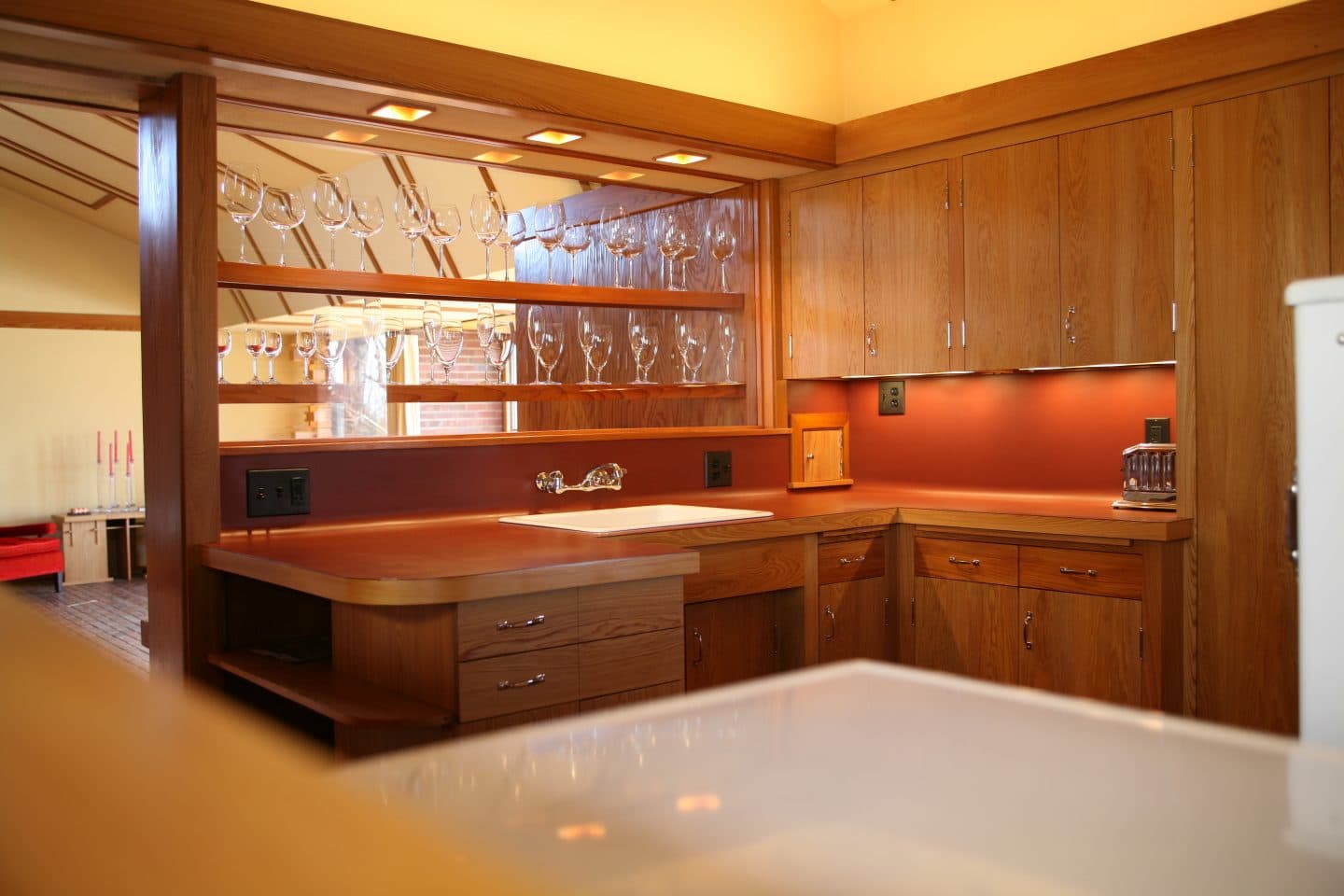
Photo by Matt Schmitt
Today we recognize the kitchen as the center of the home. The open plan kitchen long ago surpassed the living room as the most important entertaining space in a modern American life. Exactly where and when that shift began was not clear until recently.
It was Frank Lloyd Wright who reinvented domestic architecture to reflect emerging middle class ideas about leisure time, freedom, convenience, and the desire for simplicity. The kitchen, or workspace was central to his reimagining. And he didn’t do it alone. A progressive, young client in the form of Nancy Willey was the impetus required to nudge him resolutely in that directionTogether they cooked up another idea for the workspace. The phone closet/wardrobe, adjacent to the kitchen partition was given a tiny pass-through making it possible to talk on the phone while working in the kitchen, an early form of multi-tasking. For the first time in Wright’s career, every room in the house needed to be equally beautiful and functional, because these new, young clients would expect to live in all rooms of their house.

Photo by Steve Sikora
In a hand-written post script insert to her 1995 Oral History interview with Indira Berndtson Nancy wrote, “I seem to see now a significance of my house as pioneer – in the servant-less house! Only in the second design for the Willeys did he design a servant-less house. Was it difficult for him to do that? I mean he liked the grace of service in domesticity. I think I shoved him away from it, and how he responded, once he accepted it!! My kitchen seen from the living room thru a glass wall (made beautiful by shelves of china, pottery and glasses) my kitchen thus was included within the domestic scene, and the Dutch door confirming that intention! Here we have Wright struggling toward minimalism reining in his instinct for the maximum of elegance-dependent-on-service!” Future discussions on ideas developed by Frank Lloyd Wright need to extend beyond spiral ramps, dendriform columns and cantilevers to practical innovations that completely redirected domestic architecture and touched the lives of millions, as the open kitchen has.

