Willey House Stories: The Space Within: Part 2, “Vista Inside and Out”
Steve Sikora | Mar 9, 2021
In this second of a special five-part feature series for the ongoing Willey House Stories, homeowner Steve Sikora explores variations on the theme from the Frank Lloyd Wright Foundation’s Spring 2021 Quarterly issue “The Space Within.” In Part 2, titled “Vista Inside and Out,” Steve explores three concepts: 1. Prospect and refuge, 2. Miegakure, and 3. The Möbius ring.
The Space Within – Part 2: Vista Inside and Out
“The house emphasizes the modern sense of space by vista inside and outside.”
—Frank Lloyd Wright, The Natural House
Prospect and Refuge
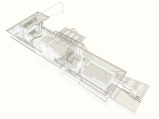
In The Wright Space, Grant Hildebrand identifies the concept of “prospect and refuge” in Wright’s houses, the ability to see out and around with the security of knowing you are not visible and therefore safe. As a tool for survival, this strategy is as old as mankind’s most primitive shelters. Architectural Historian, Neil Levine compared Willey to an image found in the Viollet-le-Duc The Habitations of Man in All Ages, of “House in the Arya,” a rude lean-to built against the side of a mountain slope. In my experience, the Willey living room is exactly like the kind of lean-to shelter “forts” we built as children on the sand dunes of Lake Michigan, in southern Wisconsin. Propping a line of branches and limbs up against a sloping dune created a safe space inside, an ideal “refuge.” The many gaps between branches offered the “prospect.” It was easy to spot an approaching enemy, in the form of neighborhood marauders. If you happened to be in the company of older kids and a firepit was added. It was placed against the back wall exactly as it is at Willey. The Willey House was conceived with a protected side made of nearly solid masonry (to block out the unwanted) “refuge,” and an open side composed largely of glass (to take advantage of the southern horizon) “prospect.” Completing the picture, the living room fireplace is unenclosed, creating the sensation that your fire is burning on the living room floor.
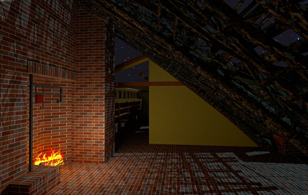
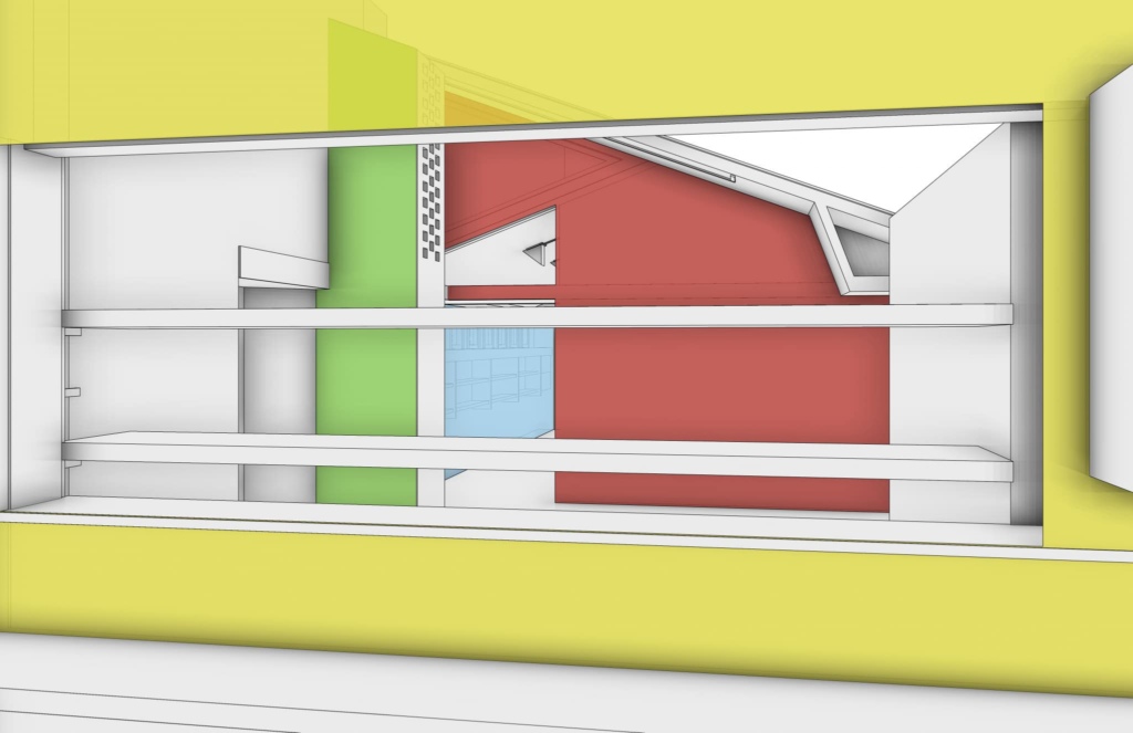
The Willey House living room envisioned as a primitive lean-to providing “prospect and refuge” to the inhabitants. Modeled by Craig Beddow.
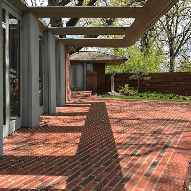
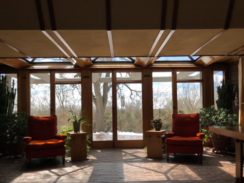
One of Hildebrand’s most remarkable revelations marks a distinct difference between Wright’s spaces and those of the modernists. The International Style sought to create whole walls of butted glass with nary a visible seam or sign of vertical support. A wall-length expanse of floor-to-ceiling glass creates an open-ness, but subjects inhabitants to an inescapable full exposure. Wright’s window walls almost always consist of opening glass doors that not only frame an external view but provide direct access to it. They establish an inherent degree of privacy due to the practical requirements of wooden door frames and window mullions. These vertical interruptions, far from being inferior to the seamless glass window wall, or in some way its predecessor, instead are purposeful and call upon our instincts through abstraction.
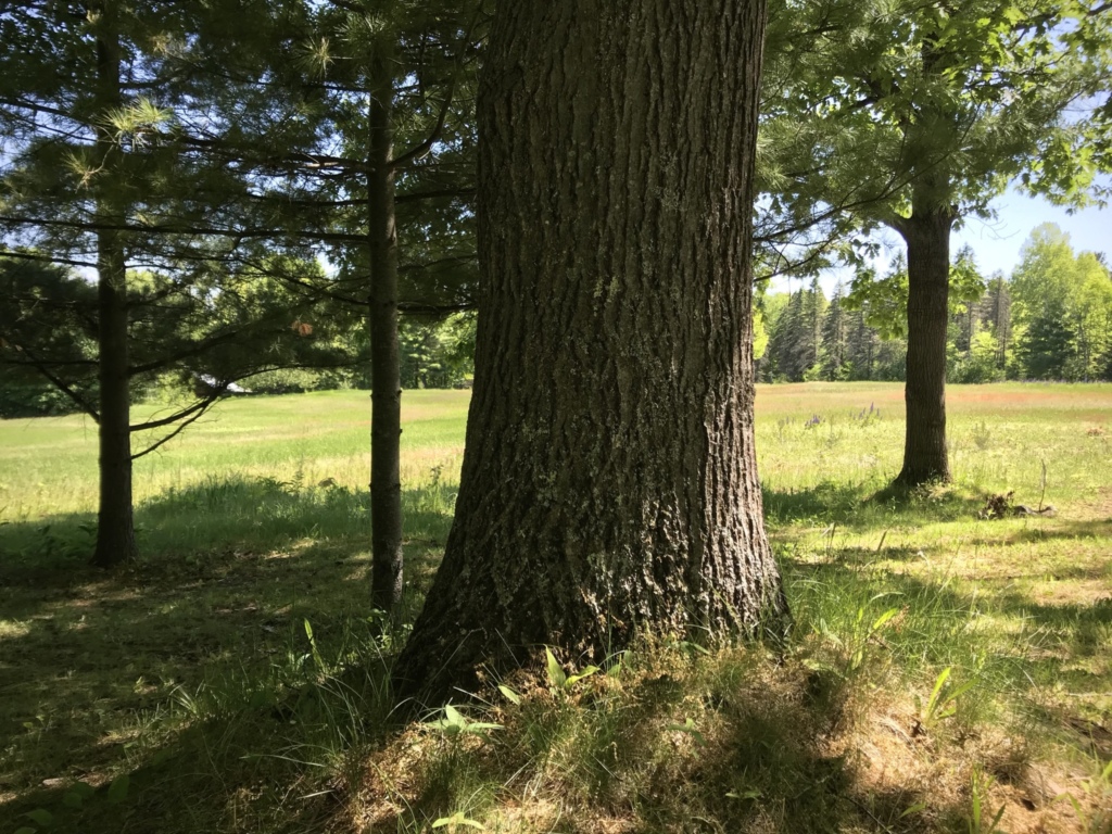
Photo by Steve Sikora
Hildebrand says, on a subconscious level they represent tree trunks at the edge of an open meadow. Their staggered presence on an exterior wall replicates the impression of what he calls a bio-preferable environment; which is the boundary zone that exists where meadow meets forest. In the deep forest there are places to hide but the density of trees may also allow a predator to approach unnoticed. An open meadow offers a high degree of visibility but far too much exposure and is thus insecure. The ideal balance is struck in that slender zone between the two environments where both prospect and refuge are available in equal measure.
Our response to prospect and refuge is neither rational nor emotional. It is purely instinctual. Our genetic attraction to these zones is not even unique to the Homo sapiens. The draw is universal and species independent. The edge of the forest is where the greatest concentrations of plant, bird and animal life thrive, for all the same reasons these zones appeal to humans. It is no accident that this is what Wright implied as master of his own environments and no coincidence that for us these spaces hold such allure.
Our deepest response to Wright’s spaces, is not due to the fact that these spaces are shockingly new to us, but precisely the opposite. In our deepest human memories his spaces are shockingly familiar.
—Robert Hughes
Miegakure
Vistas are framed views and Willey is a house of vistas. Notable are the views from kitchen “workspace” into the living space that also tease a tantalizing view down the gallery hall. And the panorama from the living room, through the pattern of wooden uprights with a middle ground view into the garden and then as background the far distant horizon. A presentation made at the Frank Lloyd Wright Building Conservancy Conference, in Madison in 2018 riveted my attention. It was entitled From the Japanese Print to the Jacobs and Schwartz Houses—delivered by Ken Dahlin, AIA of Genesis Architecture. Dahlin’s topic was Wright’s use of an effect called miegakure.
Miegakure essentially means “hide and reveal.” It is a principle originating in Japanese garden design, epitomized by the prospect of being offered only a tantalizing glimpse of something, such as the roofline of a teahouse shrouded by interceding foliage or the moon alternating between seen and obscured by passing clouds.
The Japanese woodblock prints Wright loved and collected, produced from the 17th century onward captured the spirit of ukyio-e, a genre that presented “pictures of the floating world” to the public. The master printmakers used miegakure largely as a replacement for conventional western perspective. A print typically featured the graphic device of three (or more) relatively flat planes that floated one above the other to create the impression of depth, a background, a middle ground and a foreground. The foreground and middle ground layers often partially obscure or reveal what is behind them, generating the sensation of depth without much use of conventional perspective techniques.
In Wright’s architectural elevations, miegakure is implied, offering layers of concealment to the viewer because the viewer of a drawing, like the admirer of Japanese prints is locked in a fixed position. In physical reality however, the viewer is more likely to be a roving eye, and is free to shift their point of view relative to the scene, stand on tiptoes, crane one’s neck, or take a step in any direction to peer around corners. Which make’s Wright’s use of miegakure more akin to landscape design than that of block prints, thanks to human binocular vision and a full host of other sensory information we employ in the real world. In the third-dimension the layered effect serves to arouse a sense of mystery or to stimulate our inquisitiveness, rather than create a depth effect as it does in the prints.
My point here is to say that the experiential qualities of Wright spaces are what make them extraordinary. In rendered elevation their magic is greatly diluted, if not altogether nil. Even most familiar Wright buildings appear unrecognizable to us in section and elevation. A Frank Lloyd Wright building seen in elevation tells us no more about the reality of that building than a flat, desiccated roadkill tells us about the social life of a squirrel. However in the third-dimension, the inventive use of layers in his work does stimulate a constantly evolving sense of expanding space and lures one into the partially eclipsed territories, potent as a Siren’s call.
Möbius Ring
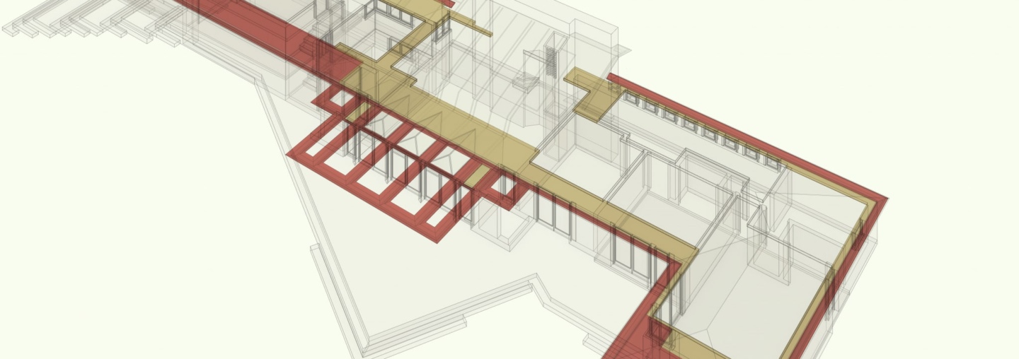
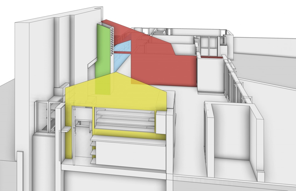
There are three horizontal planes that pass through the Willey House; the floor plane, a middle plane, level with the top of garden wall, and a datum plane—the six-foot, six-inch level line of the exterior soffits, the trellis, the wooden banding that connects room-to-room and the interior decks. Each plane passes through the entire house creating a coherence of flowing, interconnected space.
On these three planes interior details recklessly ignore perimeter walls. Brick floors extend out into the garden and plaster ceilings become exterior soffits. Much of the architectural slight-of-hand at Willey is a consequence of these interpenetrating planes. They are subtle yet powerful devices Wright used to direct elements of delineated internal space through partitions and out through perimeter walls, then in turn, draw external elements back inside the house. Wright manipulates his spaces as a Möbius ring seamlessly connects two sides of a sheet of paper. A Möbius is made with a strip of paper twisted and glued at the ends so the inside becomes the outside and vice versa.
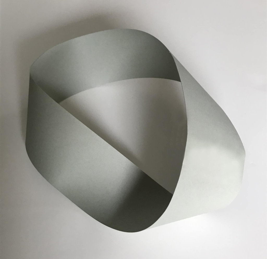
A Möbius ring, made with a strip of paper twisted and glued to create an infinite loop through which the inside of the strip flows seamlessly outside and back inside again. Photo by Steve Sikora.
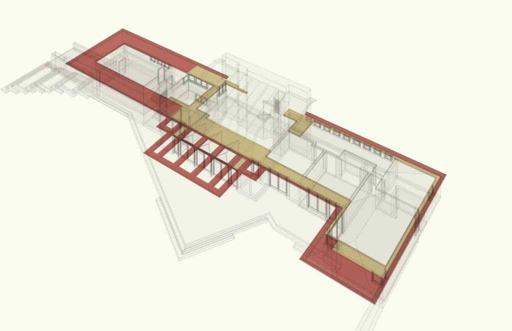
Wright used architectural elements that run throughout the house at a 6-foot, 6-inch height like a Möbius ring as they flow from inside to out and back again in a continuous re-penetration of perimeter walls blurring the distinction between what is inside the house and what is not. Tan areas depict what is within the walls. Red shows what is outside the walls. Modeled by Craig Beddow.
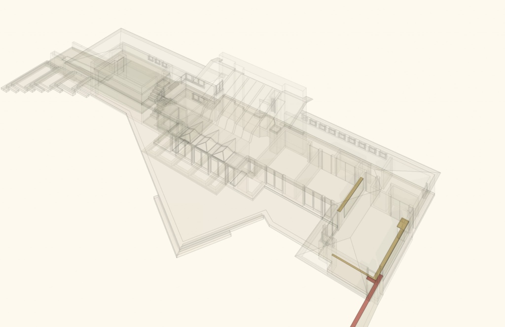
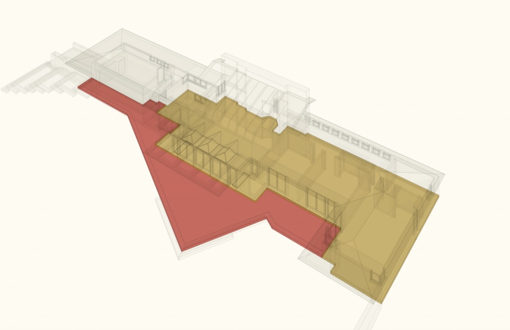
The penetration of solid walls by these sweeping horizontal planes makes us question their standing as perimeters at all. Wright’s technique effectively blurs the distinction between what is within the boundaries of the structure and what is not. This lends to the feeling of limitless space inside a structure with a very finite footprint. It is quite possible to visit the Willey House without grasping this concept, but once revealed it becomes difficult to not recognize it. A 3D rendering best illustrates what our senses fail to immediately convey. Studying the datum line plane reveals that the Willey House is woven like a basket with fibers moving from inside to out and outside to in. These and other aspects of the house are a remarkable achievement, in a re-design that Wright accomplished in a matter of a few days.
Read all of “The Space Within” blogs for this special five-part Willey House feature:
- Part 1: Little Boxes
- Part 2: Vista Inside and Out
- Part 3: Sense of Shelter
- Part 4: Sense of Space
- Part 5: The Purpose
