This Work Continues: Frank Lloyd Wright and Graphic Design
Aris Georges | Nov 8, 2018
Frank Lloyd Wright established a foundation for design with nature, abstraction, and geometry that serves as a source of graphic design inspiration for the past, present, and future Taliesin community.
The most interesting and attractive kind of graphic design is unafraid. Such design rearranges the order of familiar things, experiments with conventions, steers clear of popular stereotypes, and has the power to shift paradigms. Frank Lloyd Wright was as much an experimental graphic designer as he was a groundbreaking architect. He recognized that image was a force of influence on society and culture well before that idea developed its present prominence. His vision for an organic, American, democratic architecture reached its historic significance because it etched unconventional images into our collective memory. Wright created images that endure undated. There is a geometric quality in his graphics that eludes “fashion or sham.” This quality renders his work as relevant in today’s design culture as it was when it was created, if not more.
For designers Wright’s work remains a vital resource. The rise of geometry and patterns in popular culture is directly connected with the perpetual fluidity of geometry Wright expressed. Designers perceive foremost through visualizing. The direct experience with Wright’s work is enhanced by tacit observation and contemplation. Designers may also admire the fact that Wright was resolutely dedicated to the integrity of his creative output, knowing it will have to stand the test of time. Any mark on a piece of paper—be it a sketch, a construction detail, a title block, or the letterhead—had the opportunity to carry forward and outward his spirit of openness, unconventionality, and interconnectedness, which his architecture and philosophy and his life itself responded.
The unconventional image was the envoy of Wright’s advanced ideas for a new architecture. More importantly, image grew organically to be an intrinsic tool in his design process. Thinking through drawing is an internal engine for the design process, a way to work through design dilemmas. Much like a music composer uses an instrument to study ideas, Wright used the image as his instrument. He often called this process one that moves from within outwards.
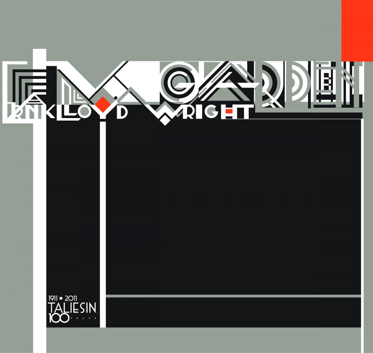
Aris Georges, digital remix of a design for the Wendingen publication by Frank Lloyd Wright, rearranging the letters to the word “garden” for an invitation to a garden recep-tion hosted by Taliesin Preservation, Inc.—a free event for the community in Spring Green, Wisconsin, to visit Taliesin and enjoy it as guests. Courtesy Aris Georges.
GEOMETRY, ABSTRACTION & THE REFLEX
The primary quality in Wright’s design is a union of abstraction and geometry. Describing his sources of design during one Sunday morning fellowship talk, Wright said that exploring the geometric blocks of the Froebel gifts as a child taught him to consider the main geometric shapes of the square, triangle, and circle (and the three-dimensional derivatives of cube, tetrahedron, and sphere) as a geometric lexicon form with which to interpret nature. As such, he focused his interpretation systematically, in a sort of narrative form. He called it the grammar of the building.
Wright also became enchanted with the “flattened” composition of the Ukiyo-e (the Japanese woodblock print). To him these extraordinary works of art denied the false treatment of depth to imitate light and dark natural conditions (the shading of chiaroscuro). All elements of the composition were treated as abstract pure form. Wright appreciated these sources for their compositional, as well as philosophical, consequences, at one point declaring, “nature emulates but never imitates.”
Wright’s innovation of the use of geometry in design was twofold. He could discern what he called the essential character in nature and translate it into a pattern from which he generated new forms of design. He also developed a design idiosyncrasy to modulate the geometric system he was using; he called it the reflex. Not unlike Bach using modulation within the same composition, the reflex is a spontaneous intervention in the design, often blending symmetry with asymmetry. The result removes static predictability from the pattern and steers it clear of banality.
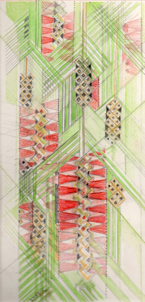
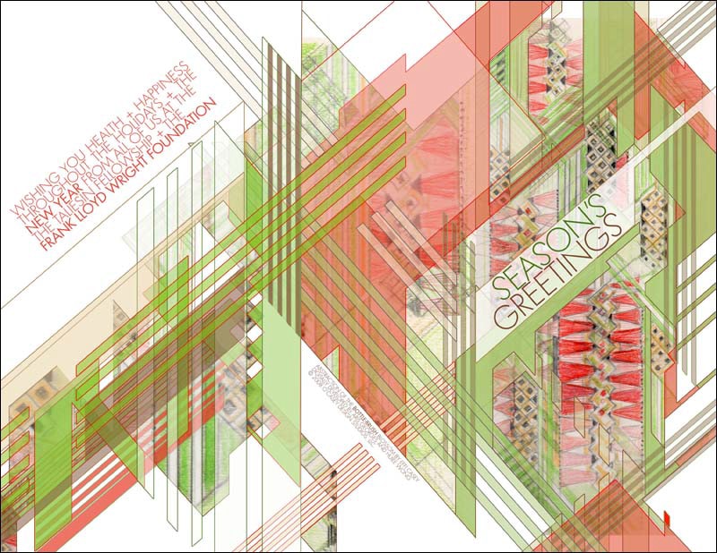
Left: Effi Casey, Bottlebrush Blossom, geometric abstraction. Courtesy Effi Casey. Above: Remix of abstraction of the Bottlebrush Blossom by Aris Georges for a Frank Lloyd Wright Foundation holiday greeting card. Courtesy Aris Georges.

Aris Georges, Gene’s Taliesin West. Digital remix of Gene Masselink’s abstraction of Taliesin West with the McDowell Mountains in the background. The abstraction was used in variations during the 75th anniversary of Taliesin West in 2012. Courtesy Aris Georges.
PERENNIAL, EVER-GROWING, LIVING
Could it be that the reason geometry has the power to cross cultural and linguistic barriers is that we may be hardwired to recognize patterns in deeper ways than we even know? Or could it be that geometry and patterns are fundamental shared conditions in nature? Quantum field theorists are conducting research that points to advanced geometric relationships underlying particle interactions (you may search the term amplituhedron for more information). The hypothesis that geometry is a fundamental framework in understanding nature isn’t new. As far back in Western origins as Plato, geometry was considered the armature for reason and philosophical thought.
What is even more fascinating about Wright is that he had a playful and dynamic relationship with geometry, as if he had discovered a key to its mysterious ways. This brings to mind the notion of a perennial process—a process with cyclical periodicity and perpetual growth patterns instead of linear beginnings and endings.
As Wright exemplifies a design process that is continually evolving and morphing organically, we cannot help but continue to explore the same principles and fearlessly create work that evolves in this established trajectory. His legacy then includes the graphics he created to support his architecture: the design of documents and publications, the decorative elements, murals, and art windows of his buildings, and the symbols that represented it all, foremost among them, the red square.

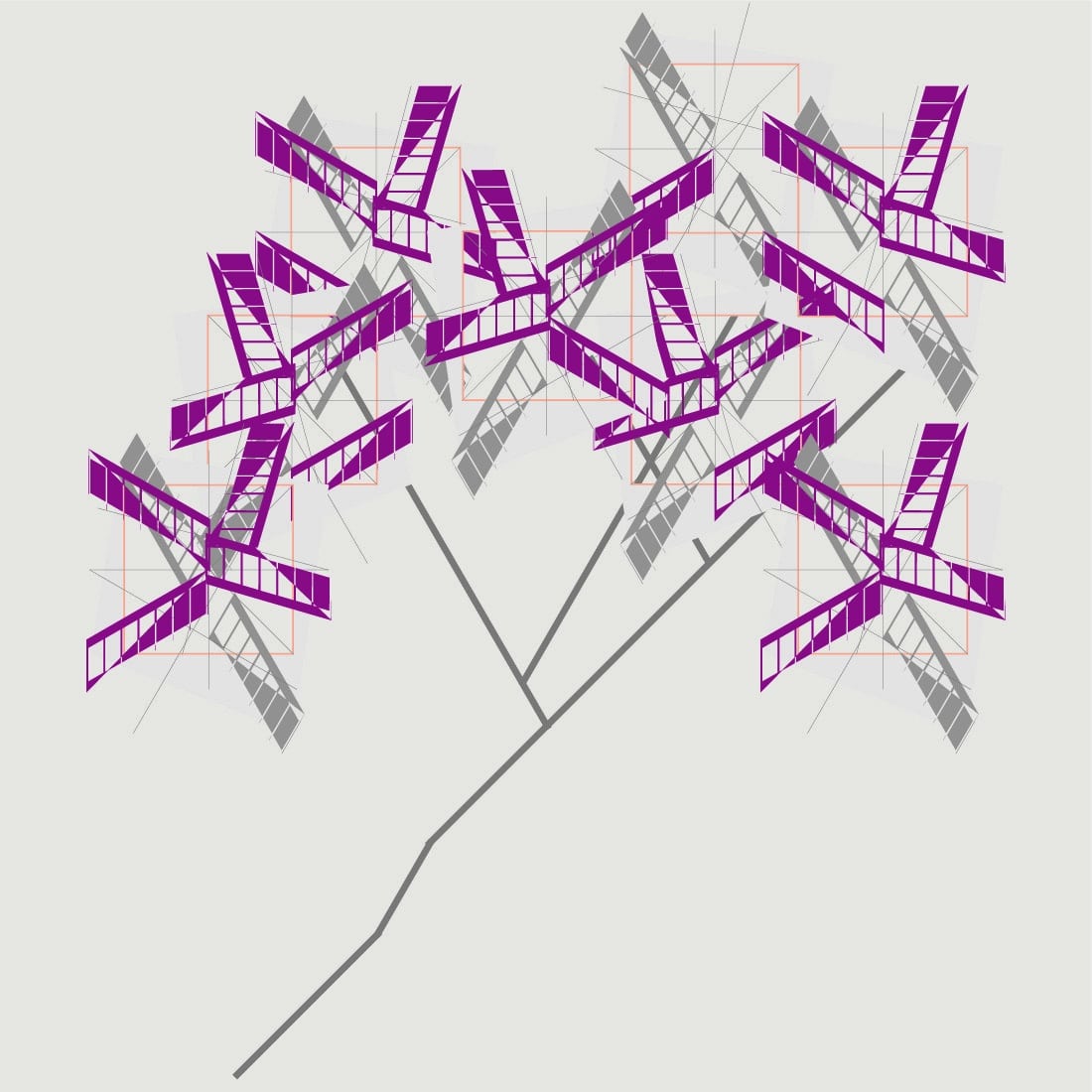
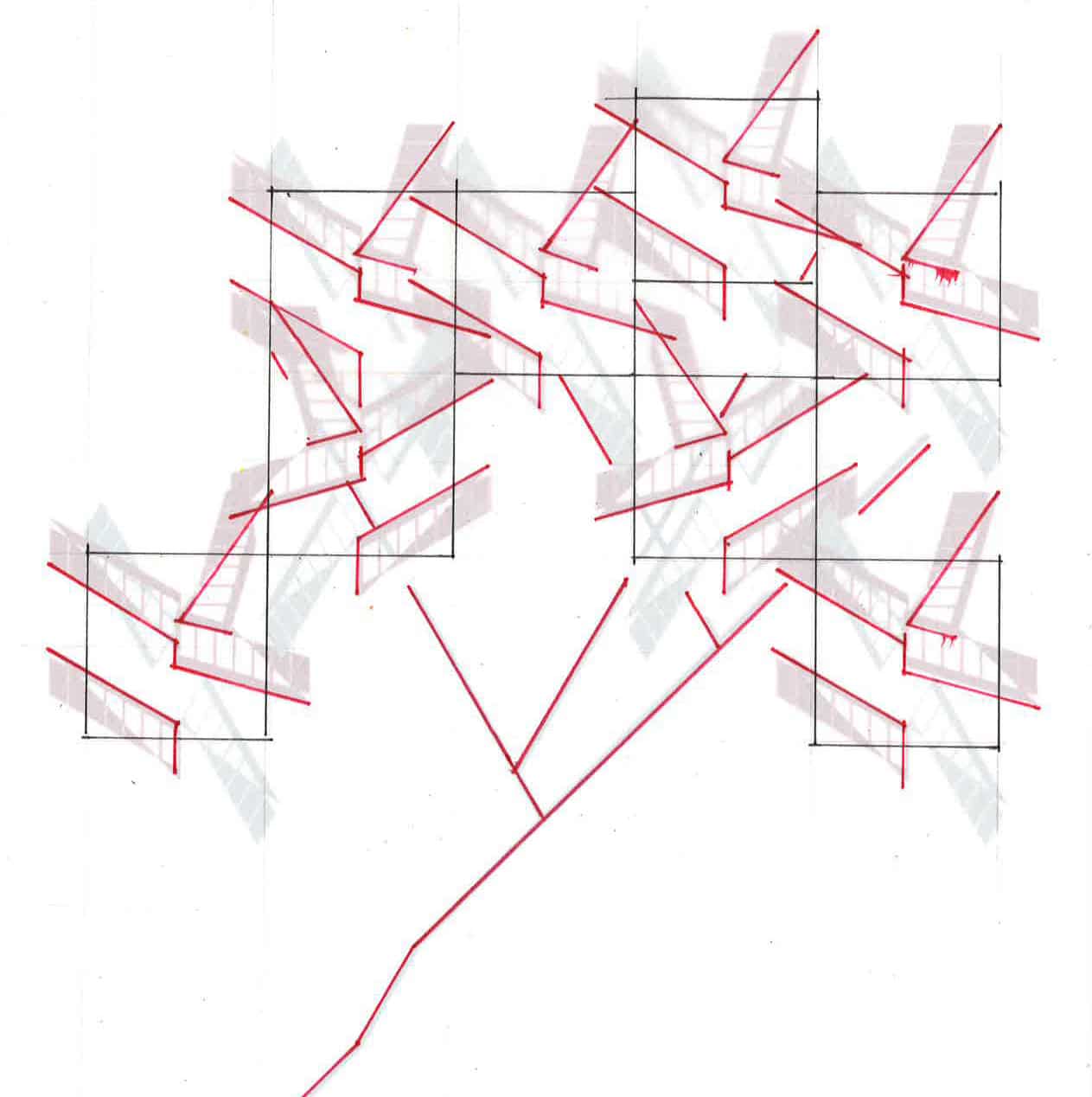
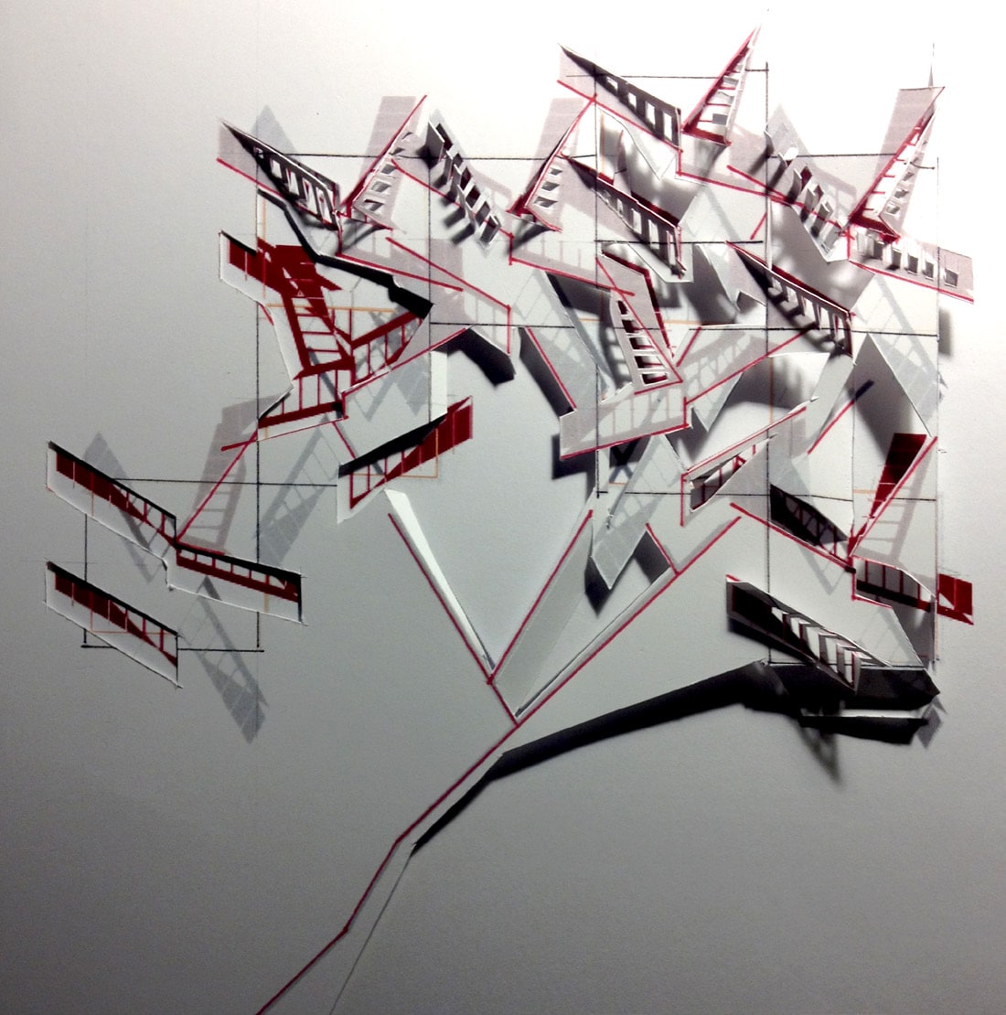
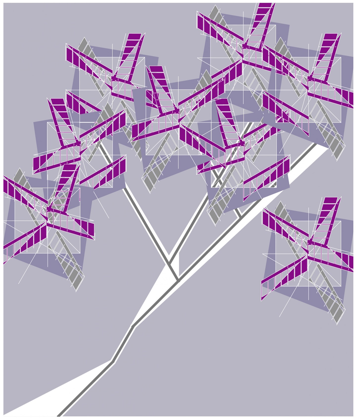
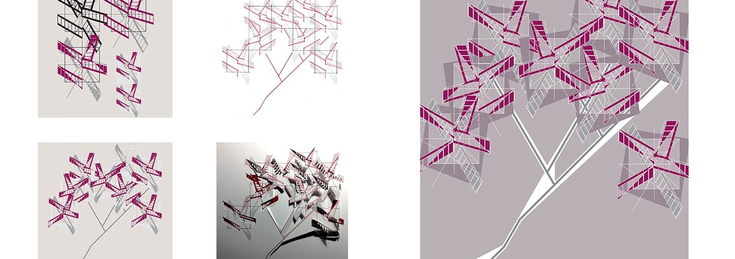
Left: Aris Georges, Sumac Abstraction, progression of the development of the sumac abstraction from freehand sketch to 3D paper model. The process went from hand to digital twice. Courtesy Aris Georges. Above: Aris Georges, Sumac Abstraction Final Composition. Courtesy Aris Georges.
EMULATE & REMIX
As the tradition of emulating Wright and nature continues forward, the obvious challenge is to bridge the source material to new interpretations without imitating or ignoring it. At Taliesin the continuation of the work happens on two fronts. First, the legacy graphics that preserve and protect certain symbols as trademarks and establish the brand and identity of the institution and its licensing program. Second, the design work for various programs of the institution that may be examined for their treatment of the design principles in the legacy. New generations cannot imitate, but they can draw from the same source—nature. It is important not to ignore the subtle urge to trust the power of abstraction and geometry as the underlying principles in the process of emulation. In short, abstraction and geometry are the tools for emulating nature.
The way forward is to ensure that these tools become second nature to a developing designer. As hand drawing persists in design education, despite the thrilling advances in technological tools, studying geometry and abstraction in design composition must be preserved. There is inherent power in geometry to generate design forms. The more one works with geometric grids and patterns, the more one knows how to blend and iterate properties embedded in the geometry itself. As the notes of the octave are common to most musical systems, so are the square, triangle, and circle (and their derivatives) common to pattern and abstraction.
There is another important analogy to draw from the music world—the remix. In music, remixing existing compositions into new ones, preserving the original as recognizable but giving it a new reality, is considered an art form and is celebrated as that. In design it is almost taboo to work off someone else’s idea. I find that the path of geometry and abstraction invites a remix-like reinterpretation. The possibilities of abstraction are unlimited. It may be too early in design culture to fully embrace the remix, but it is not too late to start pushing this particular boundary.
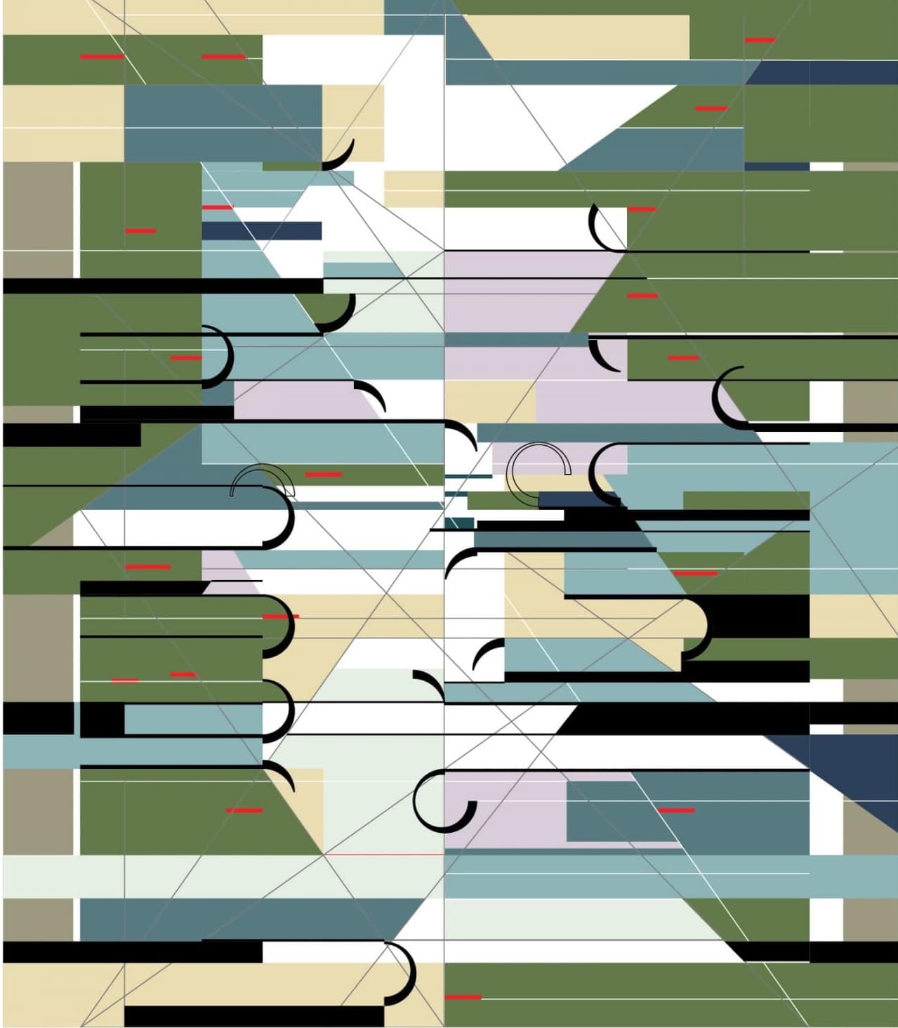
Above and right: Aris Georges, Birch Bark Nature Pattern. Progression of the development of the abstraction from hand draw-ing to digital recreation and 3D model. Courtesy Aris Georges.

NATURE PATTERNS
Knowledge of using geometry and pattern as a language of composition has been developing for decades at Taliesin, coming together for practice and creation in a long-standing design workshop known as “nature patterns.” It was originally organized as a class by Gene Masselink in the early 60s and was passed down through Ling Po, Susan Lockhart, Vern Swaback, Effi Casey, and other fellows. When I trained in nature patterns as a student in the 80s, my love for geometry, born in the vigorous Greek secondary curriculum, found new wind. With a growing conviction that geometry is an essential exercise in design education, I started teaching the class when I became a member of the senior fellowship in the 90s. I dubbed the workshop “design etudes” to emphasize that the nature of the exercise is to practice design moves, not unlike the musical etudes, as studies of ideas independent of a larger composition (in this case, architectural design).
The digital design tools emerging in recent decades and spreading like a wildfire bring a layer of challenge to the exercise. The speed and precision with which the computer can map complex patterns in relatively simple steps brings new excitement and energy to the process. Digital tools are also strong analytical aids, helping us study overlays and achieve reconstruction easily and accurately. However, the contemplative nature of drawing with analog tools (compass, straight edge, and triangle) was (and is) necessary for maintaining mental balance. Analog and digital tools are extensions of the same design experience. They are not mutually exclusive nor is one a replacement for the other. The ideas and methods of this Taliesin tradition find fertile ground in designers who appreciate the connection to nature and the discipline of geometry. Dozens of designs have been developed in this workshop by young students in the school of architecture, as well as adults attending special public classes through the outreach program. Some examples are shown later in this publication. Wright established a foundation for design with nature, abstraction, and geometry that remains a genuine Taliesin nonesuch, and will continue to grow with the unafraid work of new generations.
This article originally appeared in the summer 2016 issue of the Frank Lloyd Wright Quarterly magazine, “Inspiring Generations: The Taliesin Design Legacy.”
ABOUT THE AUTHOR
Aris Georges is a Taliesin Fellow (1986-2015), an architectural and graphic designer, and a design teacher. He served as faculty chair at the School of Architecture at Taliesin, was Senior Fellow of the Taliesin Fellowship, graphic designer for the Frank Lloyd Wright Foundation, intern architect with Taliesin Architects, and Director of Curriculum at the School. More recently, he was Art Director at a communications company in Portland, Oregon, and maintains his studio in Spring Green, WI, designing custom homes for the Lindal company.


