Building a Brand: The Enduring Legacy of Frank Lloyd Wright
Thomas de Monchaux | Apr 10, 2018
Thomas de Monchaux looks into the past, present and future of Frank Lloyd Wright’s enduring brand
This article originally appeared in the Fall 2017 issue of the Frank Lloyd Wright Quarterly, “Elevation.”
To talk about Frank Lloyd Wright is always to practice anachronism. With his seemingly endless life and career—his mentors old enough to remember the Civil War and some of his apprentices still at work today—Wright is as close to a time traveler as we have. The evolving formalisms of his body of work are enduringly resistant to the general succession of historical styles that contemporary and subsequent curators and chroniclers have been all too happy to impose.
So it is with the subject of Wright and what we now call branding. The brand, as a phenomenon of perception distinct from the corporate or personal entity that it represents, dates significantly to the post-World War II era of the professionalization of public relations in the United States; the brand as a graphic and visual artifact of that phenomenon reached a kind of apotheosis in the late-mid 20th century work of art directors like Ivan Chermayeff and Paul Rand, and their now ubiquitous logotypes for mostly corporate entities like Ford, Mobil, IBM, ABC, and others.
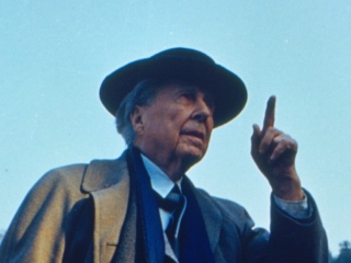
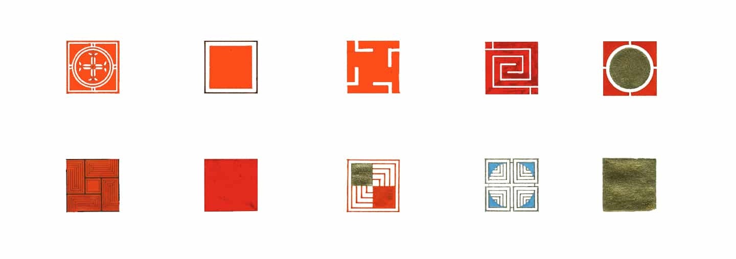
Artful self-presentation was a defining feature of Wright’s own career. He had a gift for names. Swapping or adding Lincoln for Lloyd, at age 18, established a strong three-beat meter for a would-be public name and set aside the inevitable evocation of a perpetually more famous man. Designations like Apprentice and Fellowship were neither incidental nor inevitable terms for what Wright used them to describe. The words Broadacre and Taliesin and Usonian are second only to Buckminster Fuller’s Dymaxion in the mystical-technical lexicon of American design. That we know some houses—Fallingwater, Hollyhock, Wingspread—by such one-word poems, and not by the mere surnames of their clients, attests to this naming facility. In a tactic familiar from our moment of the “personal brand” in socially-mediated self-portraiture, Wright’s idiosyncratic customization of cars and clothes, and even his big hair, all amplified the physical and photogenic presence of a physically small man. Customized accessories are not uncommon among architects, from Richardson’s robes to Le Corbusier’s spectacles. But Wright’s essential brand, literal and figurative, hides mostly in plain sight: the signature red square, variously blank, patterned, or lettered, that since the first decades of the 20th century figures in his drawings and correspondence—and eventually, as a kind of certifying clay tile, in his buildings themselves.
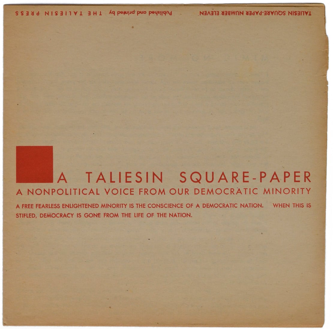
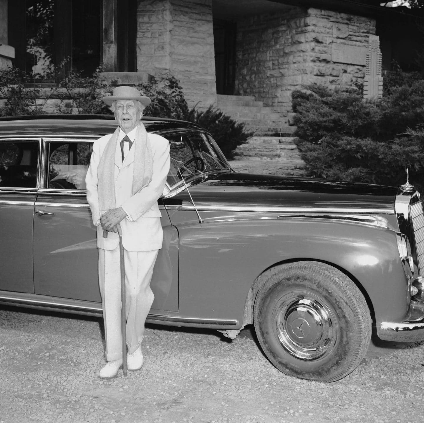
The square appears to have had its origins in a kind of cross-in-circle-in-square insignia that Wright adopted, for a while, in his first years of independent practice—which historians have interpreted variously as would-be Celtic,Theosophical, or merely consistent with the impulse throughout the Anglo-American Arts and Crafts movement in design, from Morris to Maybeck, for picturesquely runic insignia and faintly medievalist ideographs. The origins of the square’s distinctive brownish red have their own mythologies, often turning on anecdotes of Wright—as he reportedly did to the DuPont paint company for detailing at Fallingwater—submitting Native American pottery artifacts or Southwestern American soil samples as color referencesto fabricators. Among his many written tributes to the color is his citation, in a 1938 special issue of Architectural Record, of a botanist’s observation that, “the color red is invincible. It is the only life-giving color in nature.”
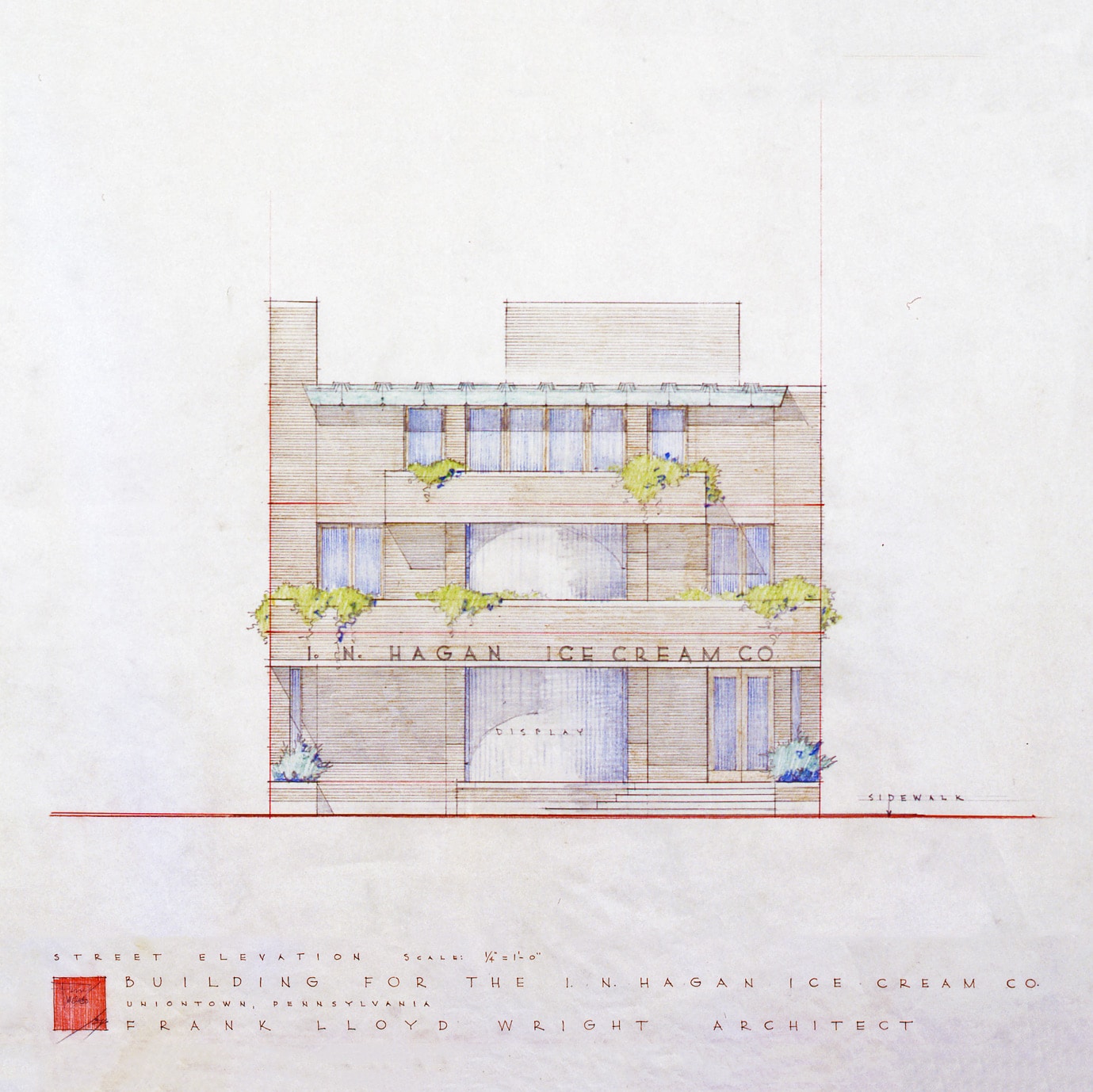
The red square—dated to 1896, applied to drawings consistently after 1904 and sufficiently well-established by 1918 for Wright’s son to take the phrase itself as the name of his toy company—appears to have had its inspiration and practical application in two different, indeed quite opposite, aspects of Wright’s endeavors. It echoes the blocky signature seals, impressed through crimson ink, wax, or other media, that were the traditional imprimatur on the Japanese woodblock prints in which Wright famously dealt. And it formalizes a convention in architectural drawing sets—established in the ages of linen-backed blueprints and successive photostatic reprographics—to leave an empty rectangle for the principal’s sign-off during design development. As for other drawing data, an empty rectangle more than a line or blank space, made the presence or absence of that confirmation all the more visible. In process drawings, in Wright’s own and other hands, the square appears as a lightly-shaded red block, awaiting or framing his initials.
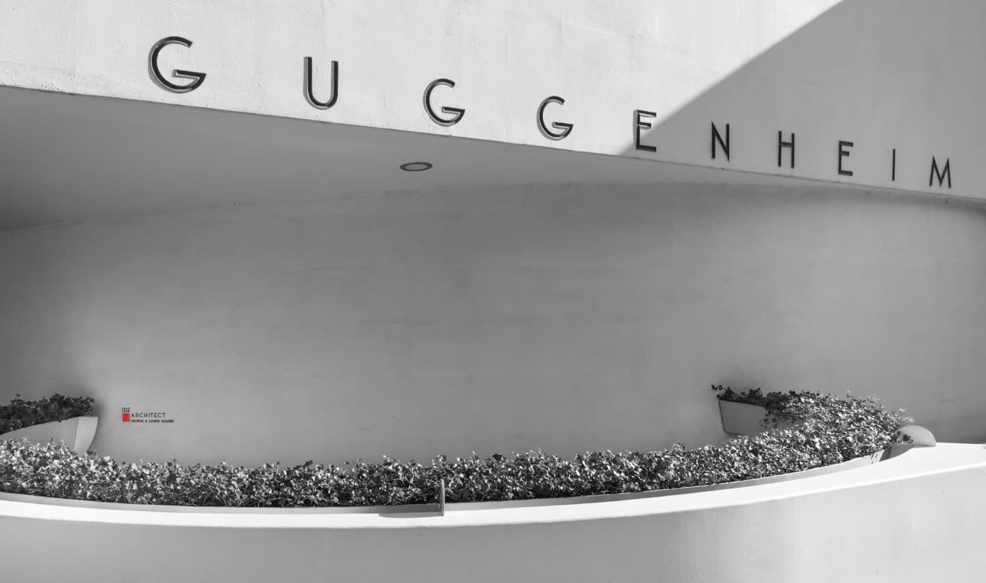
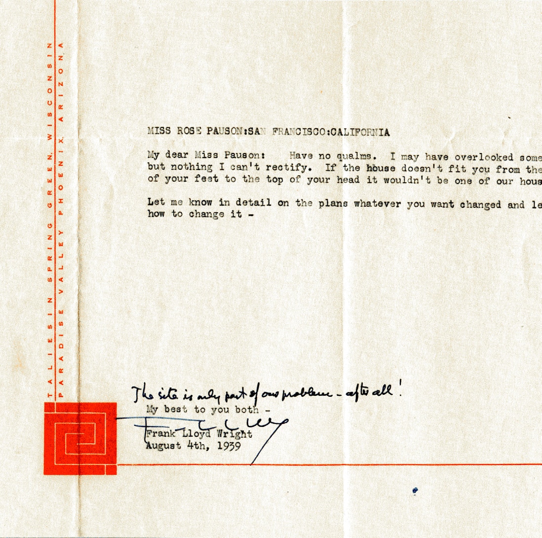
Wherever it alights on Wright’s drawings and correspondence, the red square presents paradoxes in subjects that go to the heart of any design practice: of composition and of authenticity. As a classic platonic shape—bilaterally and rotationally symmetrical, stable, and static—the figure of the square runs directly counter to the typically wildly asymmetrical, dynamic, and artfully counterpoised compositions of Wright’s plans and elevations and perspectives. In this way, however subtly, it offers a kind of visual complement-by-contrast—and even critique—of the very drawings on which it appears. In Wright’s correspondence, graphic efforts seem to have been made to temper this visual critique: by the 1940s and 1950s, letters from Taliesin featured that word extending as a long and narrow figure in identical red, to the left and off-center from the solid square such that—along with, to the square’s right, the left-justified vertical line of the letter’s typesetting and the square’s marginal position relative to the outline of the page itself—the whole reestablished a dynamic pinwheel-type geometry more consistent with Wright’s own architecture of the era. By the mid-1950s, the red square on correspondence from Taliesin West had acquired another kind of pinwheel, a labyrinthine angular inscription variously called the “clasped hands” or “whirling arrow,” ostensibly inspired by indigenous pictographic carvings found in the Arizona compound’s desert landscape—but also animating and contradicting the otherwise static square with an off-kilter whorl.
In traditional Japanese prints, the mark of the signature seal or block, generally bounded by a vertical rectangle, plays a complex role as part of the print’s composition but not part of its subject—in this way mediating between the work’s subject and object, form and content. Wright’s red square does much the same. In 1950, Wright commissioned ceramicist Jeanette Pauson Haber, to make some 25 red tiles inscribed with his initials, that were, in an account preserved in the Wright archives, “intended to be placed in buildings designed by Frank Lloyd Wright where the consecution and final completion of the opus adhered to his specifications and thus received his personal approval.” Notable projects with the tile as a kind of seal of approval include the Marin County Civic Center in California and the Price Tower in Bartlesville, Oklahoma.


But what’s poignant about the impulse to manufacture these emblems is the tacit acknowledgement, in the gesture, of buildings in which the specifications and personal approval had not, and would not, be met—buildings gone astray. Construction supervision and enforcement of detailing is a particular drama in all architectural practice, and in Wright’s especially. But the notional distinction, and therefore isolation, of 25 buildings within Wright’s oeuvre speaks with further poignancy to, for all his ubiquity and the great length of his career, Wright’s own distinction and isolation from his generations of peers and successors: to the paradox of how influential yet how inimitable his work has proved to be. Despite traces in the work of former students or associates like John Lautner and Bruce Goff, Wright’s very occasional equals in prodigious invention, and unlike the more reproducible Swiss-French and German-American designers who came a generation later, Wright’s architecture at its fullest expression begins and ends with its master. Thus making the red square a symbol not only of the endlessness of that work, but also of its limits.
Thomas de Monchaux’s book from Metropolitan Books “Slow House: Fixtures, Features, Masters, Neighbors and a Year in Pursuit of a Sweeter American Home” features Wright’s 1950 Zimmerman House in Manchester, New Hampshire, and a room from Wright’s demolished 1915 Little House preserved at New York City’s Metropolitan Museum. He teaches at Columbia University’s School of Architecture, Planning, and Preservation, and his design writing has appeared in “The New York Times,” “The New Yorker,” and the journal “n+1.”

