Wright, in the Digital Age
Jeff Ficker | Feb 14, 2017
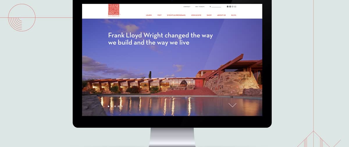
The Frank Lloyd Wright Foundation relaunched its website this year, and as it marks the 150th anniversary of Wright’s birth, the site’s designers find the master’s timeless principles are as relevant as ever. Jeff Ficker describes this experience in the Winter 2017 issue of the Frank Lloyd Wright Quarterly.
Designing a new website for the Frank Lloyd Wright Foundation is an intimidating prospect. How do you create a digital home whose scope must not only entail the life and work of the 20th century’s most celebrated architect but also the vitality of his legacy and its relevance to contemporary life, art and culture? Our firm, Casual Astronaut, was entrusted with this challenge. Unsurprisingly, we found the answers to our questions and inspiration from Wright and his work. Four guiding principles shaped the new site, FrankLloydWright.org, which launched earlier this year.
1.
Embrace simplicity. Beauty lies in simplicity. But, when piecing together a frame for the giant legacy of an architect with such a distinctive and iconic style, it can be tempting to deploy a series of aesthetic nods and visual flourishes — yet it’s the very path Wright rejected in his own work. “Space is the breath of art,” he wrote, and the Foundation’s new website embraces this maxim with a clean, white canvas that allows Wright’s vision to shine as the focus. Lavish photography of the architect’s work is given room to breathe, and visitors to the site are given the space in which to contemplate his life and legacy.
2.
Form and function are one, even online. Wright’s mentor, Louis Sullivan, revolutionized design with the concept that form should follow function. Wright transcended this principle by insisting on their unity: “Form and function should be one, joined in a spiritual union” — in other words, a harmonious, symbiotic whole. A website, much like a building, should follow this principle, with space and functionality that meet its users’ needs. In the case of the Foundation’s website, that means biographical pages that can be skimmed, scrolled and filtered by topic and interest; project pages that are searchable and easily sortable by type, style, date and locale; and tour pages to buy tickets to visit Wright’s homes, Taliesin and Taliesin West.
3.
The details should be important. For Wright, good design had to be more than beautiful — it had to be purposeful. Colors evoked a building’s surrounding environment and connected it to the landscape. Oversized, cantilevered eaves on his Prairie School homes shaded windows in the summer, while at Taliesin West, clerestory windows flooded rooms with light and framed the views of the Sonoran Desert. The new Foundation website also deploys design elements for strategic purposes. For instance, sparing use of Wright’s signature red draws attention and entices users to click, while subtle uses of sky blue and prairie-field greens evoke Wright’s love of nature. And the geometric shapes that inspired and grounded so much of the architect’s work punctuate headlines and other key elements.
4.
Design for the future. Wright understood that timeless design requires a forward-thinking perspective: “The architect must be a prophet. …. If he can’t see at least 10 years ahead, don’t call him an architect.” It’s a challenge digital designers keenly understand, as the next smartphone or disruptive technology is always just around the corner. So, much like Wright was constantly evolving his desert lab, Taliesin West, the new Foundation website features a flexible design that allows for iteration and updates. Components and pages can be mixed and matched based on changing needs, and a new content hub, The Whirling Arrow, serves as an online resource offering news and in-depth information that underscore the relevance of Wright’s legacy to how we live today.
About the author
Jeff Ficker is Chief Creative Officer at Casual Astronaut, a content marketing and design firm based in Phoenix, Arizona. He has written for Travel + Leisure and Sunset magazines, and is a former adjunct faculty member at Arizona State University’s Walter Cronkite School of Journalism.


