How Today’s Designers are Influenced by Frank Lloyd Wright’s Principles
Design Milk | Jun 19, 2017
In honor of 150th birthday, Design Milk asked some architects and designers how Frank Lloyd Wright’s design philosophies shaped their work.
This article originally appeared on Design Milk.
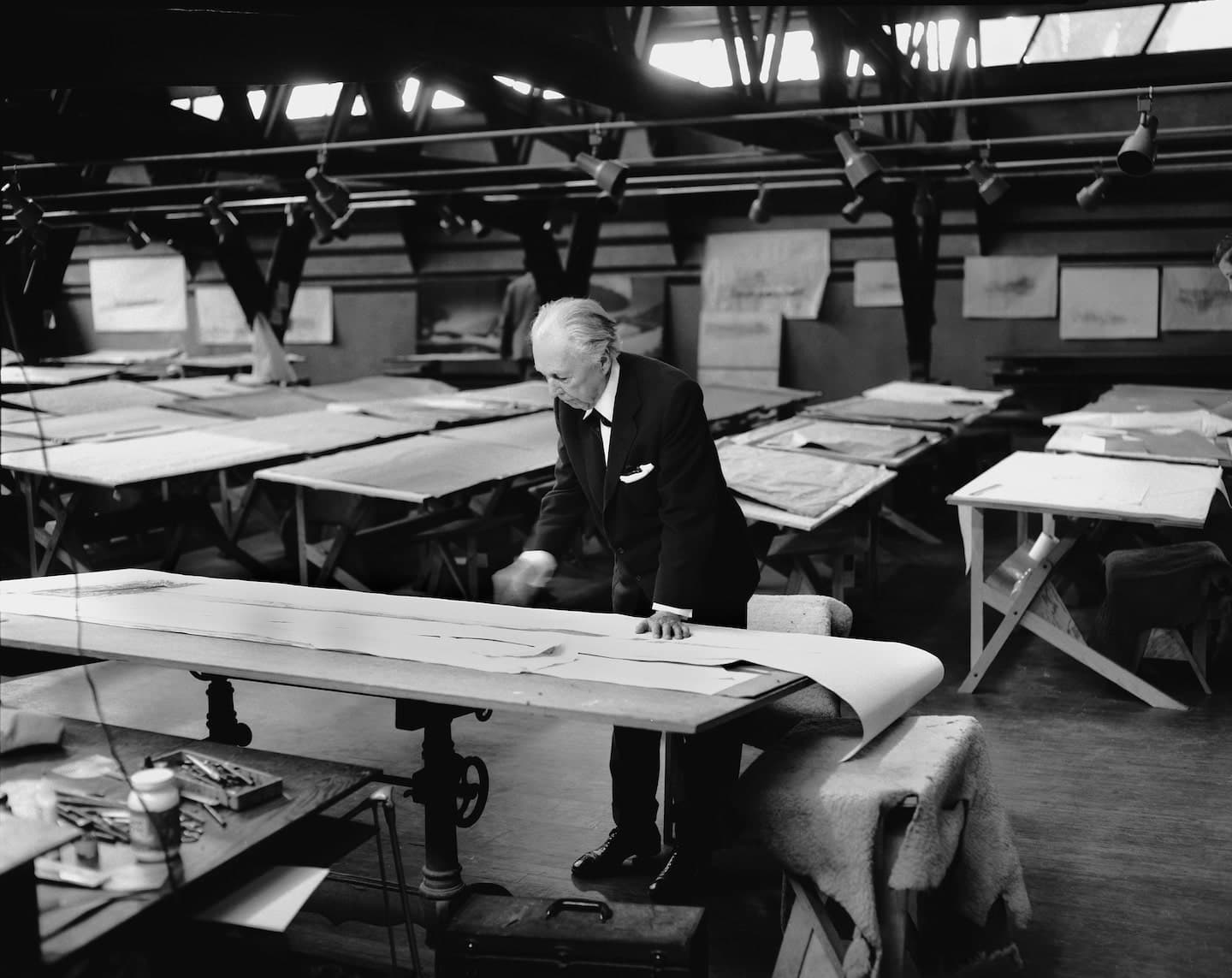
June 8, 2017, marked the 150th anniversary of the birth of the greatest American architect, Frank Lloyd Wright. And while 150 seems like a number that’s pretty far off into the distant past, after chatting with Foundation President Stuart Graff, we were struck by how forward-thinking Wright was, and how his five key principles of design are still relevant today. Not only did he design buildings to respect (and often improve) the natural environment, but he emphasized a sense of shelter. While he was thoughtful in use of natural materials, he also fully embraced technology. He had an overarching belief that architecture, which encompassed both interior and products, should be a complete work of art and that all elements should contribute to the whole. In honor of 150th birthday, we asked some architects and designers how Frank Lloyd Wright’s design philosophies shaped their work.
Jonathan Adler
Potter, designer and author Jonathan Adler told us about how he loved that Frank Lloyd Wright broke the rules, and created his own rulebook, one that certainly paved the way for outside-the-box thinkers and creators like Adler:
“I hadn’t considered Frank Lloyd Wright’s philosophical approach to design but what I love is the visual vocabulary and his innovations. There are so many signature visual tricks that have influenced me – how he cantilevered everything, his horizontal gestures, his idea of buildings as sculptural objects. Whenever I can, I think, ‘Why not cantilever something?’” Jonathan says. “He seems like a person who felt like the rules never applied to him – good, bad, or other. I think about him constantly when I’m designing. What would Frank Lloyd Wright do? What kind of unexpected solution would he have for a problem? How would he throw out the rule book? I love Frank Lloyd Wright.”
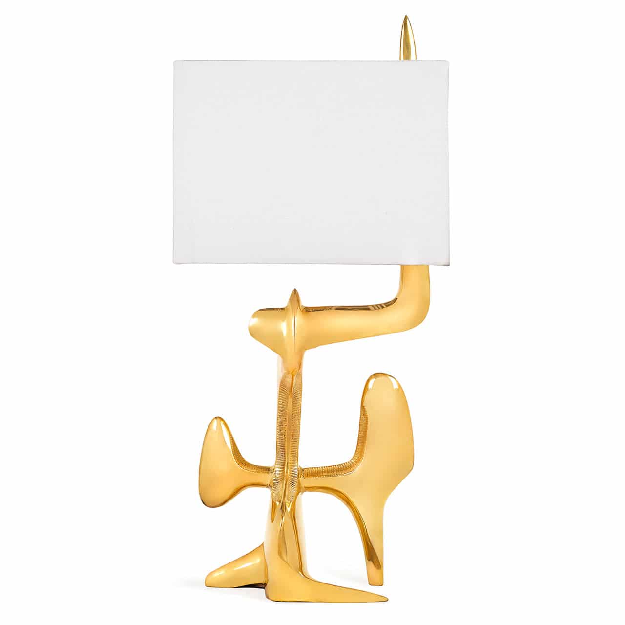
Reform Lamp by Jonathan Adler
“What would Frank Lloyd Wright do? What kind of unexpected solution would he have for a problem? How would he throw out the rule book?” – Jonathan Adler
Michael Bierut
Philosophy: Understand the nature of materials and use them honestly and respectfully.
Frank Lloyd Wright once said “No house should ever be on a hill or on anything. It should be of the hill. Belonging to it. Hill and house should live together each the happier for the other.” That interplay between materials and site is one that particularly resonated with Michael Bierut, partner at Pentagram, graphic designer, design critic and educator, whose work is in the permanent collections of museums. He was a driving force behind the beloved Helvetica.
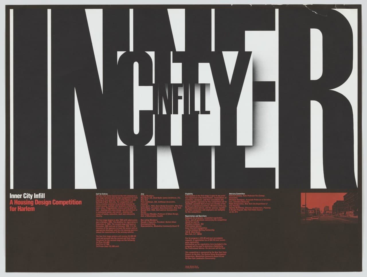
Michael Bierut, Inner City Infill, 1984 from the collection at MOMA
Michael relayed the following story describing how when the site and materials work together, magic is created: “I grew up in the ’60s and ’70s in suburban Ohio. I can remember our class field trip to Fallingwater. I still remember coming down the path, hearing the waterfall, and just sensing the building. It was so unbelievably powerful. At the time, I knew who Frank Lloyd Wright was, but the experience was something completely different. I wasn’t reacting to the fact that the building was so sensibly situated on the site or the audacity in putting it there or on the technical challenges that entailed. What floored me was the sense of transformation. You felt like a miracle was being formed before your eyes in stone and glass and steel. It’s also not merely a piece of sculpture. It’s the fulfillment of a functional request. Someone wanted a house and Wright did it in such an otherworldly, graceful and beautiful way. That’s what the power of design is. When something strikes you like that. It seems completely surprising on one hand, and then completely comfortable on the other. There are so many lessons you can derive from Wright that are more than merely intellectual.”
He explains, “Every time I undertake a design project, there are functional requirements, technical parameters (budget, etc.). I know how to do things that are elegant resolutions of complex problems, but every time I sit down, I’m trying to find that moment of magic that every manmade thing has the potential to evoke. I think that I miss 99% of the time, but that impulse is always there.”
“It’s also not merely a piece of sculpture. It’s the fulfillment of a functional request. Someone wanted a house and Wright did it in such an otherworldly, graceful and beautiful way. That’s what the power of design is.” – Michael Bierut
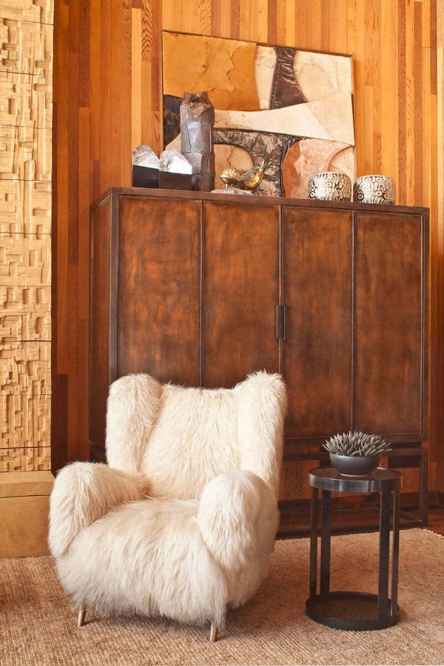
Designer Kelly Wearstler is known for her super luxe approach to design where the texture of materials plays a central role. It is Frank Lloyd Wright’s thoughtful use of natural materials and command to understand the nature of materials and use them honestly and respectfully that most appeals to her: “The fluidity with which he paired the practical with the fanciful is exceptional. I take his honest and respectful approach toward materiality into every project. If it looks like wood, it is wood. There is no better way to instill authentic beauty and soul into a space than with natural materials. By understanding the essential properties of a material and embracing its singular characteristics, the result will be uniquely expressive and beautiful.”
Artist Colette Vermeulen, who studied fashion in The Netherlands, spent time at Taliesin West as an Artist in Residency. Her background studying textiles and design gave her a strong sense of color, pattern and shape, which led her to create colorful collages inspired by the surrounding Arizona landscape. Her experience working in Wright’s drafting studio influenced the architecture of her artwork: “The way Frank Lloyd Wright abstracted nature was a big source of inspiration. Each shape in nature can be brought back to pure elementary forms like circles and triangles. It has also encouraged me to eliminate superfluous aspects and to free my images of the sense of perspective. It gives the viewer a feeling of being sucked into the images and to be dissolved into them. The way Frank Lloyd Wright created living spaces in which nature is amplified rather than disregarded, inspired me to create images that are not restricted by a rectangular frame and that emphasize the purest elementary forms.”
“The way Frank Lloyd Wright created living spaces in which nature is amplified rather than disregarded, inspired me to create images that are not restricted by a rectangular frame and that emphasize the purest elementary forms.” – Colette Vermeulen
Philosophy: Emphasize the sense of shelter.
A graduate of Princeton University’s visual arts program, Neeta Patel is a graphic design fellow at the Frank Lloyd Wright Foundation. As a fellow, she both lives and works at Taliesin West and so gets to experience Frank Lloyd Wright in a way that few others do. “I’ve developed a sensitivity to space, to light and shadow; to sound—to the sensory experience of architecture at its finest—that only such a beautiful and fully considered environment could develop. Taliesin West is teaching me how to see in ways I hadn’t before, in ways the architects who studied here and continue to study here do—with a relentless attention to every detail and every expression of a space.”
Working at the in Wright’s desert laboratory has reinforced Patel’s instinct to challenge convention in her design. “This experimentation and innovation is what causes him — and American society — to move toward a more beautiful, thoughtful and sustainable way of life. Each day, with my work, I am compelled to absorb this spirit of innovation, and try things that are new, exciting, and daring.”
“Taliesin West is teaching me how to see in ways I hadn’t before, in ways the architects who studied here and continue to study here do—with a relentless attention to every detail and every expression of a space.” – Neeta Patel
Eric Chang
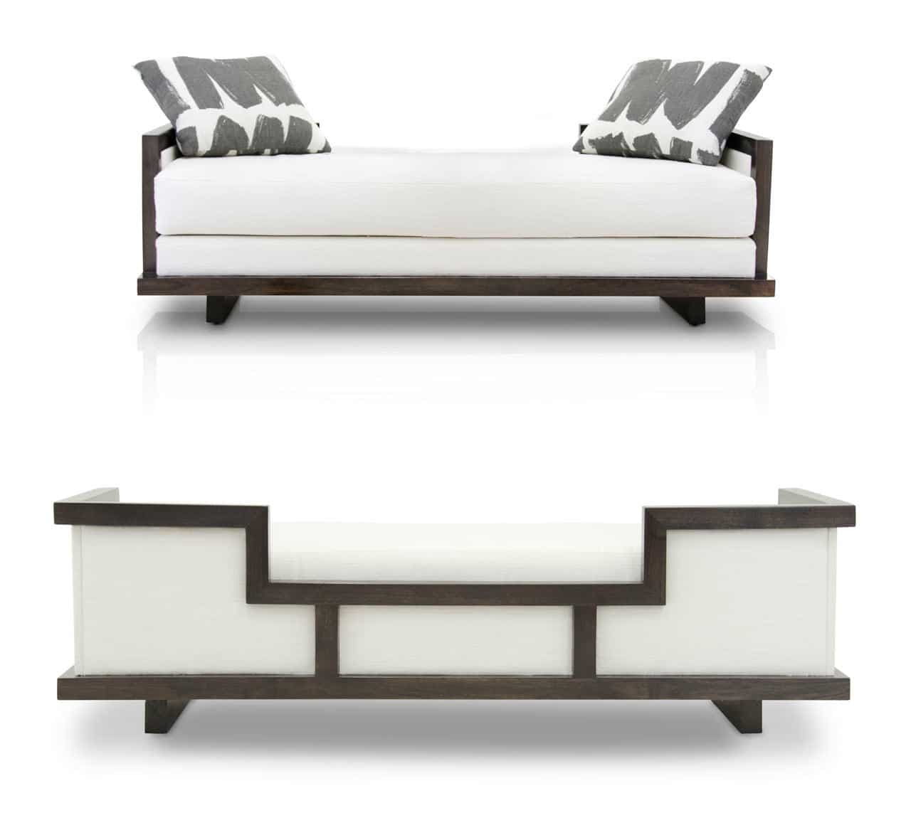
Tao daybed by Hellman-Chang
Philosophy: Architecture (and interiors/products) should be a complete work of art, all elements contributing to the whole.
The furniture that Brooklyn-based designer Eric Chang, of Hellman-Chang, handcrafts in his studio has been used in luxury hotels throughout the world and has been featured in TV and films ranging from Gossip Girl to Sex and the City 2. His work is characterized by both an intense respect for the organic materials and a careful attention to detail. “Frank Lloyd Wright upheld a holistic approach of how every home and building should be designed as a unified vision of design and craft with utmost respect for nature and materials,” said Eric. “More importantly, though, before Frank Lloyd Wright, there wasn’t really anyone that American designers could look to as a guiding light or defining voice for what was truly ‘American’ Design. He gave us a design identity – something that could be called our own. He is to American design what Bauhaus is to European design and architecture. So it’s not just his designs, but his work as a visionary that inspires us today. This achievement is what influences Hellman-Chang’s very mission: to prove to the global design community that the very best designed and best crafted furniture in the world doesn’t have to come from Europe, but can come from America.”
“He gave us a design identity – something that could be called our own.” – Eric Chang
Philosophy: Utilize advances in technology.
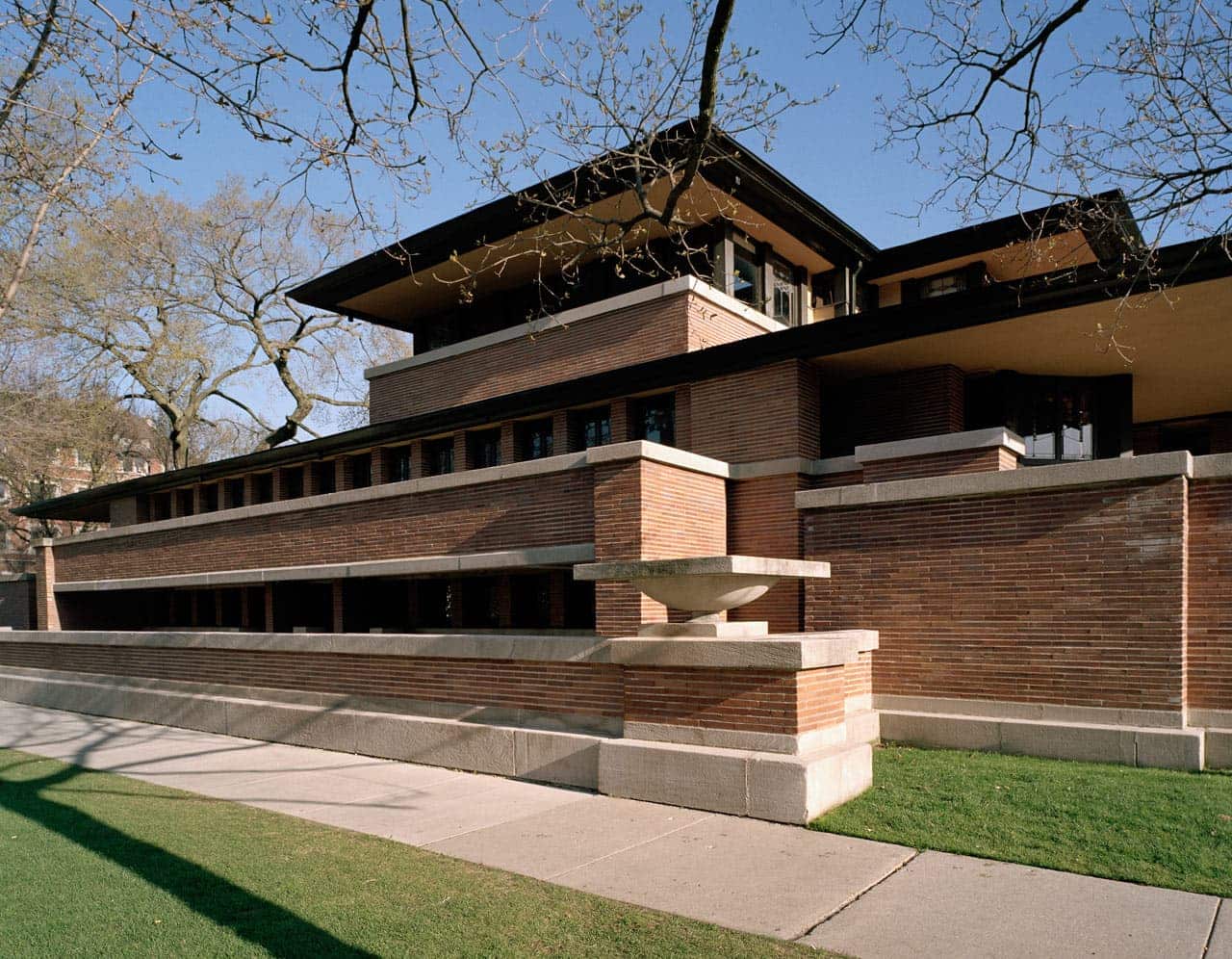
Lara Deam, the founder of Dwell, , the cult modern shelter magazine, vividly remembers her first encounter with Frank Lloyd Wright in her History of Interior Design class. “The professor was showing slide after slide of Victorian homes circa 1910 and then…The Robie House.” The difference was palatable. This house was Frank Lloyd Wright’s first use of the cantilever system, which utilized the combined strength of steel and cement to allow the walls to hang like curtains, that would become a Prairie School trademark. “I was struck by how important innovative architecture is to a culture, how it guides, inspires, and informs all aspects of culture.”
It’s clear that Frank Lloyd Wright was a game changer in architecture, but his design principles and philosophy reach far beyond, touching artists and designers across all disciplines. From adaptation of technological advances to sustainability to aesthetic disruption, design as we know it today has been forever changed by Wright and will continue thanks to his legacy of innovation.

