Willey House Stories: The Space Within: Part 4, “Sense of Space”
Steve Sikora | Mar 23, 2021
In this fourth segment of a special five-part feature series for the ongoing Willey House Stories, homeowner Steve Sikora explores variations on the theme from the Frank Lloyd Wright Foundation’s Spring 2021 Quarterly issue “The Space Within.” In Part 4, titled “Sense of Space,” Steve explores three concepts: 1. The Book of Tea, 2. Room for Jello, and 3. Rubin’s Vase.
The Space Within – Part 4: Sense of Space
“… with the sense of space,”
-Frank Lloyd Wright, The Natural House
Inspired by Frank Lloyd Wright’s own description of the Willey House, in this, the fourth of five parts in the series The Space Within, we’ll explore the concepts of:
- The Book of Tea
- Room for Jello
- Rubin’s Vase
The Book of Tea
Coincident with his architecture proceeding from closed box to open shelter, was Wright’s spiritual evolution. It was inextricably bound up with his artistic growth and the two became one. Through a careful reading of the tea leaves, it is revealed how and when Frank Lloyd Wright stumbled upon the philosophy that resonated with him so completely that when applied to his creative pursuits, it forever changed the course of his work. Soon came the elimination of applied ornament, implementation of austere materials palettes, and the streamlining of plans. The greatest effect was Wright’s shift of focus from the physical envelope of the building to volumetric space contained within.
Originally published in 1906, Wright was gifted a copy of Okakura Kakuzo’s The Book of Tea by the Hikotaro Ichikaw, Vice-Consul at the Japanese Consulate in Chicago in 1930.
Between its covers he found significance in the following passage:
“This Laotse illustrates by his favorite metaphor of the Vacuum. He claimed that only in the vacuum lay the truly essential. The reality of a room, for instance, was to be found in the vacant space enclosed by the roof and walls, not in the roof and walls themselves. The usefulness of a water pitcher dwelt in the emptiness where water might be put, not in the form of the pitcher or the material of which it is made. Vaccuum is all-potent because all containing. In vacuum alone motion becomes possible. One who could make of himself a vacuum into which others might freely enter would become master of all situations. The whole can always dominate the part.”
Lao Tse whose name is also translated as Laotse, Laotsi, Laozi or Lao Tzu, became one of Frank Lloyd Wright’s favorite sources of inspiration. The Book of Tea may have been his introduction to the philosophies of the legendary founder of Taoism. In it he recognized what he had already stumbled upon at the Larkin Building in Buffalo and triumphantly mastered in Oak Park with Unity Temple. The serendipitous appeal of Lao Tse’s metaphor of the vacuum led Wright to seek out alternate translations, as well as other seeds of wisdom to grow in his own philosophical garden.
“Laotze expressed this truth, now achieved in architecture, when he declared the reality of the building does not consist of the roof and walls but in the space within to be lived in.’ I have built it. When Unity Temple was built this sense of interior space began to ‘come through’: 1906.”
—A Testament, Frank Lloyd Wright
A similar quote can be found in The Complete Works of Lao Tzu. It reads:
Thirty spokes together make the wheel for a cart.
It is the empty space in the center
which enables it to be used.
Mold clay into a vessel;
It is the emptiness within
that creates the usefulness of the vessel.
Cut out doors and windows in a house;
It is the empty space inside
that creates the usefulness of the house.
Thus, what we have may be something substantial,
But its usefulness lies in the unoccupied space.
The substance of your body is enlivened
by maintaining the part of you that is unoccupied.
At the surface, his frequent references in later writings to “the space within” might seem like pure rhetoric, but when aligned with his evolving work, it is clear that he practiced what he preached. It is as if, with each new undertaking Wright squares his shoulders and declares, “Hold my teacup. I’m gonna try something.” The ever-present nature-form abstractions underpinning Wright’s architecture are merely a stylistic means to an end, no more than his signature brushstrokes, when compared to the profundity of his philosophical thought.
Architects could learn from me to use the sun as a brush and the earth as canvas. The pigment: human nature.
-Frank Lloyd Wright, The Roots of Life
Room for Jello
Just before the turn of the millennium our design firm was commissioned by Marshall Field’s Department Stores to create a Wright-themed shop in partnership with the Frank Lloyd Wright Foundation, to occupy space in their Chicago flagship store, with smaller iterations of it for other stores in the chain. Included in the over-the-top presentation was a series of product idea sketches. One product sketch, shared with a wink, was a Jello mold of the Imperial Hotel. With it a proud host or hostess of a Wright-themed event could illustrate how the famed building jiggled its way through the Great Kantō earthquake of 1923 demonstrated in delicious, colorful and undulating Jello!
One afternoon, sitting alone in the living room at Willey, I was considering the phrase, “the space within,” and realized we still tend to study the vessel, rather than the contents within. I tried to imagine the shape of the negative space of the room. It brought to mind that Jello mold. What would a cast solid of the negative space of Wright’s Willey House living room look like? What would it reveal? What could be learned by direct comparison to rooms in non-Wright buildings?
Rubin’s Vase
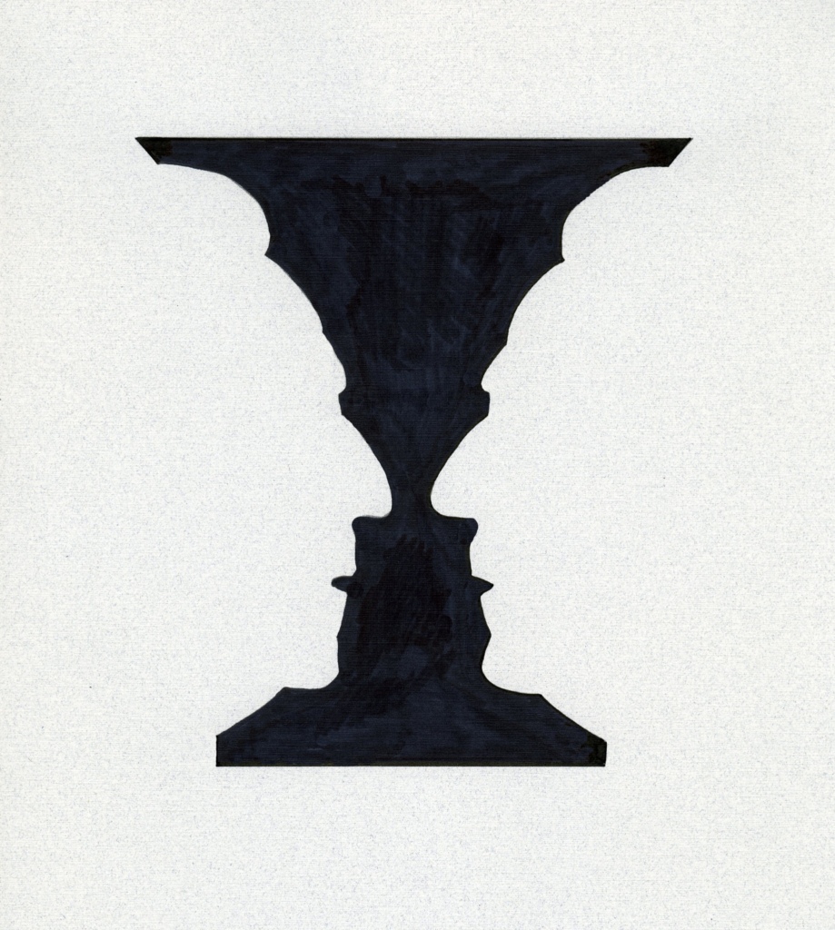
The classic Rubin’s vase illusion is an illustration of a bi-stable, two-dimensional form. The edge line can be read equally as the outline of face or of vase. Image by: Steve Sikora
In the illusion known as Rubin’s vase the silhouettes of two people face each other in close proximity to create a third form in the negative space between them; the shape of a vase.
Artists, photographers, filmmakers, designer and printmakers most of all, have been keenly aware of and capitalized on the use of negative space in their frame or picture plane. The shape of the negative space and manner in which an image is cropped can create dynamic tension and contribute immense power to an image.
A conscious use of negative space is well accepted in 2-dimensional art of all kinds but has been largely overlooked in 3D artworks. An exception to this can be found in the work of Gregory Payce who has mastered the use of negative space in his sculpture. Unlike 2-dimensional art, Payce’s sculptural ceramics do not require a fixed point of view. In fact, his art compels the onlooker to move from one viewpoint to another for a cascading series of effects that materialize and dematerialize in a mesmerizing cinematic fashion.
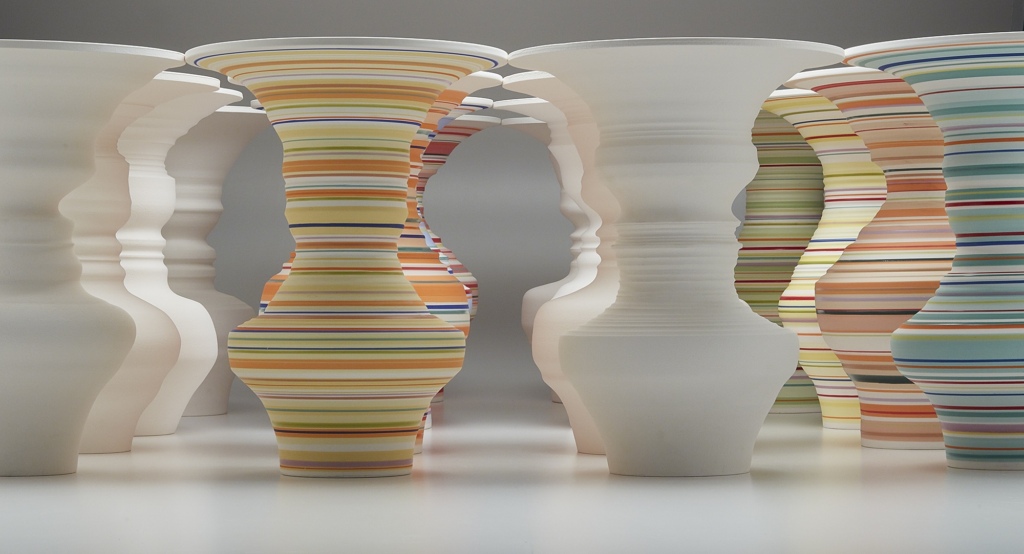
“Brothers and Sisters,” 2016, by Calgary artist Gregory Payce is template, wheel-thrown porcelain, decorated with slips and glazes of his own design. Payce has been working “outside the pot” for the past several decades. “I believe that visual art/culture is a lot about determining relationships between things. When you place one object or idea beside another, things get interesting. The physical spaces between both objects and ideas, becomes a very interesting, non-material, slightly otherworldly, space to work in, the territory ripe with possibilities that have not yet been articulated with other languages. The archetypal relationships between human and vessel form help viewers enter the works. When your perception is mislead, your imagination becomes activated.” His works perfectly illustrate that the power of negative space we are so familiar with in 2D illusions like Rubin’s vase is equally potent in the third dimension, say inside a building. Photograph by Marc Hutchinson
His work proves that negative space in physical realm can be anticipated and shaped in the design process. Likewise, negative space in the third dimension can be manipulated to be as dynamic as in any two-dimensional picture plane. I believe Wright was able to envision the physicality of the negative space in his constructions and that his ability to do so added immensely to the experience of dwelling within those spaces. Rather than hollow voids created by ceiling and walls, the empty space of a room has shape and becomes wholly active, energetic and alive, a powerful form of its own.
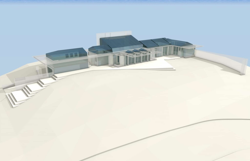
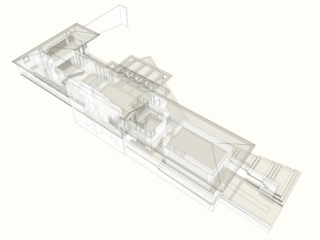
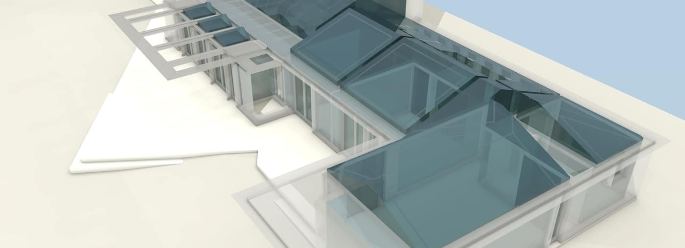
The interior space of the Willey House modeled as a volumetric solid. Note the richness of form particularly in Wright’s ceilings. Modeled by Craig Beddow.
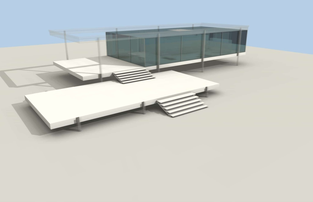
The interior space of the Farnsworth House modeled as a volumetric solid. Note the obviousness of Wright’s pet peeve rooms that are “boxes within boxes.” Modeled by Craig Beddow.
I believe this is what Wright referred to as “the new reality”
Now a new liberation may be the natural consequence in every building exterior. The first conscious expression of which I know in modern architecture of this new reality—the “space within to be lived in”—was Unity Temple in Oak Park. True harmony and economic elements of beauty were consciously planned and belong to this new sense of space-within. The age-old philosophy of Laotse is alive in architecture. In every part of the building freedom is active. Space the basic element in architectural design.
This affirmation, due to the sense of “the space within” as reality, came from the original affirmative negation (the great protestant) 1904, the Larkin Building of Buffalo—now demolished. Here came the poetic principle of freedom itself as anew revelation in architecture. This new freedom that was first consciously demonstrated in Unity Temple, Oak Park (1906) as written in 1927 for An Autobiography. With this new principle at work in our American architecture came a new sense of style as innate. A quality natural to the act and art of modern habitation: no longer applied by “taste.”
-Frank Lloyd Wright, A Testament
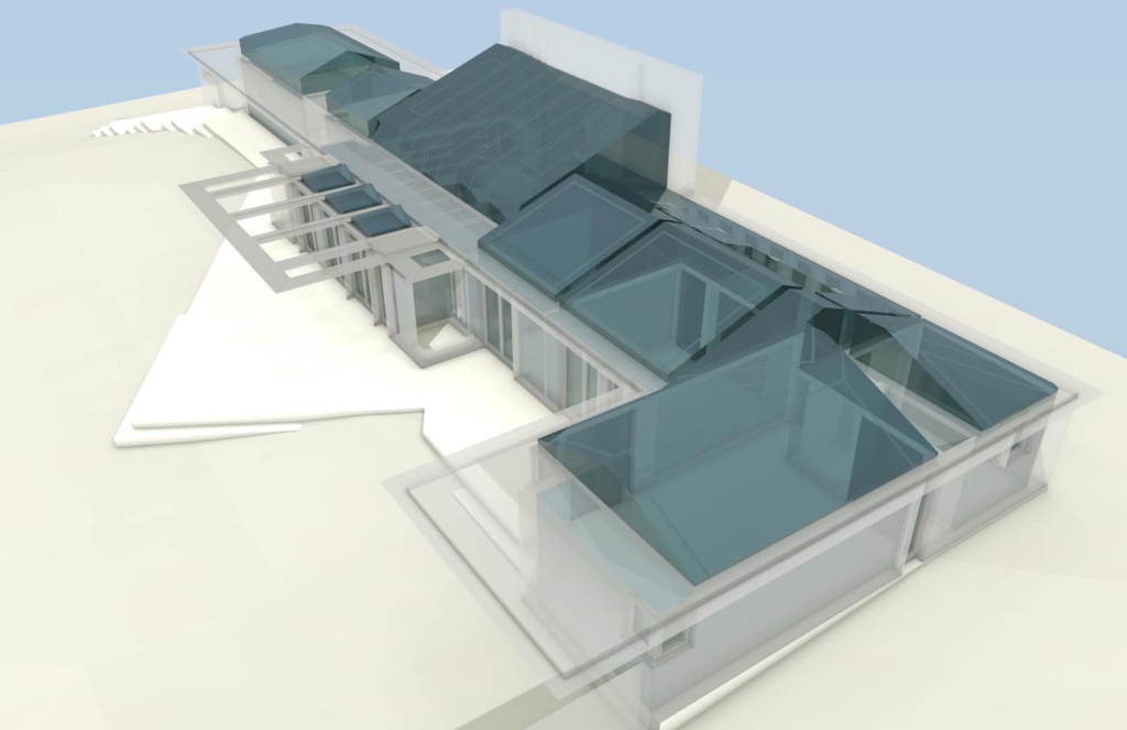
The Willey House modeled as a volumetric solid. The energy and rich, variability of Wright’s negative space is even more evident from this angle. Modeled by Craig Beddow.
In a revelatory collaboration with architectural designer/educator/illustrator Craig Beddow, a picture of this previously invisible space is slowly emerging. We’ve only just begun to explore the idea of solid modeling Wright’s interior spaces, and I hope others take up this cause, but the idea is developed here enough to make the point. To fully appreciate Wright’s inner space at Willey it was necessary to compare it with that of a similarly scaled International Style masterpiece. For this we selected Ludwig Mies van der Rohe’s Farnsworth House to contrast Wright’s modeling of space with that of a modernist peer.
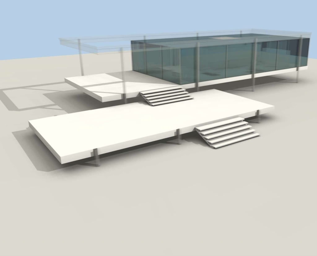
The Farnsworth House modeled as a volumetric solid. The static boxiness of the interior space is more pronounced from this angle. Modeled by Craig Beddow.
Apart from the many extraordinary aspects of the Mies design, it is all too evident the negative space of the Farnsworth House confirms it is but another example of boxes within a box, that ill Wright strove his entire career to overcome. While Wright space as emphasized at the 1934 Willey House is fluid and mutable as it pushes out and in, alternately conjuring sensations of comfort, security, drama, and freedom with its undulations. Interior space penetrates the perimeter walls and transforms itself, creating surprising, new forms as one moves about the room. Built more than a decade post Willey, the walls floor and ceiling of the Farnsworth box, sleek and formidable are entirely predictable. This is why Wright said of the International Style modernists, and I paraphrase, “When I met the men I liked them. I just didn’t like what they did.” When it came to modeling space, none of the modernists were in the same league as Wright.
Read all of “The Space Within” blogs for this special five-part Willey House feature:
- Part 1: Little Boxes
- Part 2: Vista Inside and Out
- Part 3: Sense of Shelter
- Part 4: Sense of Space
- Part 5: The Purpose
