Willey House Stories: The Space Within: Part 1, “Little Boxes”
Steve Sikora | Mar 2, 2021
In the first of a special five-part feature series for the ongoing Willey House Stories, homeowner Steve Sikora explores variations on the theme from the Frank Lloyd Wright Foundation’s Spring 2021 Quarterly issue “The Space Within.” In Part 1, titled “Little Boxes,” Steve explores three concepts: 1. Breaking the box, 2. The box as confinement, and 3. The box as conformity.
The Space Within – Part 1: Little Boxes
Little boxes on the hillside,
Little boxes made of ticky tacky,
Little boxes on the hillside,
Little boxes all the same.
There’s a green one and a pink one
And a blue one and a yellow one,
And they’re all made out of ticky tacky,
And they all look just the same.
And the people in the houses
All went to the university,
Where they were put in boxes
And they came out all the same,
And there’s doctors and lawyers,
And business executives,
And they’re all made out of ticky tacky,
And they all look just the same.
And they all play on the golf course
And drink their martinis dry,
And they all have pretty children
And the children go to school,
And the children go to summer camp,
And then to the university
Where they are put in boxes
And they come out all the same.
And the boys go into business
And marry and raise a family
In boxes made of ticky tacky
And they all look just the same.There’s a green one and a pink one
And a blue one and a yellow one,
And they’re all made out of ticky tacky
And they all look just the same.
From the song, “Little Boxes”
Words and music by Malvina Reynolds
Copyright 1962 Schroder Music Co. (ASCAP) Renewed 1990.
Used by permission. All rights reserved.
Little Boxes
Little Boxes, the biting social commentary thinly veiled as a charming folk song, was made famous by Pete Seeger in 1963. The song was written by his friend, musician and activist, Malvina Reynolds, one year earlier. Owing to the character of her voice, Reynolds’ original rendering of the tune possesses a delicious edge of sarcasm, absent in Seeger’s performance. As the story goes, the melody and lyrics presented to her spontaneously en route to a gig in La Honda, California. As she and her husband passed a housing tract near Daly City, she veered off the road, asking him to take the wheel so she could capture the song inspired by the scene that was unfolding before her eyes—rolling hillsides covered in self same, little box-like homes.
Little Boxes describes Malvina’s response to the conventional lives of the American middle-class, epitomized by what she perceived as the soulless monotony of identical, cheap houses being banged together by developers in production-style communities. While the song lampoons the relentless uniformity of tract housing developments, and by extension the modern and therefore, cheapened and shoddy materials used, it is primarily a commentary on societal conformity, which she saw as both cause and effect of neighborhoods like the one that inspired her.
Little Boxes is an artistic statement that in many ways parallels one of Wright’s own earliest propensities—his overwhelming desire to dismantle “the box.” Though their subject matter was the same, a critical distinction exists in the case each makes. For Frank Lloyd Wright, the containing box itself was an evil, while conventional thinking and expedience perpetuated the making of more inhumane boxes. For Reynolds, conformity was the evil, and identical, little boxy houses are a symbol of society’s unrealistic expectations of homogeneity.
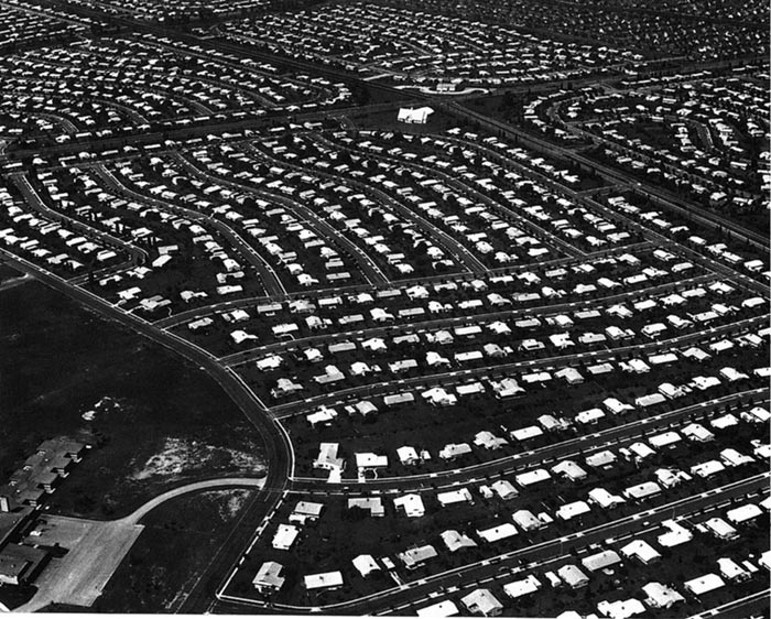
Levittown, PA, an example of the vast tract housing developments spreading across America in the 1950s and 60s. Credit: Public Domain.
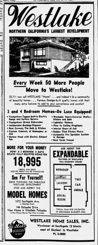
A print ad placed in the San Francisco Examiner in January 1960 for Henry Doelger’s Westlake, the development that inspired the song Little Boxes. As it turns out, the houses boxy as they were, were not made of ticky tacky.
Wright’s ambition to banish the box was equal parts architectural and societal. To him, “the box” represented confinement and conformity, two ills that needed to be overcome in order to achieve the full flowering of the individual. In addition, the box for Wright literally represented a container, a vacuum begging to be sucked full of miscellany. Wright famously called interior decorators, “inferior desecrators;” his caustic reaction to their penchant for littering living spaces with un-integrated furnishings meant to dress up these dreary boxes, devoid of spirit; or worse yet, to sully one of his own carefully orchestrated compositions.
In Catholic grade school, we sang Little Boxes in music class, and to the credit of our nuns, they took pains to explain the meaning of the contemporary, radio ditty to us. One of our parish priests was invited into class as well. However, he was on a different page from the sisters and instead warned us against building with “green lumber.” Of all things, especially in a setting where obedience, discipline and stoic behavior were highly prized, the nuns used the song as an opportunity to teach us about the concept of “conformity,” and then by extension “non-conformity,” which I instinctively preferred. Little Boxes was the ideal mnemonic to seed the concept of consensual orthodoxy in society into the receptive topsoil of our formative minds. Though our priest didn’t see beyond the “ticky-tacky,” which was hardy the point of the song, the nuns gave it to us straight. Surely, conformity need not be conflated with cheap materials nor with green lumber, regardless of the fact that one so often does seem to follow the other.
There is an ironic twist in its origin that makes Malvina Reynolds’ hit song such a hum-dinger as it relates to Frank Lloyd Wright. The post-war housing development she sang about, the one her collective audience lamented and had no difficulty projecting into their own communities, was in reality, not among the worst examples of rapidly metastasizing suburban landscape. Because the development in question was Westlake, just outside Daily City, California and the local developer responsible was Henry Doelger. Doelger was well known as a purveyor of affluent properties not low budget ones. Westlake was a development of boxes all right, but they were “modernist” boxes. It was marketed as a housing development of contemporary luxury homes, which just so happened to be another windmill that Wright tilted at. “Modernistic” houses were in his opinion just more of the same old post and beam construction that had been going on for millennia, now simply striped of extraneous ornamentation and repackaged as avant-garde, but still grossly insufficient for free-living America.
The Box as Confinement
“In relation to architecture, anybody can stand up four sticks together, put a box on top of them, then bore holes through the box, and there is the building—in the so called “modern international style.”
—Frank Lloyd Wright, quote from Olgivanna Lloyd Wright’s The Roots of Life
The box is an efficient form for storage, shipping and packaging, but when used as living space it is redolent of a cage or a prison cell. The addition of a flat ceiling and floor completes this claustrophobic effect. In protest, Wright prodded all six sides of the box in his efforts to coax it out of form, in so doing to liberate the soul of man.
“I think I first consciously tried to beat the box in the Larkin Building. I found a natural opening to the liberation I sought when (after a great struggle) I finally pushed the staircase towers out from the corners of the main building, made them into free-standing individual features. Then the thing began to come through as you may see.
I had felt this need for features quite early in my architectural life. You will see this feeling growing up, becoming more apparent a little later in Unity Temple: there is perhaps where you will find the first real expression of the idea that the space within the building is the reality of that building. Unity Temple is where I thought I had it, this idea that the reality of the reality of a building no longer consisted in the walls and roof…You will find the sense of the great room coming through—space not walled in now but more or less free to appear. In Unity Temple you will find the walls actually disappearing; you will find the interior space opening to the outside and see the outside coming in. You will see assembled about this interior space, screening it, various free, related features instead of enclosing walls. See, you now can make features of many types for enclosure and group about the interior space with no sense of boxing it.”
—The Destruction of the Box, Frank Lloyd Wright: Writings and Buildings, selected by Edgar Kaufmann and Ben Raeburn
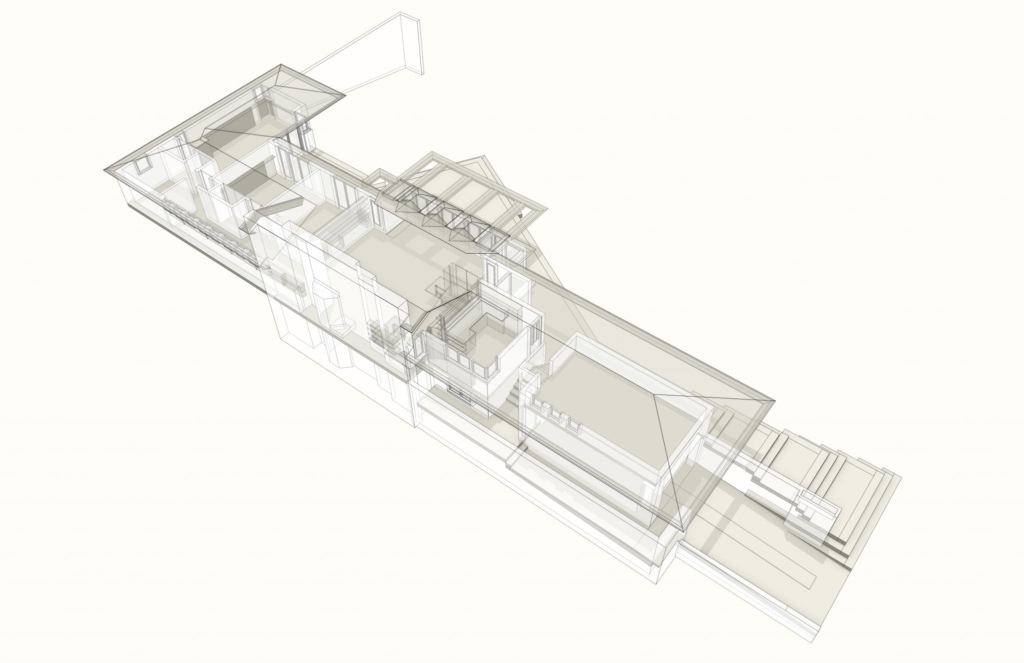
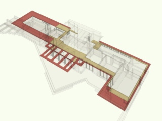
The Willey House plan though rectilinear in nature, proves to be anything but box-like in its physical form. Digital rendering modeled by Craig Beddow.
The Box as Conformity
Frank Lloyd Wright saw the opportunity to found an indigenous American architecture as a physical expression of the individual freedoms espoused in the United States’ Constitution and reflected in its landforms. In his increasing unconstrained use of space he strove to achieve nothing less than the democratic ideal of freeing and elevating the individual. Creating a discreet, new architecture deserving of the great American experiment, was the only appropriate means by which to house the recently emancipated human spirit. Wright was opposed to the importation of borrowed architectural styles washing up like flotsam and jetsam upon our shores, outmoded and unbecoming to the American landscape. He believed the great melting pot of America was unlike anything the world had ever witnessed and was fully deserving of homegrown forms to call its own. He was determined to make them.
Thanks to the value placed on a return to artistic craftsmanship espoused by Charles Robert Ashbee, and his involvement in the Arts & Crafts movement, Wright chaffed at the cheap excesses of the industrial revolution. All around him, he saw the degrading expedience of mass production. This march toward mediocrity is something else Wright warned of:
“Unfortunately conformity reaches far and wide into American life: to distort our democracy? This drift toward quantity instead of quality is largely distortion. Conformity is always too convenient? Quality means individuality, is therefore difficult. But unless we go deeper now, quantity at expense of quality will be our national tragedy—the rise of mediocrity into higher places.”
—A Testament, Frank Lloyd Wright
In retrospect his observations could hardly have been more prescient.
In Frank Lloyd Wright’s Living Space, Gail Satler described how Wright’s architecture evolved from the conventional box (in his earliest works) to opened corners (in the Prairie houses) to open shelter (in his Usonian houses) over the span of his long career.
Frank Lloyd Wright called the box “…the highest, most subjective, conventionalization of nature known to man.” Satler uses The Destruction of the Box a lecture Wright delivered to the Junior Chapter of the American Institute of Architects in 1952, as the focus of her study. Her book contributes greatly to an understanding of Wright’s novel living spaces.
After Unity Temple, Frank Lloyd Wright knew he had made a quantum leap.
“Buildings, at long last—like their occupants—may be themselves free and wear the shining countenance of principle and directly say honestly, by free expression, yet becomingly, what they really are, what they really mean. The new sense of interior space as reality may characterize the modern building. Style will be the consequence of integral character. Intellect thus reinforces and makes Spirit effective. An art as flexible, as various, as infinite in its possibilities as the spirit of man.”
–The New Architecture: Principles, Frank Lloyd Wright: Writings and Buildings, selected by Edgar Kaufmann and Ben Raeburn
Like Pandora’s Box in Greek mythology, Wright’s version is the source of malady and depravity in the world. The difference is that his preoccupation with opening up the box is to alleviate those ills from society rather than to unleash them.
However, it is one thing to want to “break the box.” It is quite another to actually do so. The process was gradual and can be traced in the progression of his work. As Satler points out, his evolution required intermittent “breakthroughs,” that would carry him a step further with each new discovery. The Willey House, I believe, represents one of those breakthroughs.
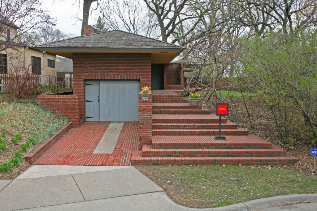
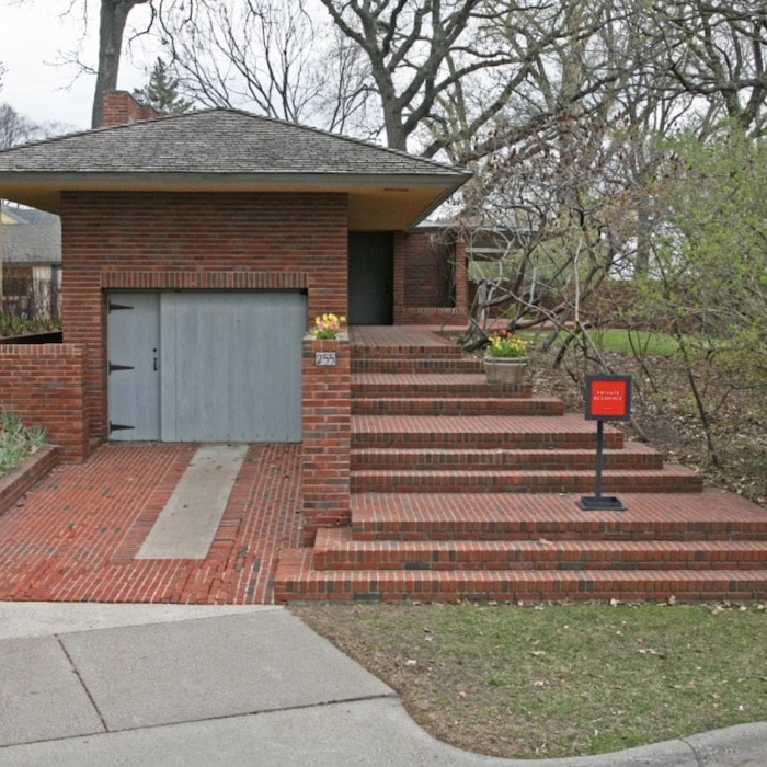
The street view of the Willey House appears to be an uncomplicated, single story structure. Photo by Steve Sikora.
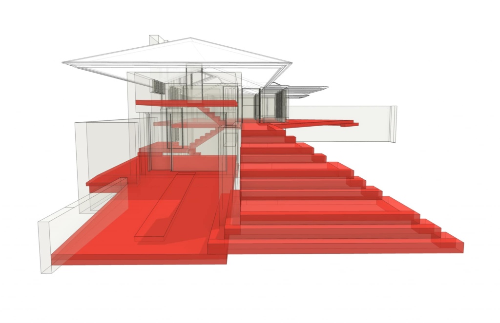
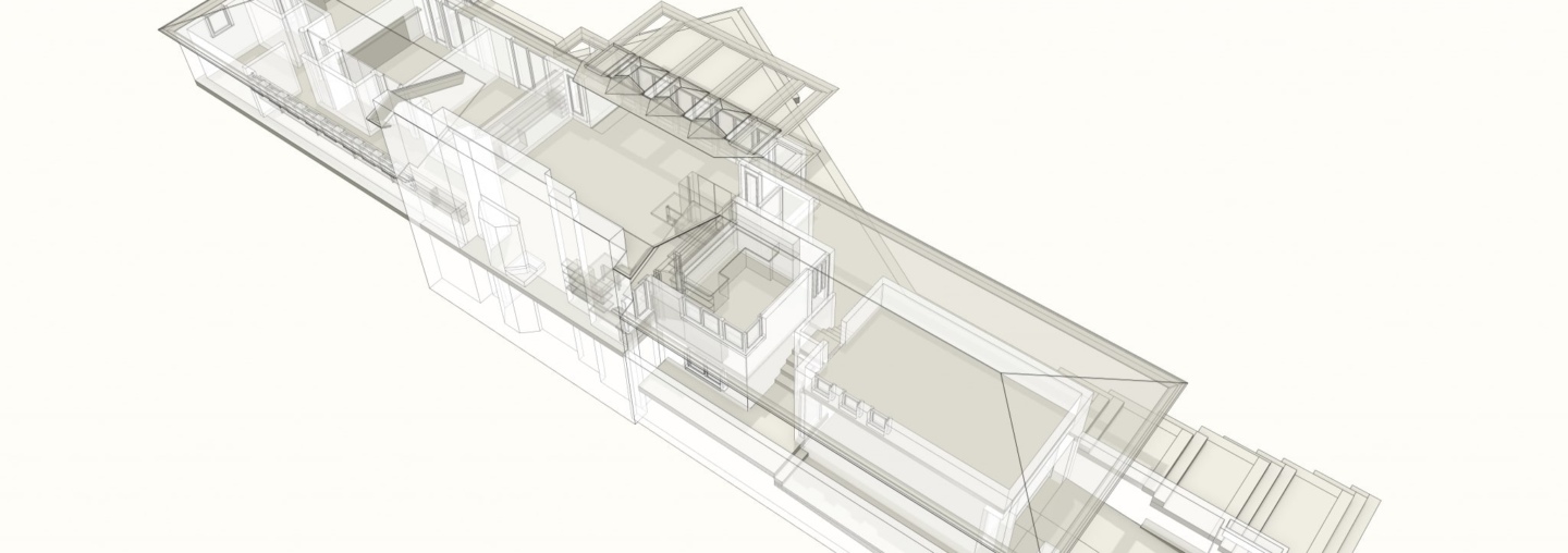
The same street view of the house in wireframe reveals a number of additional unseen floor levels. Modeled by Craig Beddow.
To explain Wright’s mastery of space at the Willey House I relied on several resources that helped me better grasp his use of space in general before I could understand the particulars of Willey. I already mentioned Gail Satler’s book. Grant Hildebrandt produced an excellent volume on this topic called The Wright Space: Pattern & Meaning in Frank Lloyd Wright’s Houses. Pertinent in the Hildebrandt book are the concepts of Wright’s signature “pattern,” prospect and refuge, and the concept of a bio-preferable environment. Last and not least, an essay highlighting Wright’s use of the diagonal at the Willey House, written by Neil Levine in a book of essays edited by Robert McCarter.
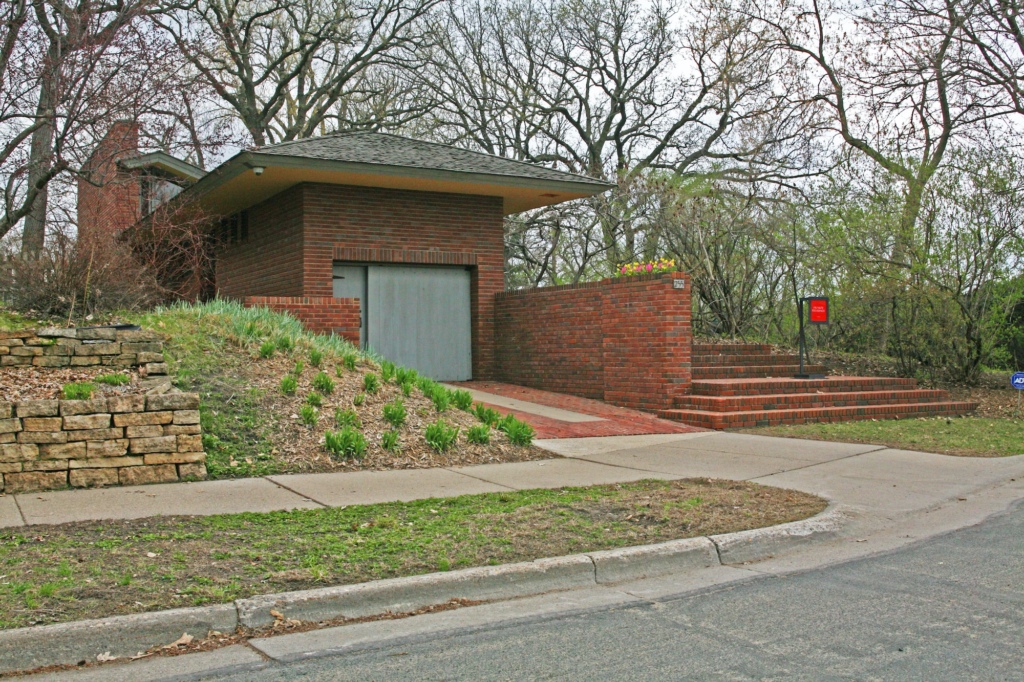
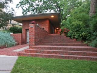
The Willey House appears to be a low, single level house, with an atrium ceiling pressed into a hillside. Photo by Steve Sikora
So, how is the Willey House a broken box? If you glimpse Willey only in plan, you see an ostensibly boxy form. Though it is asymmetrical and L-shaped in overall composition, it appears to be constructed of a series of rectangles strung together inline, including the expected number of 90˚ corners, the very definition of a boxy form. The experience of the house however, is anything but box-like. You see, Wright’s destruction of the box does not require a unit grid of circles, triangles, parallelograms or hexagons to shatter that paradigm, although he employed all of those things later on. At the Willey House the box is diffused, if not dissolved by a combined optical and spatial slight of hand on Wright’s part. The first transcendent aspect one becomes conscious of is Wright’s dramatic use of ceiling planes.
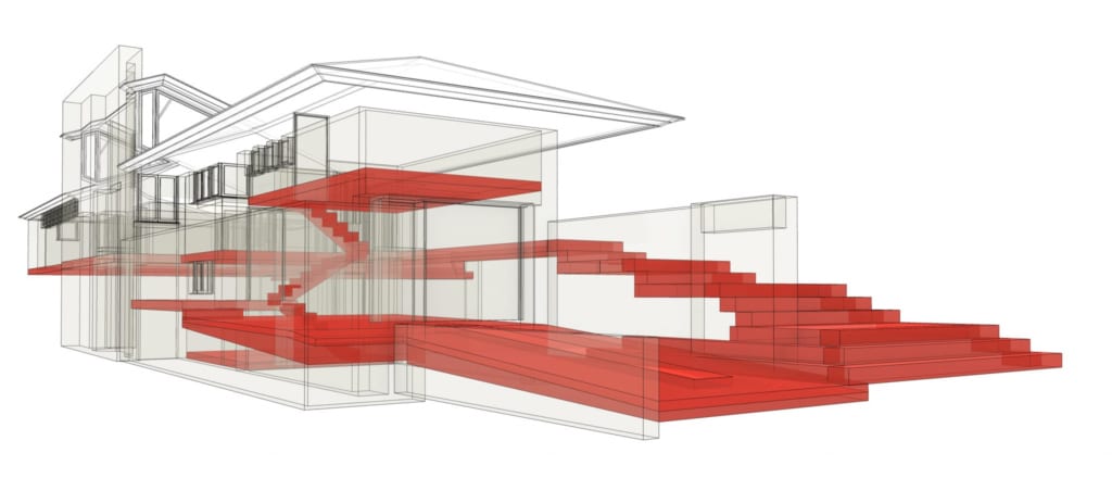
Although the floor level of the main living spaces is continuous with the terrace, this wireframe view shows unseen floor levels of the storage room above the garage, the garage floor, the small basement utility room, the driveway and the terraced steps. Modeled by Craig Beddow.
At Willey, as in most Wright Houses there are virtually no flat ceilings. His overheads follow the contours of the external roofline in what would now be called a cathedral ceiling. This device begins to alleviate the constraining quality inherent in rectilinear rooms. Cathedral ceilings serve a second, important purpose, in that they also contribute to diminishing the idea of boxes contained within bigger boxes. Wright’s ceilings at Willey, reflect a clear relationship to the outside of the building. The inner form reflects the outer and vice versa. This awareness of the whole diminishes the perception of individual, isolated cells. Instead, a room is an aspect of the building as a whole, not just a partitioned space contained within a larger structure.
The perimeter walls are pushed and pulled in and out of line with the 5-foot planning grid. Window openings appear in corners and line the entire southern face of the house. Kite-shaped windows that more resemble open airspaces occur at the roofline on each end of the living room, dissolving the end walls and creating the impression of a gravity defying, pitched canopy gently hovering over the space. A glass partition wall between living space and kitchen, here for the first time called the workspace, vanquishes the boundaries between interior rooms while retaining specific functions.
“The real voyage of discovery consists not in seeking new landscapes, but in having new eyes.”
—Marcel Proust
The limitations of the physical world were not much of a hindrance to Wright’s re-envisioning of architecture. After he had stretched the boundaries of physics to the breaking point he took us further by giving us new eyes with which to see. For instance, the spatial/cultural development of linking the workspace (nee kitchen) to the primary living space, it was a revolutionary idea that reflected patterns of the emergent and decidedly casual, middle class American culture.
Frank Lloyd Wright’s words from The Natural House provide an ideal outline to explain his spatial breakthroughs at the Willey House—“vista inside and out, the sense of shelter, with the sense of space, augmented by the sense of materials.”
Wright’s own words are the basis for the parts of this series to follow, The Space Within, Parts 2-5.
Read all of “The Space Within” blogs for this special five-part Willey House feature:
- Part 1: Little Boxes
- Part 2: Vista Inside and Out
- Part 3: Sense of Shelter
- Part 4: Sense of Space
- Part 5: The Purpose
