Illuminating Details from Frank Lloyd Wright’s Guggenheim Blueprints
Ashley Mendelsohn | Jun 23, 2017
Guggenheim Blogs explores the museum’s array of obscure details discovered by a thorough analysis of their archival documents.
This article originally appeared on Guggenheim.org/blogs, and is used with permission.
Over the course of the sixteen-year period between the commissioning of the Solomon R. Guggenheim Museum in 1943 and its 1959 opening, the project underwent a series of revisions. The iconic spiral form remained primarily unchanged, but a close reading of documents in the Guggenheim Museum Archives sheds additional light on an array of obscure details that were designed out over time to accommodate budgetary, programmatic, and structural needs and constraints.
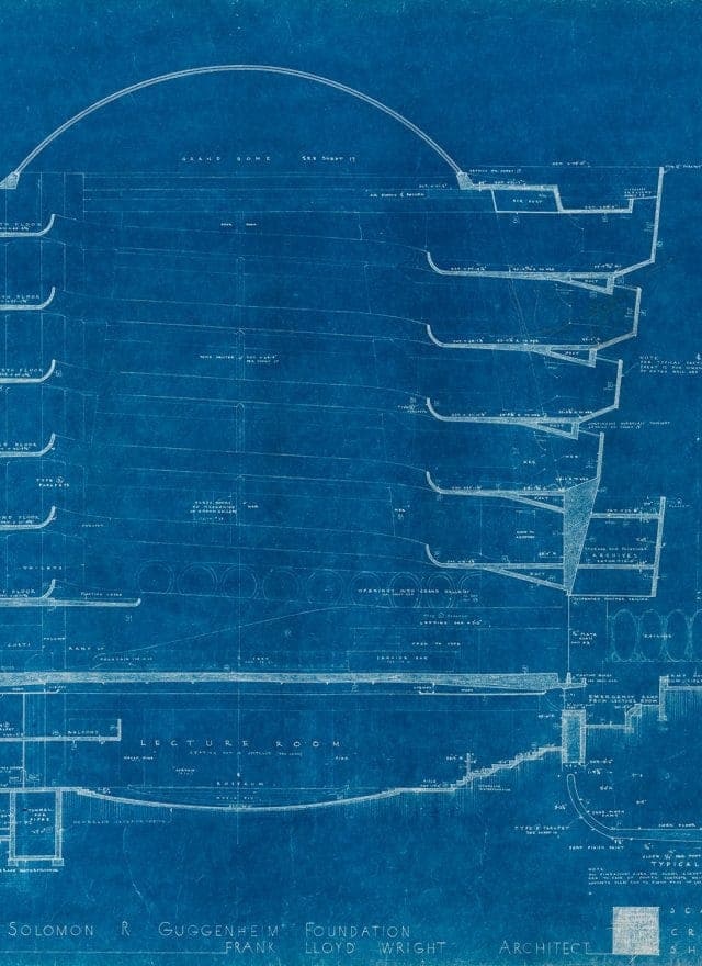
One of those unrealized details was an alternate means of navigating the museum: Architect Frank Lloyd Wright’s design was originally distinguished by two discrete ramps—the Grand Ramp, that all Guggenheim visitors know well, and the Quick Ramp. The latter, a smaller, steeper ramp, was intended for “quick” access between each level of the museum.
-
The Quick Ramp is depicted on the left-hand side of this section drawing from the 1953 presentation set produced for Harry Guggenheim. Solomon R. Guggenheim Museum Archives, New York, NY Copyright © 2017 Frank Lloyd Wright Foundation, Scottsdale, AZ. All rights reserved. Photo: Kristopher McKay
-
Detail of 1953 section drawing showing the Quick Ramp. Solomon R. Guggenheim Museum Archives, New York, NY
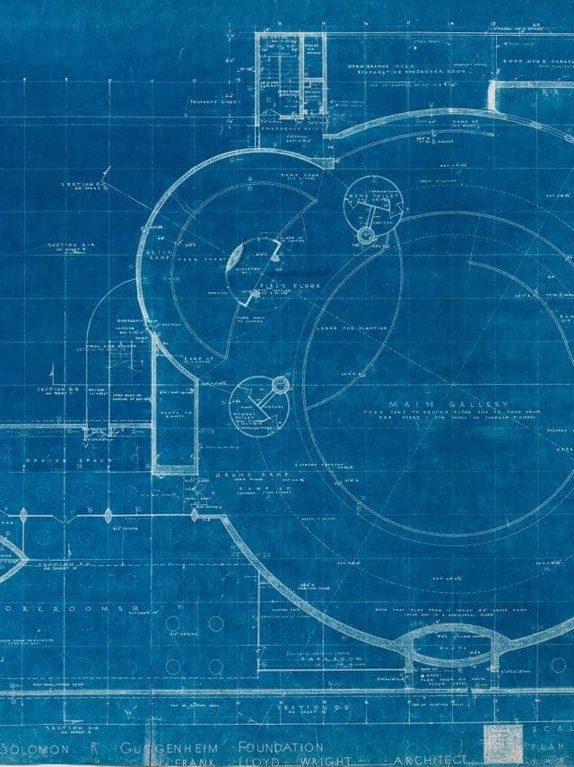
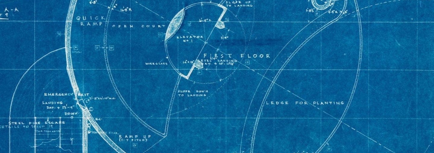
The blueprints shown here are 2 of the 36 in the 1953 presentation set produced for Harry Guggenheim, museum founder Solomon R. Guggenheim’s nephew and longtime Guggenheim Foundation president. The drawing below illustrates the relationship between the two ramps in plan: overlapping circles. This intersection of pure forms was archetypal of Wright’s design process. The annotations on the drawing reveal that the Quick Ramp was designed to be more than twice as steep as the Grand Ramp. The ramping exhibition space of the rotunda’s spiral rises one unit for every 20 units of horizontal change, while the Quick Ramp was designed to rise one unit for every 7 units of horizontal change. That is practically a slide.
-
Plan drawing from the 1953 presentation set produced for Harry Guggenheim. Solomon R. Guggenheim Museum Archives, New York, NY. Copyright © 2017 Frank Lloyd Wright Foundation, Scottsdale, AZ. All rights reserved. Photo: Kristopher McKay
-
Detail of Quick Ramp on plan drawing from the 1953 presentation set produced for Harry Guggenheim. Solomon R. Guggenheim Museum Archives, New York, NY. Copyright © 2017 Frank Lloyd Wright Foundation, Scottsdale, AZ. All rights reserved. Photo: Kristopher McKay
Another intriguing detail from the drawing is the Index of Surface Finishes, which shows that Wright did not initially plan for the exclusive use of terrazzo flooring. Both the Grand and Quick ramps were designated “CF” for cork flooring. Only the rotunda floor is labeled with the “TF” for terrazzo. It’s unsurprising that cork was eventually ruled out, as it would have been both expensive and difficult to maintain. Be that as it may, this early material specification speaks to Wright’s vision of the museum as a social space; cork flooring would have absorbed sound, ensuring an entirely different acoustic quality in the rotunda.

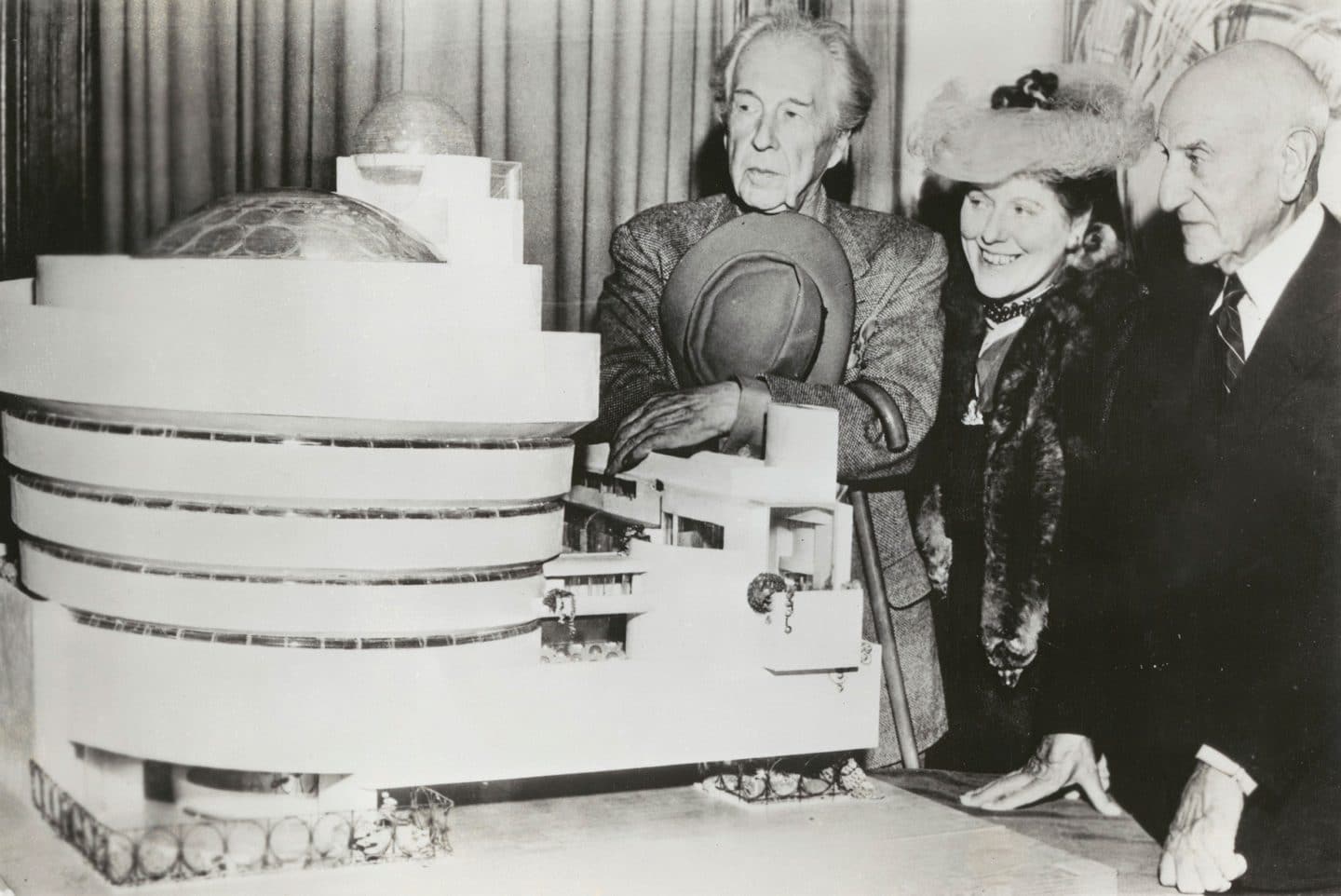
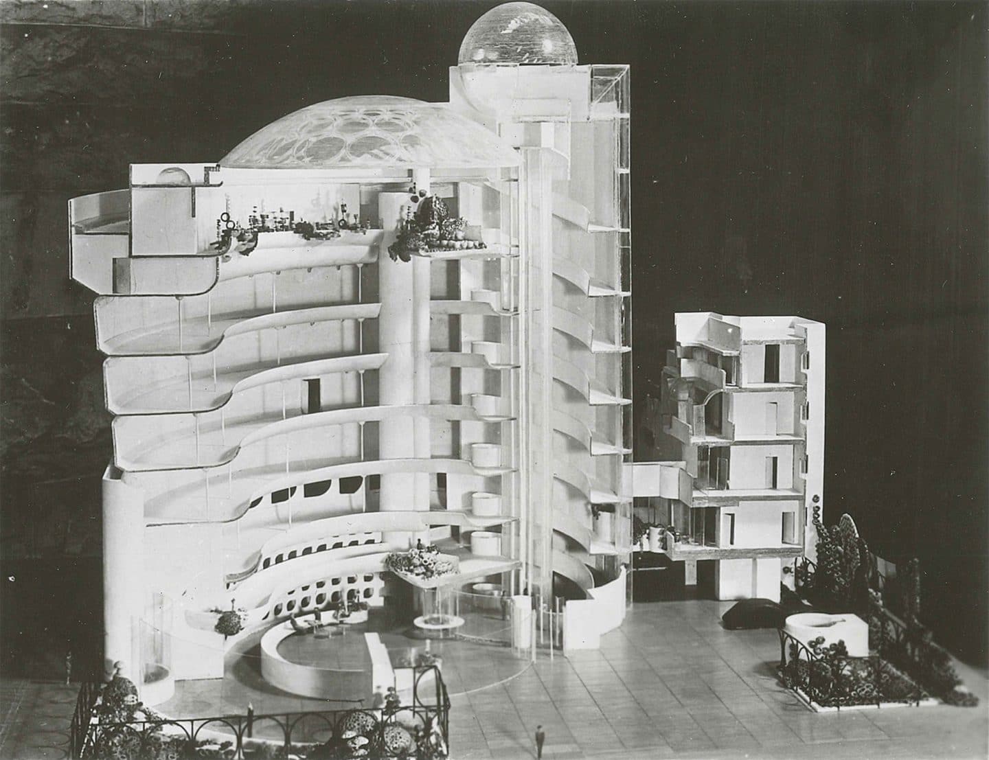
Wright and the museum’s founding director Hilla Rebay first unveiled the design of the museum to the public at a press luncheon at the Plaza Hotel on July 9, 1945. Later that summer, the first set of working drawings were produced and another press preview at the Plaza was held, this time with a large-scale model. From the beginning, conventional drawings of the Guggenheim Museum—a building with almost no right angles or parallel surfaces—were difficult to interpret. For that reason, constructing a physical model was essential, since it conveyed an accurate and accessible depiction of the building’s design to the press and to all of the parties involved in the project.
Frank Lloyd Wright explained the importance of the model to Solomon R. Guggenheim, writing to him on August 28,1945:
“The model is now finished. It is a great beauty. It will save us many thousands of dollars in the construction of the building, as any dubious points in the plans are cleared up immediately by a look at the model.”
There are several noticeable differences between the 1945 model and the building as it stands today, including the Grand Dome glass roof over the rotunda and the spherical glass observatory that capped the elevator shaft. The greatest discrepancy, however, is the lot size. In 1944, the Guggenheim Foundation acquired land along Fifth Avenue that did not span the full block between 88th and 89th Streets. Two buildings, a 14-story apartment building and a townhouse, existed on the north end of the block. The initial design, as depicted in the model, shows the museum on this smaller site. It wasn’t until 1951, when the entire site was purchased, that Wright revised the design to extend to 89th Street.
The photograph shown above of Wright, Rebay, and Solomon R. Guggenheim standing alongside the model has been widely distributed. However, the image’s vantage point doesn’t make clear the complexity of the model, which was constructed to break down into sections, revealing the inner workings of the building. Photographs of sections of the model clearly show the smaller, secondary ramp spiraling around the elevator shaft. The Quick Ramp was eventually replaced by the museum’s distinctive triangular staircase in 1955.
The stories of the two ramps and the material choices constitute only portions of the history of the design of the Guggenheim Museum. The model, the six sets of construction drawings, and the sketches—around seven hundred of them—that were produced and revised throughout the development of the project provide a plethora of insights into Wright’s design process. There is plenty to mine in the Guggenheim Museum archives—the Guggenheim’s Library and Archives department is in the process of applying for a grant to have their collection of Wright’s drawings digitized in an effort to make this wealth of information available to scholars and Wright enthusiasts alike. For now, those who dream of skateboarding down the rotunda’s spiral can fantasize about the speeds they could have reached on Wright’s Quick Ramp.
© 2017 The Solomon R. Guggenheim Foundation

