Designing the Icons for the Winter 2020 Quarterly Magazine
Frank Lloyd Wright Foundation | Feb 27, 2020
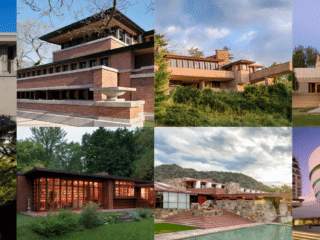
In the winter 2020 issue of the Frank Lloyd Wright Quarterly magazine, 2019–2021 Graphic Design Fellow Rachel Minier created unique icons for each of the eight Frank Lloyd Wright sites included in the 20th-Century Architecture of Frank Lloyd Wright, a group inscription of Wright sites to the UNESCO World Heritage List. Here she shares some insight into her design process.
The eight Wright-designed buildings highlighted in the 20th-Century Architecture of Frank Lloyd Wright, while distinct, form the singular UNESCO World Heritage inscription, so a level of design consistency across those articles seemed prudent. That said, each structure was chosen for the way in which it specifically represents a larger contribution by Frank Lloyd Wright to architecture within the United States and beyond. I concluded that while each title spread needed to contain a consistent set of components, ones that would be able to move and change based on the drawings supplied by Michael Pipher, each also warranted a unique element.
I was thinking about these buildings as significant chapters in Wright’s career and settled on a look that was partially inspired by old book covers, which often included a small illustration on the title page. From a purely graphic standpoint I knew these icons needed to be able to be produced at a small scale, meaning simplicity was key, and I also wanted to keep them single color and somewhat in contrast with the pen and ink drawings by Pipher, for greater visual interest on the page.
Unity Temple
Unity Temple is one of the four sites included in the UNESCO inscription that I’ve personally visited, and as such was able to draw on my own experience of the space in brainstorming an element that could represent the structure. One of the pieces that stood out to me on my tour were the slender art glass windows in the stairwells, which was my initial pitch for the icon. As the others came together, however, I revisited and looked to the design of the lamps that descend into the worship space, which are much more site-specific and truly call Unity Temple to mind.
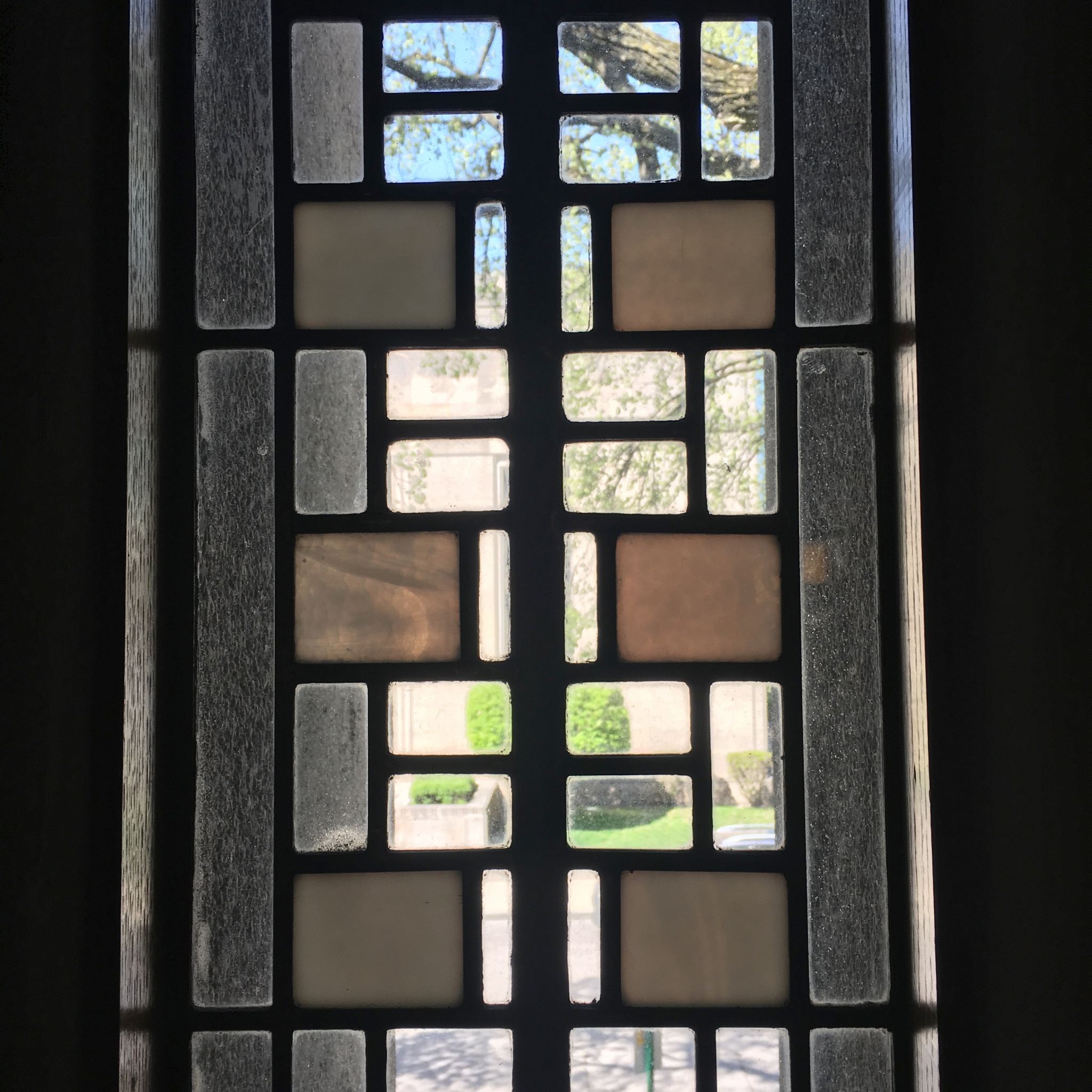
Unity Temple stairwell window
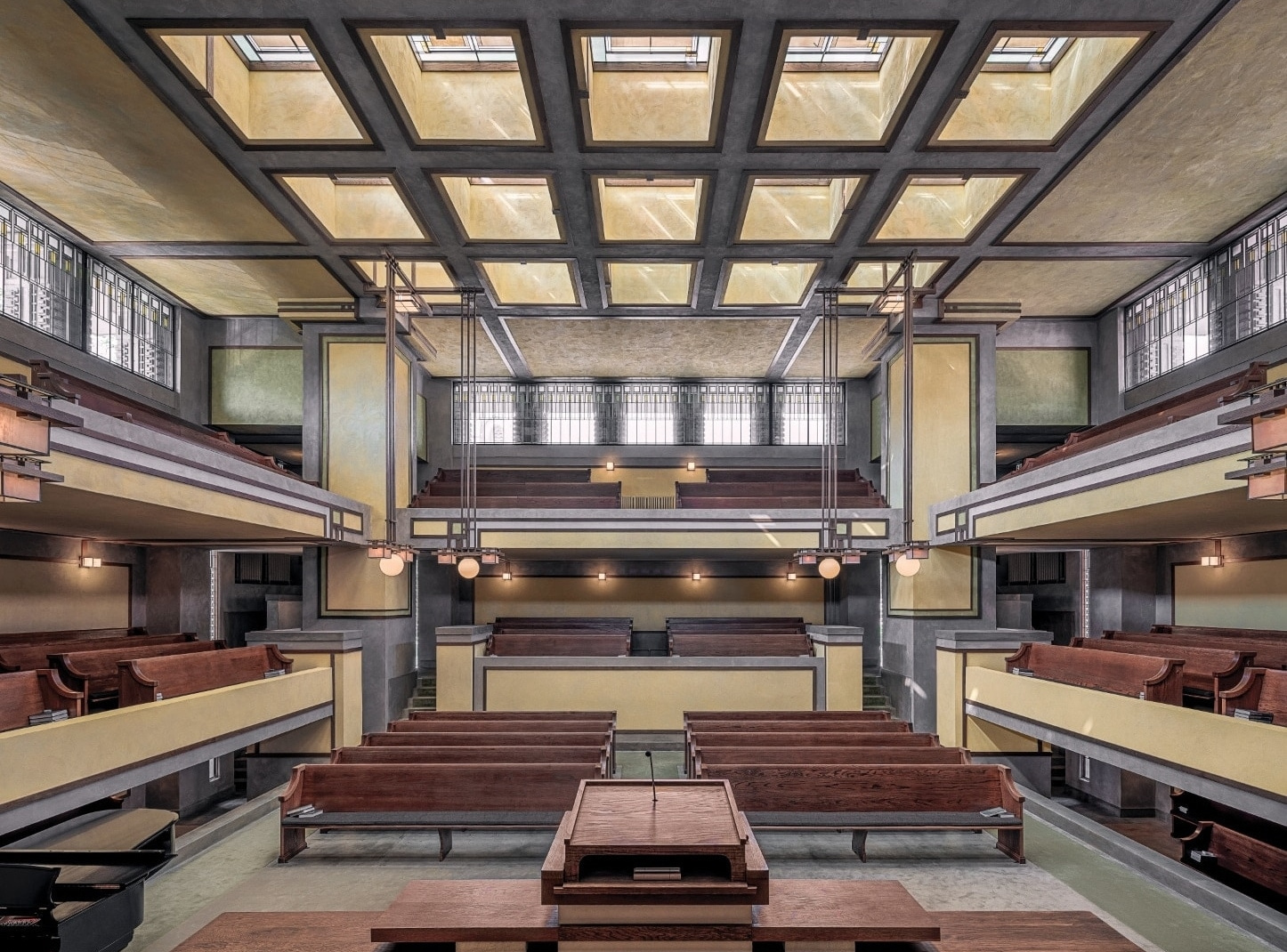
Photo by James Caulfield
Frederick C. Robie House
Robie House is one of the buildings that I have not been to, and instead relied heavily on looking at photos and reading about its significant characteristics. Robie feels similar to Unity Temple in both the use of wood and in the design of the lamps, but my first instinct again (and final icon design) was to focus on the art glass windows, which are incredibly representative of Robie House in my mind, despite similar designs in Wright’s other works, including Hollyhock House. The pattern, created by 30 and 60 degree angles, is simplified and carried over to the design of the gate, from which I ended up pulling the design for the icon.


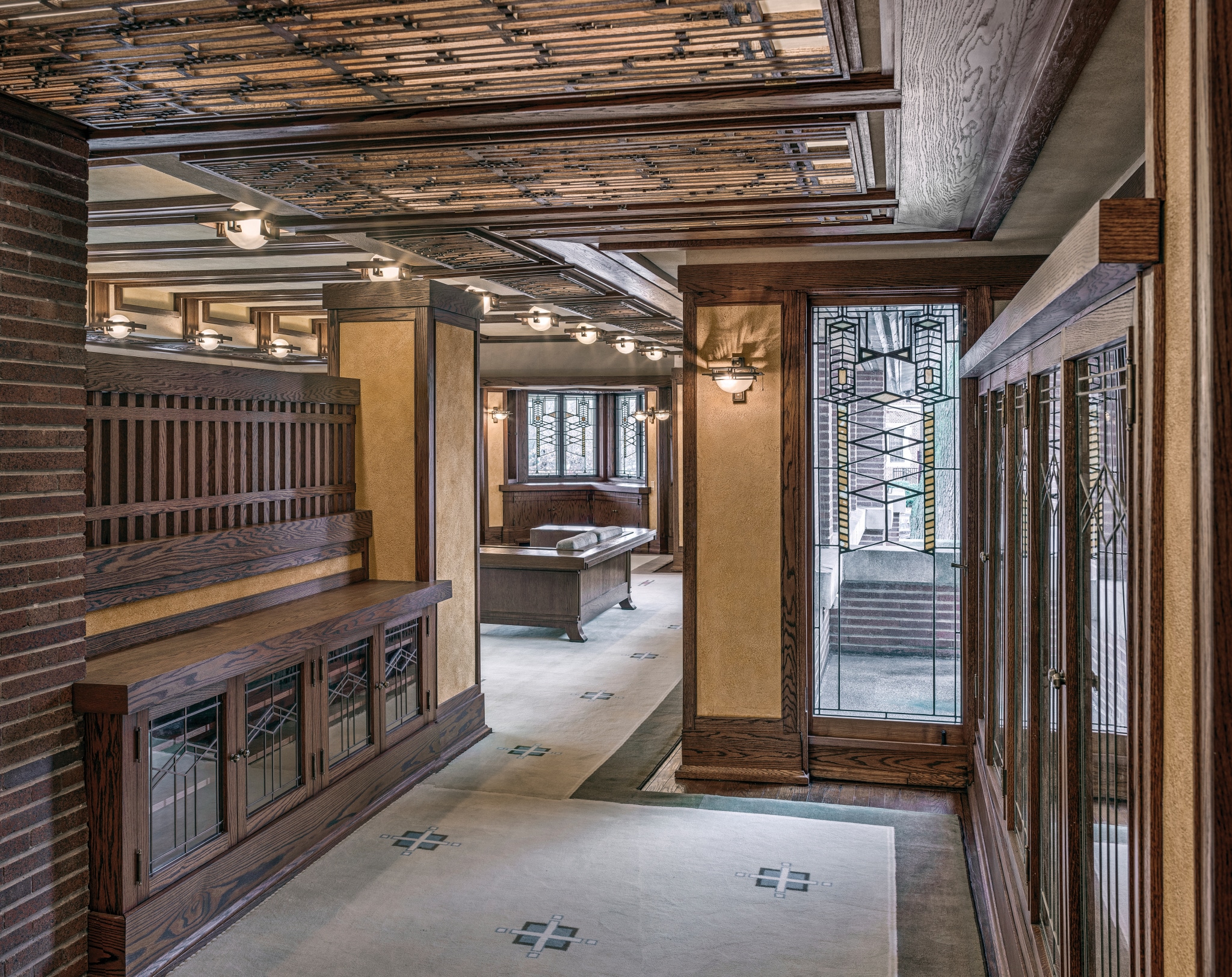
Photo by James Caulfield. Courtesy of the Frank Lloyd Wright Trust, Chicago
Taliesin
I haven’t yet had the pleasure of visiting Taliesin, so for this icon I began getting input from others who had, and asked what they considered to be especially notable features that could translate well into an icon. Taliesin was also the site that prompted a discussion on needing to draw inspiration only from the original structure. After weighing a few different ideas, including the trellises in the gardens surrounding the house, the final icon came again from the windows — though this time the clerestory windows (and shades) in the Living Room.


The Living Room at Taliesin
Hollyhock House
The icon for Hollyhock House was by far the quickest and easiest of all eight to design, after all it is right there in the name of the home. In some ways it did feel like taking the easy way out to use Wright’s abstracted hollyhock motif that adorns the building’s exterior and reappears in a variety of other places throughout the house. At the same time, of the eight buildings, it was the one I felt already had the clearest solution. I did briefly consider switching instead to a portion of the cast-concrete fireplace, another standout detail of the building, but couldn’t bring myself to leave the hollyhock behind.

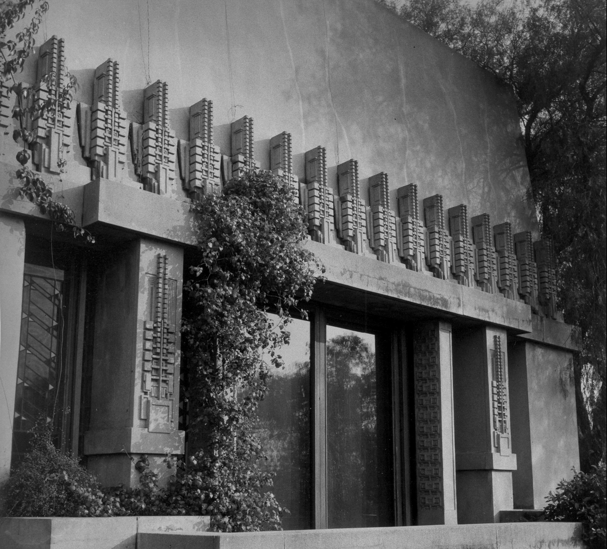

Photo by Joshua White
Fallingwater
Creating the icon for Fallingwater turned out to be in stark contrast with the ease of Hollyhock House. Finding inspiration from Fallingwater wasn’t the difficult part, very quickly I latched on to the idea of doing the large pot in the living room that can swing into the fireplace which I remembered so vividly from my own visit there. Even with repeated revisions I was never able to get it quite right, it was too heavy when compared with the other icons and the contrast between the large, circular pot and the supporting beams was always too great. I finally accepted that I needed to try something new and instead the final design is based on of the structure of the stone walls, which to me also reflects the cantilevered trays that form the overall look of the structure.

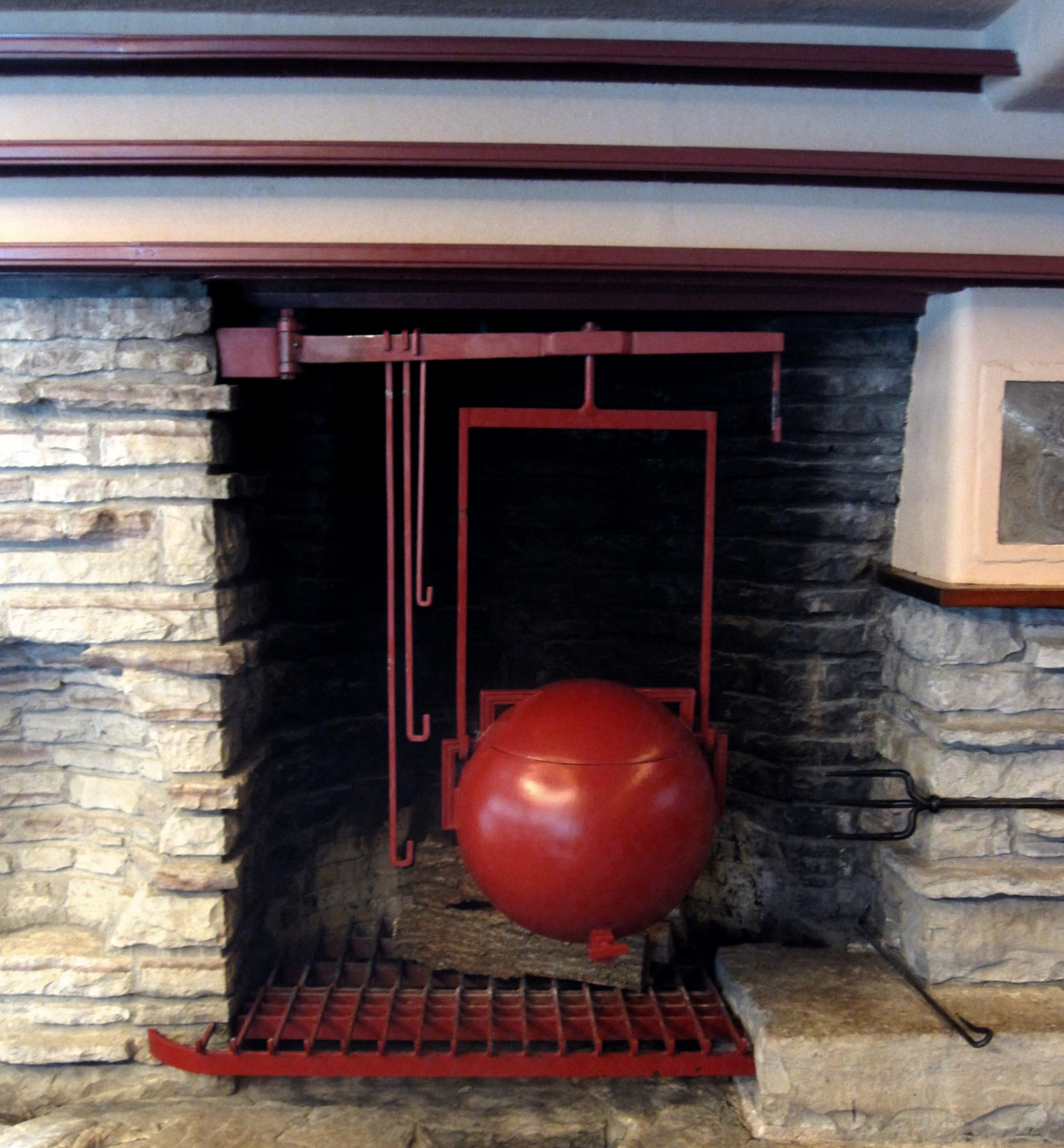
Photo by Mark Hertzberg
Herbert & Katherine Jacobs House
The Jacobs House presented an interesting challenge as a Usonian, since by nature they are more streamlined and less ornate than other Wright buildings — meaning fewer of those small details to pull from. Again, one of the potential ideas was the grid of the windows, though I was concerned that wasn’t specific enough to the site. Inspiration for the final icon came from the triangular and slatted inset lights in the dining alcove, which I would say is the most obscure reference of all eight, particularly given the private ownership of the Jacobs House.

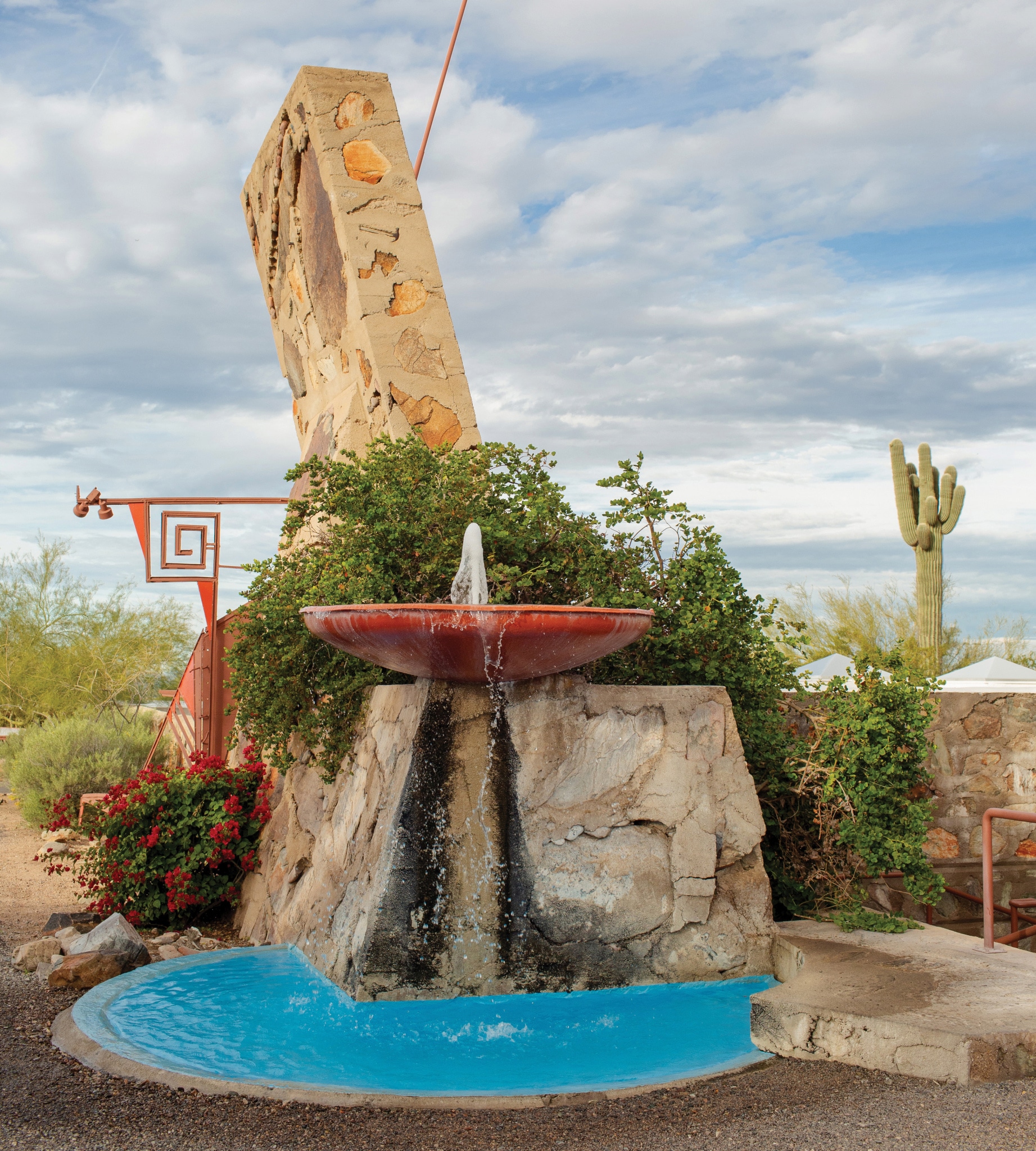
Taliesin West
Being a resident at Taliesin West made it incredibly easy to find potential ideas, while also making it much more challenging to narrow those ideas down to what would truly feel representative of this place. As is often the case, the simplest solution is the best one, which in this case is the whirling arrow. The whirling arrow is an icon Wright originally derived from petroglyphs found on the grounds of what is now Taliesin West. Of course, it didn’t seem appropriate for the icon to mimic exactly the whirling arrow of the Frank Lloyd Wright Foundation logo, so instead I used the metal whirling arrow sculpture outside of the Frank Lloyd Wright Store.

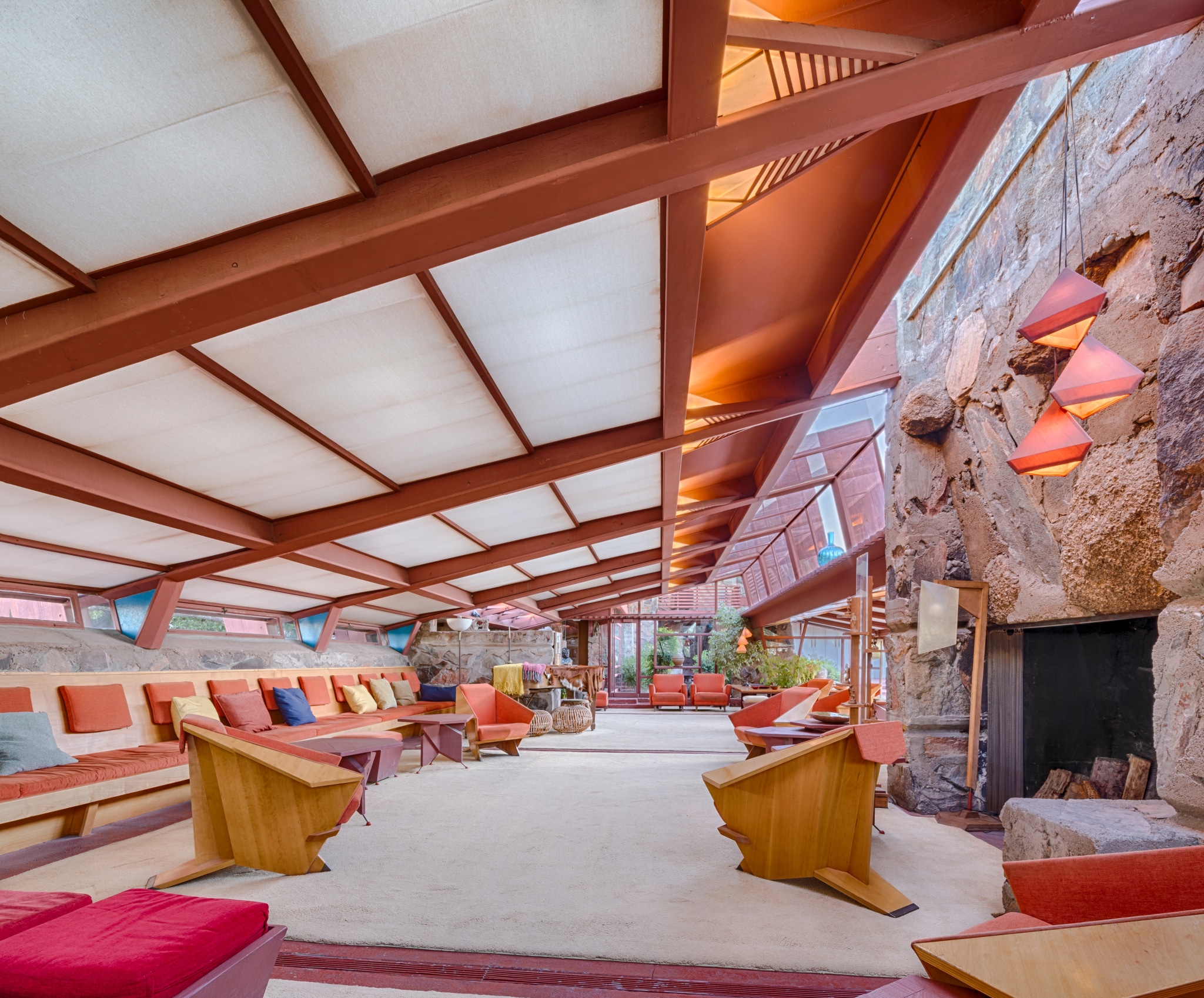
Photo by Andrew Pielage
Solomon R. Guggenheim Museum
Similar in a way to the Jacobs House, the Guggenheim Museum was challenging in that it has so little ornamentation. It’s such a recognizable structure, but I didn’t want to make the icon related to the spiral for a few reasons: first, the spiral seemed too obvious a choice; and second, it’s much more a “macro” view compared to the other icons, and for that reason felt incongruous from the rest. Another possibility was the triangular space created by the stairs, though compared with the skylight, which was the source for the final design, that didn’t seem representative enough of the Guggenheim as a whole.

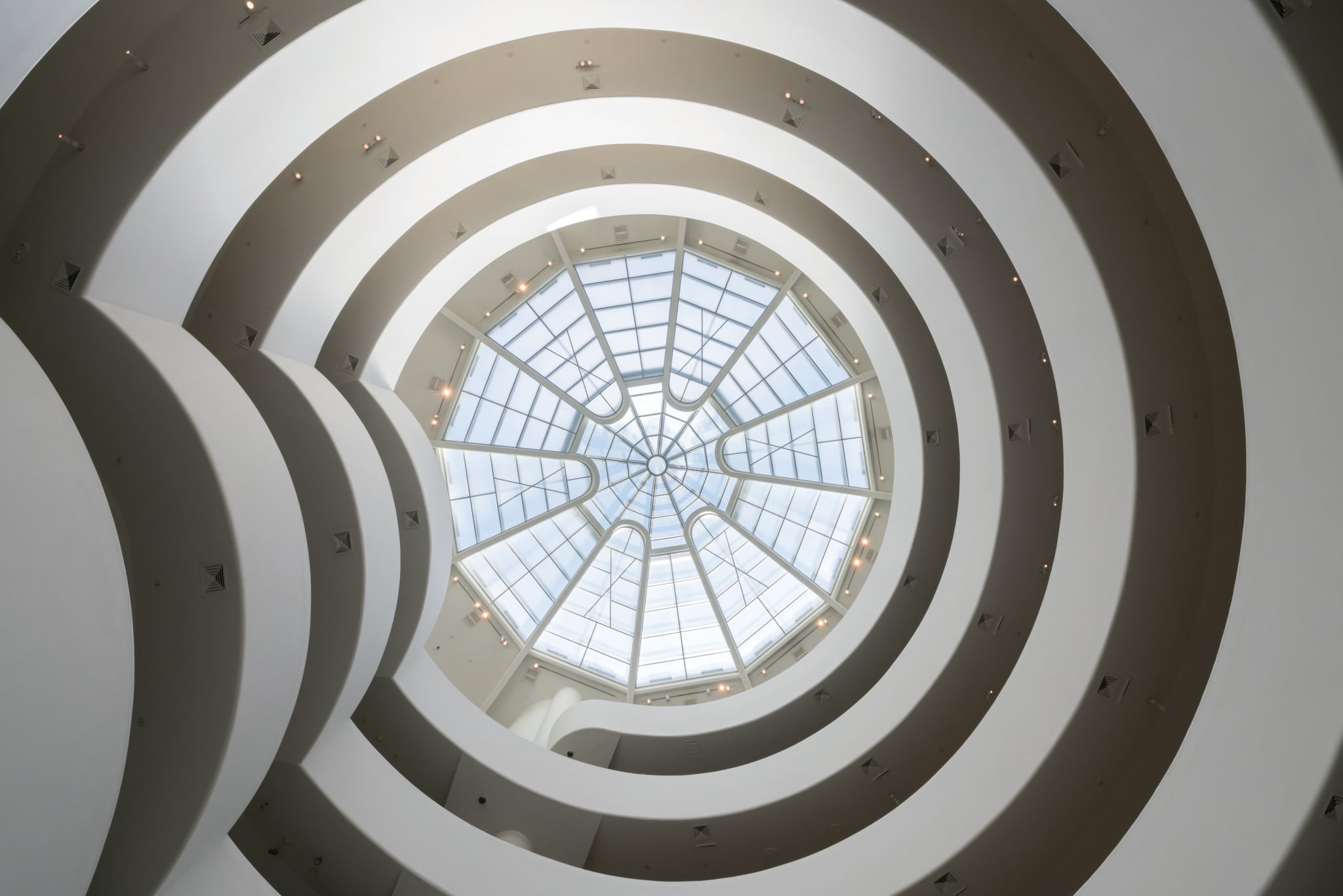
Solomon R. Guggenheim Museum, New York ©SRGF. Photo by David Heald
Designing an icon for each of the eight buildings that make up the UNESCO World Heritage inscription gave me the opportunity to get better acquainted with each, in particular the four that I have yet to see in person. It was challenging to distill such intricately designed and crafted structures down to a single element and I relished getting to immerse myself in the details. Going forward, whenever I visit a new Wright site, I’ll always be on the lookout for those little features and might need to create a commemorative icon just for myself.
Frank Lloyd Wright Foundation members receive the Frank Lloyd Wright Quarterly magazine as part of their membership benefits. In this special winter 2020 issue of the Quarterly, “UNESCO World Heritage: The 20th Century Architecture of Frank Lloyd Wright,” we celebrate the recent inscription by sharing personal reflections from stewards of each of the eight sites.